【信息可视化】网络舆情监控系统创意可视化设计
2015-10-19 17:45
585 查看
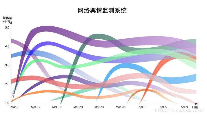
Figure 1: An overview of my visualization design.

Figure 2: The mouseover event of the picture on the curve.

Figure 3: The mouseover event of the torus on the curve.

Figure 4: The mouseover event of the torus on the curve.

Figure 5: The data set from different media by clicking the bar
Description
Dataset: The data is created by myself. In this assignments, I only collect some data form the internet. It includes the news, the news title, the picture, website name, and the time when the news is reported.Target user: the cyber policeman, journalist and people who need to analyze the website news.
User task:
User can see what is hot on the internet and analyze whether it’s good for our sociality.
User can compare the numbers of the reports from different website.
User can see how many media report the same news and who’s the first media report this event.
Visual design:
This visualization includes the title, the curve graph, the timeline and the bar chart.
The curve graph shows the number of the news and the width of the curve represent how many media enterprises report the same news.
The picture on the curve represent a big event which promotes the news hotter and hotter.
The torus on the curve indicate that on this point, you can see how many media enterprises report the same news.
Interaction:
If you put the mouse on one curve, the color of other curves will fade out. In addition, you will see some pictures and tori on the curve. (shown in figure 2).
If you put the mouse on one picture, the event represented by the picture will appear and by clicking the learning more, you can see the full text on the internet. (shown in figure 2).
You will see a bar chat which shows the main media report the same news at the same time, if you put the mouse on one torus. (shown in figure 3,4).
Click the bar chart. A new page will show a news timeline of different media companies. By clicking different bar, you can see other company’s news timeline. On the right, there is a progress bar, which can control the timeline. (shown in figure 5).

相关文章推荐
- 查看 并发请求数及其TCP连接状态
- 基于AFNetWorking搭建APP的网络请求框架[iOS]
- System.Net.HttpClient Post 处理复杂类型
- 网络七层协议和tcp/ip协议总结图
- python实现的json数据以HTTP GET,POST,PUT,DELETE方式页面请求
- Python SimpleHTTPServer 简单开发
- BP网络在MATLAB工具箱中常用的几类函数
- 网络中常用的几种矩阵
- 网络通信
- Linux网络编程并发服务器模型
- 【PHPsocket编程专题(理论篇)】初步理解TCP/IP、Http、Socket.md
- 使用sqlmapapi和http-proxy检测SQL注入漏洞
- HTTP请求中POST与GET的区别
- 【计算机网络面试题】
- 无线网络的优化
- httpclient模拟登录
- Http
- Xutil过时出现的HttpException:java.io,IoException:stack size 1036KB的异常
- Web性能优化与Http2
- CF 589F 网络流(or贪心?)