TextBox 英文文档
2015-10-15 12:29
344 查看
TextBox
Extend from $.fn.validatebox.defaults. Override defaults with $.fn.textbox.defaults.The TextBox component is a enhanced input field that allows users build their form easily. It is the base component for building other complex components such as combo,datebox,spinner,etc.
Dependencies
validateboxlinkbutton
Usage Example
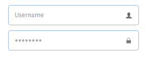
Create textbox from markup.<input class="easyui-textbox" data-options="iconCls:'icon-search'" style="width:300px">
Create textbox by using javascript.
<input id="tb" type="text" style="width:300px">
$('#tb').textbox({
buttonText:'Search',
iconCls:'icon-man',
iconAlign:'left'
})
Properties
The properties extend from validatebox, below is the added properties for textbox:| Name | Type | Description | Default |
|---|---|---|---|
| width | number | The width of the component. | auto |
| height | number | The height of the component. | 22 |
| prompt | string | The prompt message to be displayed in input box. | '' |
| value | string | The default value. | |
| type | string | The textbox type. Possible values are 'text' and 'password'. | text |
| multiline | boolean | Defines if this is a multiline textbox. | false |
| editable | boolean | Defines if user can type text directly into the field. | true |
| disabled | boolean | Defines if to disable the field. | false |
| readonly | boolean | Defines if the component is read-only. | false |
| icons | array | The icons attached to the textbox. Each item has the following properties: iconCls: string, the icon class. disabled: boolean, indicate if the icon is disabled. handler: function, the function to process the clicking action on this icon. Code example: $('#tb').textbox({
icons: [{
iconCls:'icon-add',
handler: function(e){
$(e.data.target).textbox('setValue', 'Something added!');
}
},{
iconCls:'icon-remove',
handler: function(e){
$(e.data.target).textbox('clear');
}
}]
}) | [] |
| iconCls | string | The background icon displayed on the textbox. | null |
| iconAlign | string | Position of the icons. Possible values are 'left','right'. | right |
| iconWidth | number | The icon width. | 18 |
| buttonText | string | The displaying text of button that attached to the textbox. | |
| buttonIcon | string | The displaying icon of button that attached to the textbox. | null |
| buttonAlign | string | Position of the button. Possible values are 'left','right'. | right |
Events
The events extend from validatebox, below is the added events for textbox.| Name | Parameters | Description |
|---|---|---|
| onChange | newValue,oldValue | Fires when the field value is changed. |
| onResize | width,height | Fires when the textbox is resized. |
| onClickButton | none | Fires when the user click the button. |
| onClickIcon | index | Fires when the user click a icon. |
Methods
The methods extend from validatebox, below is the added methods for textbox.| Name | Parameter | Description |
|---|---|---|
| options | none | Return the options object. |
| textbox | none | Return the textbox object. The user can bind any events to this editing box. Code example: var t = $('#tt');
t.textbox('textbox').bind('keydown', function(e){
if (e.keyCode == 13){ // when press ENTER key, accept the inputed value.
t.textbox('setValue', $(this).val());
}
}); |
| button | none | Return the button object. |
| destroy | none | Destroy the textbox component. |
| resize | width | Resize the component width. |
| disable | none | Disable the component. |
| enable | none | Enable the component. |
| readonly | mode | Enable/Disable readonly mode. Code example: $('#tb').textbox('readonly'); // enable readonly mode
$('#tb').textbox('readonly',true); // eanble readonly mode
$('#tb').textbox('readonly',false); // disable readonly mode |
| clear | none | Clear the component value. |
| reset | none | Reset the component value. |
| initValue | value | Initialize the component value. Calling this method does not trigger the 'onChange' event. |
| setText | text | Set the displaying text value. |
| getText | none | Get the displaying text value. |
| setValue | value | Set the component value. |
| getValue | none | Get the component value. |
| getIcon | index | Get specified icon object. |

相关文章推荐
- leetcode面试准备: Game of Life
- flash与字符串:抽离安卓xml描述文件ID
- Mybatis中的常用sql
- LVS Nginx HAProxy 优缺点
- 圆与任意多边形交的长度
- Skype for Business iOS版正式发布
- Linux服务器密钥安全登录
- Java并发编程:Timer和TimerTask
- jsp页面加载时自动执行action
- 黑马程序员——java集合框架——List接口
- [sic 4000 ily]1153. 马的周游问题
- Adobe Acrobat XI pro虚拟打印机的安装教程(附激活)
- 网曝广电总局公布81个非法视频软件
- JDBC详解
- 网曝广电总局公布81个非法视频软件
- 吴晓波:马化腾的“邮件癖”
- 对Hadoop二次排序的理解
- KVC 和 KVO 的使用场景
- 端口占用解决办法
- tomcat的最大线程数、最大排队数多少合适