Material Design with the Android Design Support Library
2015-10-14 11:30
1101 查看
With it came new UI components such as the ‘Floating Action Button’. Implementing these new components while ensuring backward compatibility was typically a tedious process. Third party libraries would usually be needed to streamline the process.
At this year’s Google IO conference, Google introduced the Android Design Support Library which brings a number of important material design components to developers. The components are backwards compatible, with support back to Android 2.1 and implementing
them is easier than previously. The library includes a navigation drawer view, floating labels for editing text, a floating action button, snackbar, tabs and a motion and scroll framework to tie them together. In this tutorial we’ll create an app that showcases
these components.
More from this author
FaceDetection in Android with Google Play Services
Using
the YouTube API to Embed Video in an Android App
Getting Started
You can find the final project code on gitHub.Before getting started on the components, we’ll set up the project and set some styles. Using Android Studio, create a new Android project. Name it ‘Design Demo’ and leave the other settings as default, ensure the Minimum SDK version is at API level 15.
Add the following dependencies to the build.gradle (Module:app) file.
compile 'com.android.support:design:22.2.1'
compile 'com.android.support:cardview-v7:22.2.1'
The first statement adds the design support library and the second the CardView library, which we’ll use later. Sync the project with the updated Gradle files. This may involve downloading some of the support libraries.
Create a resource file in the res/values folder called colors.xml. Modify it as below:
<?xml version="1.0" encoding="utf-8"?>
<resources>
<color name="primary">#3F51B5</color>
<color name="primary_dark">#303F9F</color>
<color name="accent">#FF4081</color>
</resources>
Modify res/values/strings.xml as below. These are all the Strings we’ll need for the project:
<resources>
<string name="app_name">Design Demo</string>
<string name="hello_world">Hello world!</string>
<string name="action_settings">Settings</string>
<string name="nav_item_attachment">Attachment</string>
<string name="nav_item_images">Images</string>
<string name="nav_item_location">My Location</string>
<string name="nav_sub_menu">Sub Menu</string>
<string name="nav_sub_menu_item01">Sub Menu Item 1</string>
<string name="nav_sub_menu_item02">Sub Menu Item 2</string>
<string name="drawer_header_text">Drawer Header</string>
<string name="second_activity_text">Lorem ipsum dolor sit amet, consectetur adipiscing elit. Proin consectetur diam id aliquam scelerisque. Donec ultrices lacus vel dignissim pharetra. Vivamus pharetra augue quis rhoncus placerat. Sed ultricies at risus non cursus. Nam rutrum leo nec placerat consectetur. Vestibulum feugiat eleifend diam, nec interdum augue tincidunt sit amet. Praesent feugiat est auctor lacus consectetur, vitae pellentesque dolor laoreet.</string>
<string name="title_activity_second">SecondActivity</string>
</resources>
Modify
res/values/styles.xmlas
below:
<resources>

<!-- Base application theme. -->
<style name="AppTheme" parent="Theme.AppCompat.Light.NoActionBar">
<!-- Customize your theme here. -->
<item name="colorPrimary">@color/primary</item>
<item name="colorPrimaryDark">@color/primary_dark</item>
<item name="colorAccent">@color/accent</item>
</style>

</resources>
In the code above, we customize the app’s Color
Palette by setting the primary, primary-dark and accent colors as specified in the material design guide.
Other theme settings that can be customized are shown in the image below.
Notice we do not include the
android:prefix
before the item name (e.g.
android:colorPrimaryDark).
This is for backward compatibility. The
android:annotation
requires the minimum API level set to 21. We use a theme with
NoActionBarbecause
we’ll be using a Toolbar as our Action Bar (or AppBar as it is now called).
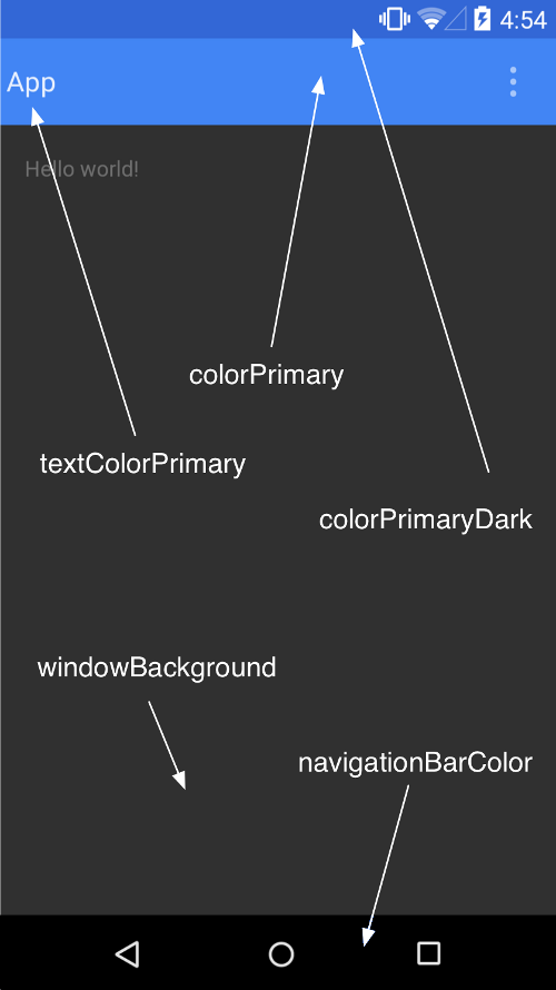
(SOURCE: https://developer.android.com/training/material/theme.html)
To create the Toolbar, modify res/layout/activity_main:
<RelativeLayout xmlns:android="http://schemas.android.com/apk/res/android"
xmlns:tools="http://schemas.android.com/tools"
android:layout_width="match_parent"
android:layout_height="match_parent"
tools:context=".MainActivity">

<android.support.v7.widget.Toolbar
android:id="@+id/toolbar"
android:layout_width="match_parent"
android:layout_height="?attr/actionBarSize"
android:background="?attr/colorPrimary"
android:theme="@style/ThemeOverlay.AppCompat.Dark" />

</RelativeLayout>
Above, we remove the default padding on the
RelativeLayoutand
add a Toolbar from the support library. If you are supporting devices from API level 21 and above, you would only need to use the default Toolbar component and not one from the support library.
In MainActivity.java modify the
onCreate(Bundle)method:
@Override
protected void onCreate(Bundle savedInstanceState) {
super.onCreate(savedInstanceState);
setContentView(R.layout.activity_main);

Toolbar toolbar = (Toolbar) findViewById(R.id.toolbar);
setSupportActionBar(toolbar);
ActionBar actionBar = getSupportActionBar();
actionBar.setHomeAsUpIndicator(R.drawable.ic_menu);
actionBar.setDisplayHomeAsUpEnabled(true);
}
Download
the project resources from gitHub which contains drawable folders that you can paste into theres directory so that the above code doesn’t result in errors.
When prompted by Android Studio, ensure you import the Toolbar from the support library.
In the above code, we get a reference to the Toolbar and set it as the Action Bar. We then get a reference of the Action Bar and set its Home icon to the infamous
hamburger menu icon.
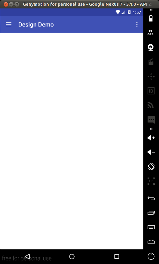
Run the app and you should see the Toolbar set as the app’s AppBar.
NavigationView
The Navigation Drawer is a common component in Android apps. It is one of the ways to build a navigation hierarchy on Android, the others being Tabs and Spinners. Implementing one was never a quick process, but now with the Design Support Library, its implementationis much simpler.
To get started, modify activity_main.xml as shown.
<android.support.v4.widget.DrawerLayout
xmlns:android="http://schemas.android.com/apk/res/android"
xmlns:app="http://schemas.android.com/apk/res-auto"
android:id="@+id/drawer_layout"
android:layout_width="match_parent"
android:layout_height="match_parent"
android:fitsSystemWindows="true">

<RelativeLayout
android:layout_width="match_parent"
android:layout_height="match_parent">

<android.support.v7.widget.Toolbar
android:id="@+id/toolbar"
android:layout_width="match_parent"
android:layout_height="?attr/actionBarSize"
android:background="?attr/colorPrimary"
android:theme="@style/ThemeOverlay.AppCompat.Dark" />

</RelativeLayout>

<android.support.design.widget.NavigationView
android:id="@+id/navigation_view"
android:layout_width="wrap_content"
android:layout_height="match_parent"
android:layout_gravity="start"
app:headerLayout="@layout/drawer_header"
app:menu="@menu/drawer"/>
</android.support.v4.widget.DrawerLayout>
In the above code, we add a
NavigationViewto
the layout. A
NavigationViewis
placed within a
DrawerLayout.
Two important attributes to note are
app:headerLayoutwhich
controls the (optional) layout used for the header and
app:menuwhich
is the menu resource inflated for the navigation items (this can also be updated at runtime).
Create a file labelled drawer_header.xml in the
res/layoutfolder
and modify it as shown.
<?xml version="1.0" encoding="utf-8"?>
<LinearLayout xmlns:android="http://schemas.android.com/apk/res/android"
android:orientation="vertical"
android:layout_width="match_parent"
android:layout_height="150dp"
android:background="?attr/colorPrimaryDark"
android:padding="16dp"
android:theme="@style/ThemeOverlay.AppCompat.Dark"
android:gravity="bottom">

<TextView
android:layout_width="match_parent"
android:layout_height="wrap_content"
android:text="@string/drawer_header_text"
android:textAppearance="@style/TextAppearance.AppCompat.Body1"/>

</LinearLayout>
This creates a header for the drawer that will have a background color of the app’s set primary color (in our case blue), with a height of 150dp and some text.
Next create a file named drawer.xml in the
res/menufolder
and modify it as shown.
<?xml version="1.0" encoding="utf-8"?>
<menu xmlns:android="http://schemas.android.com/apk/res/android">

<group android:checkableBehavior="single">
<item
android:id="@+id/navigation_item_attachment"
android:checked="true"
android:icon="@drawable/ic_attachment"
android:title="@string/nav_item_attachment" />
<item
android:id="@+id/navigation_item_images"
android:icon="@drawable/ic_image"
android:title="@string/nav_item_images" />
<item
android:id="@+id/navigation_item_location"
android:icon="@drawable/ic_place"
android:title="@string/nav_item_location" />
</group>

<item android:title="@string/nav_sub_menu">
<menu>
<item
android:icon="@drawable/ic_emoticon"
android:title="@string/nav_sub_menu_item01" />
<item
android:icon="@drawable/ic_emoticon"
android:title="@string/nav_sub_menu_item02" />
</menu>
</item>

</menu>
In the above, we create the drawer’s menu items. The first part shows a collection of checkable menu items. The checked item will appear highlighted in the navigation drawer, ensuring the user knows which navigation item is currently selected. In the second
part, we use a subheader to separate the second group of items from the first.
In MainActivity.java add the following member variable.
private DrawerLayout mDrawerLayout;
Then add the following to the bottom of
onCreate(Bundle).
mDrawerLayout = (DrawerLayout) findViewById(R.id.drawer_layout);
Modify
onOptionsItemSelected(MenuItem)as
shown:
@Override
public boolean onOptionsItemSelected(MenuItem item) {
// Handle action bar item clicks here. The action bar will
// automatically handle clicks on the Home/Up button, so long
// as you specify a parent activity in AndroidManifest.xml.
int id = item.getItemId();
switch (id) {
case android.R.id.home:
mDrawerLayout.openDrawer(GravityCompat.START);
return true;
case R.id.action_settings:
return true;
}
return super.onOptionsItemSelected(item);
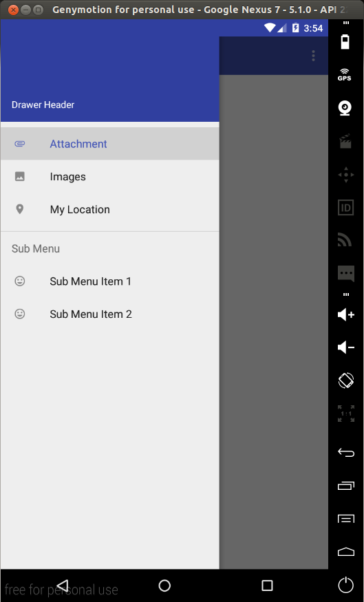
}This will bring the drawer onto the screen when the Home button (the one with the hamburger menu icon) is tapped. Run the app and you should see the following.
To capture click events on the menu items we need to set an
OnNavigationItemSelectedListeneron
the
NavigationView.
Place the following at the bottom of
onCreate(Bundle).
NavigationView navigationView = (NavigationView) findViewById(R.id.navigation_view);
navigationView.setNavigationItemSelectedListener(new NavigationView.OnNavigationItemSelectedListener() {
@Override
public boolean onNavigationItemSelected(MenuItem menuItem) {
menuItem.setChecked(true);
mDrawerLayout.closeDrawers();
Toast.makeText(MainActivity.this, menuItem.getTitle(), Toast.LENGTH_LONG).show();
return true;
}
});
The above code sets a listener on the navigation view so that when a drawer menu item is selected, the menu item is set to checked (this will only affect the menu items marked as checkable), The drawer is closed and a Toast is shown displaying the title of
the selected menu item.
In a real app you would do something like navigate to another Fragment and not just show a Toast. If you open the drawer again, you can confirm that the selected menu item is now checked by its highlight (only for the items marked checkable).
Floating Action Button (FAB)
A floating action button is a round button denoting a primary action on your interface. The Design library’sFloatingActionButtongives
a single consistent implementation, by default colored using the
colorAccentfrom
your theme.
In addition to the normal size (56dp) floating action button, it supports the mini size (40dp) when visual continuity with other elements is critical.
To add a FAB to the layout, modify
res/layout/activity_main.xmlas
shown.
<android.support.v4.widget.DrawerLayout
xmlns:android="http://schemas.android.com/apk/res/android"
xmlns:app="http://schemas.android.com/apk/res-auto"
android:id="@+id/drawer_layout"
android:layout_width="match_parent"
android:layout_height="match_parent"
android:fitsSystemWindows="true">

<RelativeLayout
android:layout_width="match_parent"
android:layout_height="match_parent">

<android.support.v7.widget.Toolbar
android:id="@+id/toolbar"
android:layout_width="match_parent"
android:layout_height="?attr/actionBarSize"
android:background="?attr/colorPrimary"
android:theme="@style/ThemeOverlay.AppCompat.Dark" />

<android.support.design.widget.FloatingActionButton
android:id="@+id/fab"
android:layout_width="wrap_content"
android:layout_height="wrap_content"
android:layout_alignParentBottom="true"
android:layout_alignParentRight="true"
android:layout_marginRight="@dimen/activity_horizontal_margin"
android:layout_marginBottom="@dimen/activity_vertical_margin"
android:src="@drawable/ic_done" />

</RelativeLayout>

<android.support.design.widget.NavigationView
android:id="@+id/navigation_view"
android:layout_width="wrap_content"
android:layout_height="match_parent"
android:layout_gravity="start"
app:headerLayout="@layout/drawer_header"
app:menu="@menu/drawer"/>
</android.support.v4.widget.DrawerLayout>
In the above, we add the
FloatingActionButtonat
the bottom right corner of the layout.
android:srcsets
the icon shown within the button. In code, you can set this with
setImageDrawable().
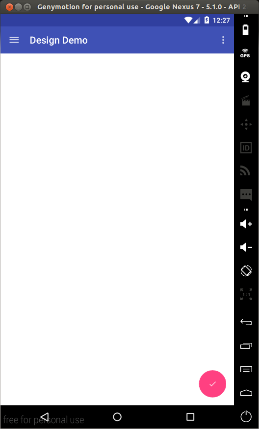
Run the app, and you should see the FAB.
We’ll set an
onClickListeneron
the FAB in the next section.
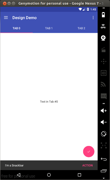
Snackbar
Traditionally, if you wanted to present quick brief feedback to the user, you would use a Toast. Now there is another option – the Snackbar.Snackbars are shown at the bottom of the screen and contain text with an optional single action. They automatically time out after the given time by animating off the screen. Users can also swipe them away before the timeout.
By including the ability to interact with the Snackbar through actions and swiping to dismiss, they are considerably more powerful than toasts, and the API is familiar.
In MainActivity.java add the following to the bottom of
onCreate(Bundle):
FloatingActionButton fab = (FloatingActionButton)findViewById(R.id.fab);
fab.setOnClickListener(new View.OnClickListener() {
@Override
public void onClick(View v) {
Snackbar.make(findViewById(R.id.drawer_layout), "I'm a Snackbar", Snackbar.LENGTH_LONG).setAction("Action", new View.OnClickListener() {
@Override
public void onClick(View v) {
Toast.makeText(MainActivity.this, "Snackbar Action", Toast.LENGTH_LONG).show();
}
}).show();
}
});
In the above, we set an
onClickListeneron
the FAB so that when it is tapped, a Snackbar will be shown. We create an Action on the Snackbar and set an
onClickListenerthat
displays a Toast when tapped.
Note the use of a View as the first parameter to
make().
Snackbar will attempt to find an appropriate parent of the Snackbar’s view to ensure that it is anchored to the bottom. Run the app to test this.
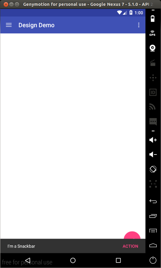
Notice that the Snackbar overlaps the FAB. We’ll fix this in the section on
CoordinatorLayout.
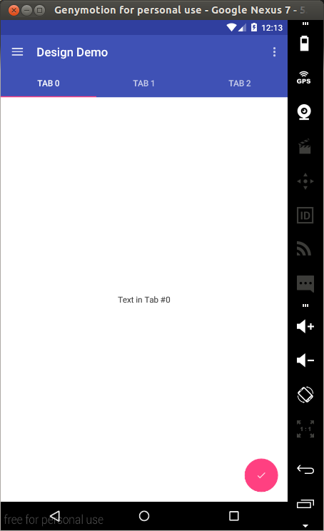
TabLayout
Using Tabs to switch between different views is not a new concept on Android. The Design library’sTabLayoutsimplifies
the process of adding tabs to your app. It implements both fixed tabs, where the view’s width is divided equally between all of the tabs, as well as scrollable tabs, where the tabs are not a uniform size and can scroll horizontally.
To add a
TabLayoutto
the app, modify
res/layout/activity_main.xmlas
shown.
<android.support.v4.widget.DrawerLayout
android:id="@+id/drawer_layout"
xmlns:android="http://schemas.android.com/apk/res/android"
xmlns:app="http://schemas.android.com/apk/res-auto"
android:layout_width="match_parent"
android:layout_height="match_parent"
android:fitsSystemWindows="true">

<RelativeLayout
android:layout_width="match_parent"
android:layout_height="match_parent">

<LinearLayout
android:layout_width="match_parent"
android:layout_height="match_parent"
android:orientation="vertical">

<android.support.v7.widget.Toolbar
android:id="@+id/toolbar"
android:layout_width="match_parent"
android:layout_height="?attr/actionBarSize"
android:background="?attr/colorPrimary"
android:theme="@style/ThemeOverlay.AppCompat.Dark" />

<android.support.design.widget.TabLayout
android:id="@+id/tablayout"
android:layout_width="match_parent"
android:layout_height="wrap_content"
android:background="?attr/colorPrimary"
app:tabGravity="fill"
android:theme="@style/ThemeOverlay.AppCompat.Dark" />

<android.support.v4.view.ViewPager
android:id="@+id/viewpager"
android:layout_width="match_parent"
android:layout_height="0dp"
android:layout_weight="1"/>

</LinearLayout>

<android.support.design.widget.FloatingActionButton
android:id="@+id/fab"
android:layout_width="wrap_content"
android:layout_height="wrap_content"
android:layout_alignParentBottom="true"
android:layout_alignParentRight="true"
android:layout_marginBottom="@dimen/activity_vertical_margin"
android:layout_marginRight="@dimen/activity_horizontal_margin"
android:src="@drawable/ic_done"/>

</RelativeLayout>

<android.support.design.widget.NavigationView
android:id="@+id/navigation_view"
android:layout_width="wrap_content"
android:layout_height="match_parent"
android:layout_gravity="start"
app:headerLayout="@layout/drawer_header"
app:menu="@menu/drawer"/>
</android.support.v4.widget.DrawerLayout>
In the above, we add a
TabLayoutas
well as a
ViewPager.
The
ViewPagerwill
be used to enable horizontal paging between tabs.
In MainActivity.java add the following subclasses.
public static class DesignDemoFragment extends Fragment {
private static final String TAB_POSITION = "tab_position";

public DesignDemoFragment() {

}

public static DesignDemoFragment newInstance(int tabPosition) {
DesignDemoFragment fragment = new DesignDemoFragment();
Bundle args = new Bundle();
args.putInt(TAB_POSITION, tabPosition);
fragment.setArguments(args);
return fragment;
}

@Nullable
@Override
public View onCreateView(LayoutInflater inflater, ViewGroup container, Bundle savedInstanceState) {
Bundle args = getArguments();
int tabPosition = args.getInt(TAB_POSITION);
TextView tv = new TextView(getActivity());
tv.setGravity(Gravity.CENTER);
tv.setText("Text in Tab #" + tabPosition);
return tv;
}
}
static class DesignDemoPagerAdapter extends FragmentStatePagerAdapter {
public DesignDemoPagerAdapter(FragmentManager fm) {
super(fm);
}
@Override
public Fragment getItem(int position) {
return DesignDemoFragment.newInstance(position);
}
@Override
public int getCount() {
return 3;
}
@Override
public CharSequence getPageTitle(int position) {
return "Tab " + position;
}
}Then at the bottom of
onCreate(Bundle)add
the following.
DesignDemoPagerAdapter adapter = new DesignDemoPagerAdapter(getSupportFragmentManager());
ViewPager viewPager = (ViewPager)findViewById(R.id.viewpager);
viewPager.setAdapter(adapter);
TabLayout tabLayout = (TabLayout)findViewById(R.id.tablayout);
tabLayout.setupWithViewPager(viewPager);
In the above, we create a
Fragmentclass
that creates a simple fragment with a single
TextViewas
its content. We then create a
FragmentStatePagerAdapterthat
will be used as the
ViewPager’s
adapter. The
getCount()function
of the
DesignDemoPagerAdapterclass
returns the number of pages/tabs.
getItem(int)returns
the Fragment that will be placed on the view page and
getPageTitle(int)returns
the title that will appear on a particular tab. For this to work, we use
setupWithViewPager()on
the
TabLayout.
This ensures that tab selection events update the
ViewPagerand
page changes update the selected tab.
Run the app and you should see the tabs. You can swipe to change tabs or just tap on a tab to switch to it.
CoordinatorLayout
The Design library introduces the CoordinatorLayout,
a layout which provides an additional level of control over touch events between child views, something which many of the components in the Design library take advantage of.
An example of this is when you add a
FloatingActionButtonas
a child of your
CoordinatorLayoutand
then pass that
CoordinatorLayoutto
your
Snackbar.make()call.
Instead of the snackbar displaying over the floating action button, as seen previously, the
FloatingActionButtontakes
advantage of additional callbacks provided by
CoordinatorLayoutto
automatically move upward as the snackbar animates in and returns to its position when the snackbar animates out. This is supported on Android 3.0 and higher devices.
To use the
CoordinatorLayoutin
our layout, modify res/layout/activity_main.xml as shown:
<android.support.v4.widget.DrawerLayout
android:id="@+id/drawer_layout"
xmlns:android="http://schemas.android.com/apk/res/android"
xmlns:app="http://schemas.android.com/apk/res-auto"
android:layout_width="match_parent"
android:layout_height="match_parent"
android:fitsSystemWindows="true">

<android.support.design.widget.CoordinatorLayout
android:id="@+id/coordinator"
android:layout_width="match_parent"
android:layout_height="match_parent">

<LinearLayout
android:layout_width="match_parent"
android:layout_height="match_parent"
android:orientation="vertical">

<android.support.v7.widget.Toolbar
android:id="@+id/toolbar"
android:layout_width="match_parent"
android:layout_height="?attr/actionBarSize"
android:background="?attr/colorPrimary"
android:theme="@style/ThemeOverlay.AppCompat.Dark" />

<android.support.design.widget.TabLayout
android:id="@+id/tablayout"
android:layout_width="match_parent"
android:layout_height="wrap_content"
android:background="?attr/colorPrimary"
app:tabGravity="fill"
android:theme="@style/ThemeOverlay.AppCompat.Dark" />

<android.support.v4.view.ViewPager
android:id="@+id/viewpager"
android:layout_width="match_parent"
android:layout_height="0dp"
android:layout_weight="1"/>

</LinearLayout>

<android.support.design.widget.FloatingActionButton
android:id="@+id/fab"
android:layout_width="wrap_content"
android:layout_height="wrap_content"
android:layout_alignParentBottom="true"
android:layout_gravity="bottom|right"
android:layout_marginBottom="@dimen/activity_vertical_margin"
android:layout_marginRight="@dimen/activity_horizontal_margin"
android:src="@drawable/ic_done"/>

</android.support.design.widget.CoordinatorLayout>

<android.support.design.widget.NavigationView
android:id="@+id/navigation_view"
android:layout_width="wrap_content"
android:layout_height="match_parent"
android:layout_gravity="start"
app:headerLayout="@layout/drawer_header"
app:menu="@menu/drawer"/>
</android.support.v4.widget.DrawerLayout>
As seen above, the FAB needs to be a child of the
CoordinatorLayout,
so we replace the previous
RelativeLayoutwith
the
CoordinatorLayout.
Also note that we change the FAB’s position setting to
android:layout_gravity="bottom|right".
Next in MainActivity.java when constructing the Snackbar, pass the
CoordinatorLayoutas
the view parameter.
Snackbar.make(findViewById(R.id.coordinator), "I'm a Snackbar", Snackbar.LENGTH_LONG).setAction("Action", new View.OnClickListener() {
@Override
public void onClick(View v) {
Toast.makeText(MainActivity.this, "Snackbar Action", Toast.LENGTH_LONG).show();
}
}).show();
Run the app and now when you tap on the FAB, the Snackbar will slide into view, but this time it won’t overlap the FAB, the FAB will slide up with it and when the Snackbar is dismissed either by timing out or with a swipe, the FAB will fall back into place.
The other main use case for the
CoordinatorLayoutconcerns
the app bar and scrolling techniques. The design library provides the
AppBarLayoutwhich
allows the Toolbar and other views (such as tabs provided by
TabLayout)
to react to scroll events in a sibling view marked with a
ScrollingViewBehavior.
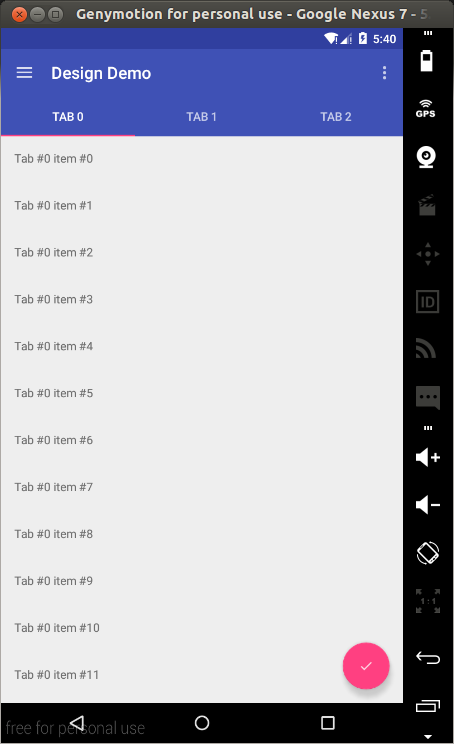
Before looking at this, let’s first create something we can scroll through. We’ll use a
RecyclerViewto
create a list of items we can scroll through.
Note: I spent about an hour trying to make the
CoordinatorLayoutwork
with a
ListView,
but the scrolling behaviour was just not working. A simple search led me to this
post, this
post and this
post. If you check those links, it seems that the
CoordinatorLayoutdoesn’t
work well out-of-the-box with
ListViews(and
apparently
GridViewsand
ScrollViews).
The last two links show a workaround to making it work with a
ListView,
but it doesn’t seem to be backwards compatible. I wanted to let you know incase you get stuck on the same issue. Support for
ListViewswill
probably be added in a future update.
I’ll go through the creation of the
RecyclerViewwithout
much explanation as this is out of the scope of this tutorial and you can easily find help online regarding
RecyclerViews.
Place the following in your build.gradle (Module: app) file and sync the gradle files..
compile 'com.android.support:recyclerview-v7:22.2.1'
Create a file in res/layout named fragment_list_view.xml. Modify it as shown.
<?xml version="1.0" encoding="utf-8"?>
<android.support.v7.widget.RecyclerView
xmlns:android="http://schemas.android.com/apk/res/android"
android:id="@+id/recyclerview"
android:layout_width="match_parent"
android:layout_height="match_parent"/>
Create another layout file in res/layout and name it list_row.xml. Replace its contents with the content below.
<?xml version="1.0" encoding="utf-8"?>
<LinearLayout xmlns:android="http://schemas.android.com/apk/res/android"
android:orientation="vertical"
android:padding="16dp"
android:layout_width="match_parent"
android:layout_height="56dp">

<TextView
android:id="@+id/list_item"
android:layout_width="wrap_content"
android:layout_height="wrap_content"/>

</LinearLayout>
Create a java file called DesignDemoRecyclerAdapter.java and paste the following.
package com.echessa.designdemo; // Rename as Appropriate

import android.support.v7.widget.RecyclerView;
import android.view.LayoutInflater;
import android.view.View;
import android.view.ViewGroup;
import android.widget.TextView;

import java.util.List;

/**
* Created by echessa on 7/24/15.
*/
public class DesignDemoRecyclerAdapter extends RecyclerView.Adapter<DesignDemoRecyclerAdapter.ViewHolder> {

private List<String> mItems;

DesignDemoRecyclerAdapter(List<String> items) {
mItems = items;
}

@Override
public ViewHolder onCreateViewHolder(ViewGroup viewGroup, int i) {
View v = LayoutInflater.from(viewGroup.getContext()).inflate(R.layout.list_row, viewGroup, false);

return new ViewHolder(v);
}

@Override
public void onBindViewHolder(ViewHolder viewHolder, int i) {
String item = mItems.get(i);
viewHolder.mTextView.setText(item);
}

@Override
public int getItemCount() {
return mItems.size();
}

public class ViewHolder extends RecyclerView.ViewHolder {

private final TextView mTextView;

ViewHolder(View v) {
super(v);
mTextView = (TextView)v.findViewById(R.id.list_item);
}
}

}
Modify
DesignDemoFragment.onCreateView()in MainActivity.java as
shown:
@Nullable
@Override
public View onCreateView(LayoutInflater inflater, ViewGroup container, Bundle savedInstanceState) {
Bundle args = getArguments();
int tabPosition = args.getInt(TAB_POSITION);
ArrayList<String> items = new ArrayList<String>();
for (int i = 0; i < 50; i++) {
items.add("Tab #" + tabPosition + " item #" + i);
}
View v = inflater.inflate(R.layout.fragment_list_view, container, false);
RecyclerView recyclerView = (RecyclerView)v.findViewById(R.id.recyclerview);
recyclerView.setLayoutManager(new LinearLayoutManager(getActivity()));
recyclerView.setAdapter(new DesignDemoRecyclerAdapter(items));
return v;
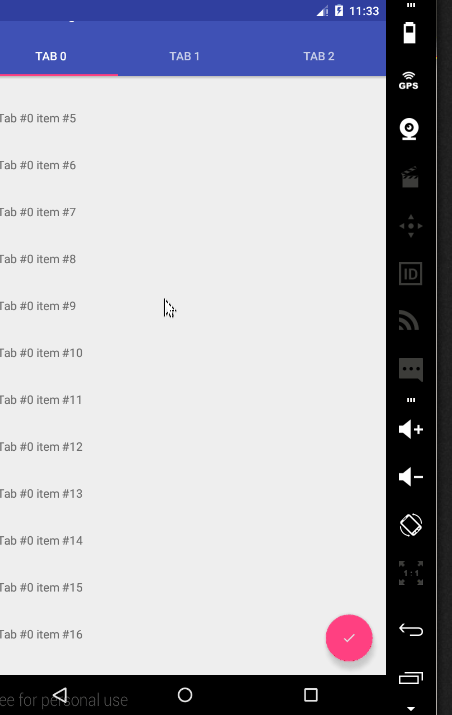
}This inflates the previously created layout file. Now the fragment’s view will contain a list of items. Run the app to confirm this.
With that completed, we can look at the scrolling behaviour provided by the
CoordinatorLayout.
Modify activity_main.xml as shown.
<android.support.v4.widget.DrawerLayout
android:id="@+id/drawer_layout"
xmlns:android="http://schemas.android.com/apk/res/android"
xmlns:app="http://schemas.android.com/apk/res-auto"
android:layout_width="match_parent"
android:layout_height="match_parent"
android:fitsSystemWindows="true">

<android.support.design.widget.CoordinatorLayout
android:id="@+id/coordinator"
android:layout_width="match_parent"
android:layout_height="match_parent">

<android.support.design.widget.AppBarLayout
android:layout_width="match_parent"
android:layout_height="wrap_content"
android:theme="@style/ThemeOverlay.AppCompat.Dark">

<android.support.v7.widget.Toolbar
android:id="@+id/toolbar"
android:layout_width="match_parent"
android:layout_height="?attr/actionBarSize"
android:background="?attr/colorPrimary"
app:layout_scrollFlags="scroll|enterAlways"/>

<android.support.design.widget.TabLayout
android:id="@+id/tablayout"
android:layout_width="match_parent"
android:layout_height="wrap_content"
android:background="?attr/colorPrimary"
app:tabGravity="fill"/>

</android.support.design.widget.AppBarLayout>

<android.support.v4.view.ViewPager
android:id="@+id/viewpager"
android:layout_width="match_parent"
android:layout_height="match_parent"
app:layout_behavior="@string/appbar_scrolling_view_behavior"/>

<android.support.design.widget.FloatingActionButton
android:id="@+id/fab"
android:layout_width="wrap_content"
android:layout_height="wrap_content"
android:layout_alignParentBottom="true"
android:layout_gravity="bottom|right"
android:layout_marginBottom="@dimen/activity_vertical_margin"
android:layout_marginRight="@dimen/activity_horizontal_margin"
android:src="@drawable/ic_done"/>

</android.support.design.widget.CoordinatorLayout>

<android.support.design.widget.NavigationView
android:id="@+id/navigation_view"
android:layout_width="wrap_content"
android:layout_height="match_parent"
android:layout_gravity="start"
app:headerLayout="@layout/drawer_header"
app:menu="@menu/drawer"/>
</android.support.v4.widget.DrawerLayout>
In the above, we nest the
Toolbarand
TabLayoutin
an
AppBarLayout.
The
AppBarLayoutallows
the
Toolbarand
other views (such as tabs provided by
TabLayout)
to react to scroll events in a sibling view marked with a
ScrollingViewBehavior.
When the user scrolls through the
RecyclerView,
the
AppBarLayoutresponds
by using its children’s scroll flags to control how they enter (scroll on screen) and exit (scroll off screen).
Flags include:
scroll: This flag should be set for all views that want to scroll off the screen. For views that do not use this flag, they’ll remain
pinned to the top of the screen
enterAlways: This flag ensures that any downward scroll will cause this view to become visible, enabling the ‘quick return’ pattern
enterAlwaysCollapsed: When your view has declared a
minHeightand
you use this flag, your View will only enter at its minimum height (i.e., ‘collapsed’), only re-expanding to its full height when the scrolling view has reached it’s top.
exitUntilCollapsed: This flag causes the view to scroll off until it is ‘collapsed’ (its
minHeight)
before exiting
Note that all views using the scroll flag must be declared before views that do not use the flag. This ensures that all views exit from the top, leaving the fixed elements behind.
In our app we use the
scrolland
enterAlwaysflags
on the Toolbar which will result in the Toolbar scrolling off screen when scrolling upwards and come back on screen on the downward scroll. Notice the use of
app:layout_behavior="@string/appbar_scrolling_view_behavior"on
the ViewPager. The support library contains a special string resource
@string/appbar_scrolling_view_behaviorthat
maps to
AppBarLayout.ScrollingViewBehavior,
which is used to notify the
AppBarLayoutwhen
scroll events occur on a particular view. The behavior must be established on the view that triggers the event.
Run the app to see the effect of scrolling on the AppBar.
CollapsingToolbarLayout
The CollapsingToolbarLayourprovides
another type of scrolling behaviour to the
AppBar.
To see it in action, we’ll first create another activity that has a
Toolbar,
but no
TabLayout.
Create a Blank Activity (File -> New -> Activity -> Blank Activity) and name it
SecondActivity.
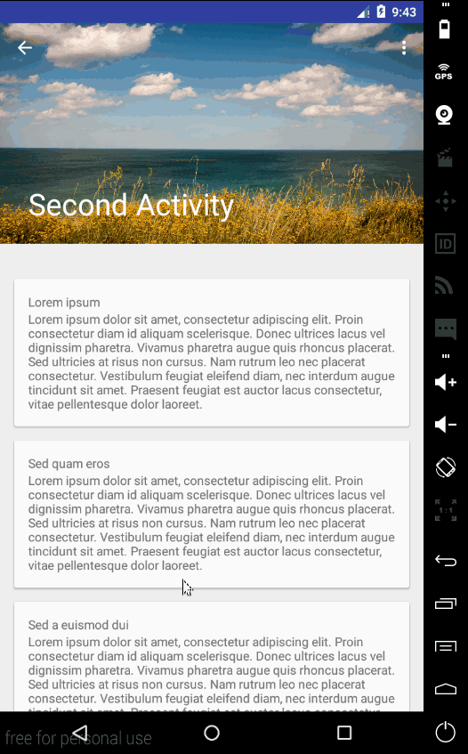
Modify res/layout/activity_second.xml as shown.
<android.support.design.widget.CoordinatorLayout
xmlns:android="http://schemas.android.com/apk/res/android"
xmlns:app="http://schemas.android.com/apk/res-auto"
android:layout_width="match_parent"
android:layout_height="match_parent">

<android.support.design.widget.AppBarLayout
android:layout_width="match_parent"
android:layout_height="250dp"
android:theme="@style/ThemeOverlay.AppCompat.Dark.ActionBar">

<android.support.design.widget.CollapsingToolbarLayout
android:id="@+id/collapsing_toolbar"
android:layout_width="match_parent"
android:layout_height="match_parent"
app:contentScrim="?attr/colorPrimary"
app:layout_scrollFlags="scroll|exitUntilCollapsed">

<ImageView
android:layout_width="match_parent"
android:layout_height="match_parent"
android:scaleType="centerCrop"
android:src="@drawable/image"
app:layout_collapseMode="parallax"/>

<android.support.v7.widget.Toolbar
android:id="@+id/toolbar"
android:layout_width="match_parent"
android:layout_height="?attr/actionBarSize"
app:layout_collapseMode="pin"/>

</android.support.design.widget.CollapsingToolbarLayout>

</android.support.design.widget.AppBarLayout>

<android.support.v4.widget.NestedScrollView
android:layout_width="match_parent"
android:layout_height="match_parent"
app:layout_behavior="@string/appbar_scrolling_view_behavior">

<LinearLayout
android:layout_width="match_parent"
android:layout_height="match_parent"
android:orientation="vertical"
android:paddingTop="24dp">

<android.support.v7.widget.CardView
android:layout_width="match_parent"
android:layout_height="wrap_content"
android:layout_margin="16dp">

<LinearLayout
android:layout_width="match_parent"
android:layout_height="wrap_content"
android:orientation="vertical"
android:padding="16dp">

<TextView
android:layout_width="match_parent"
android:layout_height="wrap_content"
android:text="Lorem ipsum"/>

<TextView
android:layout_width="match_parent"
android:layout_height="wrap_content"
android:text="@string/second_activity_text"/>

</LinearLayout>

</android.support.v7.widget.CardView>

<android.support.v7.widget.CardView
android:layout_width="match_parent"
android:layout_height="wrap_content"
android:layout_marginBottom="16dp"
android:layout_marginLeft="16dp"
android:layout_marginRight="16dp">

<LinearLayout
android:layout_width="match_parent"
android:layout_height="wrap_content"
android:orientation="vertical"
android:padding="16dp">

<TextView
android:layout_width="match_parent"
android:layout_height="wrap_content"
android:text="Sed quam eros"/>

<TextView
android:layout_width="match_parent"
android:layout_height="wrap_content"
android:text="@string/second_activity_text"/>

</LinearLayout>

</android.support.v7.widget.CardView>

<android.support.v7.widget.CardView
android:layout_width="match_parent"
android:layout_height="wrap_content"
android:layout_marginBottom="16dp"
android:layout_marginLeft="16dp"
android:layout_marginRight="16dp">

<LinearLayout
android:layout_width="match_parent"
android:layout_height="wrap_content"
android:orientation="vertical"
android:padding="16dp">

<TextView
android:layout_width="match_parent"
android:layout_height="wrap_content"
android:text="Sed a euismod dui"/>

<TextView
android:layout_width="match_parent"
android:layout_height="wrap_content"
android:text="@string/second_activity_text"/>

</LinearLayout>

</android.support.v7.widget.CardView>

<android.support.v7.widget.CardView
android:layout_width="match_parent"
android:layout_height="wrap_content"
android:layout_marginBottom="16dp"
android:layout_marginLeft="16dp"
android:layout_marginRight="16dp">

<LinearLayout
android:layout_width="match_parent"
android:layout_height="wrap_content"
android:orientation="vertical"
android:padding="16dp">

<TextView
android:layout_width="match_parent"
android:layout_height="wrap_content"
android:text="Fusce nec lacinia mi"/>

<TextView
android:layout_width="match_parent"
android:layout_height="wrap_content"
android:text="@string/second_activity_text"/>

</LinearLayout>

</android.support.v7.widget.CardView>

<android.support.v7.widget.CardView
android:layout_width="match_parent"
android:layout_height="wrap_content"
android:layout_marginBottom="16dp"
android:layout_marginLeft="16dp"
android:layout_marginRight="16dp">

<LinearLayout
android:layout_width="match_parent"
android:layout_height="wrap_content"
android:orientation="vertical"
android:padding="16dp">

<TextView
android:layout_width="match_parent"
android:layout_height="wrap_content"
android:text="Praesent hendrerit"/>

<TextView
android:layout_width="match_parent"
android:layout_height="wrap_content"
android:text="@string/second_activity_text"/>

</LinearLayout>

</android.support.v7.widget.CardView>

</LinearLayout>

</android.support.v4.widget.NestedScrollView>

</android.support.design.widget.CoordinatorLayout>
In the above, we use the
CollapsingToolbarLayoutwith
the
scrolland
exitUntilCollapsedflags
which will make its subviews scroll off screen. For the Toolbar however, we set
app:layout_collapseMode="pin"which
will ensure that the Toolbar itself remains pinned to the top of the screen while the view collapses. Another effect we’ll get is that the title in the
CollapsingToolbarLayoutwill
appear larger when the layout is fully visible, then transition to its default size as it is collapsed. We’ll set this title in code. The rest of the layout contains a
NestedScrollViewwith
several Cards as its children.
In SecondActivity.java modify
onCreate(Bundle)as
shown.
@Override
protected void onCreate(Bundle savedInstanceState) {
super.onCreate(savedInstanceState);
setContentView(R.layout.activity_second);

Toolbar toolbar = (Toolbar) findViewById(R.id.toolbar);
setSupportActionBar(toolbar);
getSupportActionBar().setDisplayHomeAsUpEnabled(true);

CollapsingToolbarLayout collapsingToolbar = (CollapsingToolbarLayout) findViewById(R.id.collapsing_toolbar);
collapsingToolbar.setTitle("Second Activity");
}
Here we set up the Up caret on the Toolbar and then set a title for the
CollapsingToolbarLayout.
For the Up caret to work, place the following in the manifest file as a child of the
SecondActivity’s
activitytag.
<meta-data
android:name="android.support.PARENT_ACTIVITY"
android:value="com.echessa.designdemo.MainActivity" />
In DesignDemoRecyclerAdapter.java modify `onBindViewHolder() as shown.
@Override
public void onBindViewHolder(ViewHolder viewHolder, int i) {
String item = mItems.get(i);
viewHolder.mTextView.setText(item);

viewHolder.mTextView.setOnClickListener(new View.OnClickListener() {
@Override
public void onClick(View view) {
Context context = view.getContext();
context.startActivity(new Intent(context, SecondActivity.class));
}
});
}
In the above, we set an
onClickListener
to the
TextViewon
each row of the
RecyclerView.
This is not the best way of setting a listener on the
RecyclerViewitems,
because if you run the app, the listener’s touch target will only cover the area with the row’s text and not the whole row. I do this here because all I want is a way to start the new activity and so I opted on a way to write the least amount of code.
Run the app and you will see the following scrolling behaviour.
Floating Labels for EditText
The last component of the Design Support Library that we’ll look at is the improved EditText.
Normally when typing is started on an
EditText,
the placeholder hint that was on the field is hidden. Now you can wrap an
EditTextin
a
TextInputLayoutcausing
the hint text to become a floating label above the
EditText,
ensuring that users never lose context in what they are entering.
To see this, place the following inside one of the
CardViewsin activity_second.xml.
You can place it after the second
TextViewof
the Card.
<android.support.design.widget.TextInputLayout
android:layout_width="match_parent"
android:layout_height="wrap_content">

<EditText
android:layout_width="match_parent"
android:layout_height="wrap_content"
android:inputType="textEmailAddress"
android:hint="Email" />

</android.support.design.widget.TextInputLayout>
Run the app and when you start to type into the EditText, the hint text will float above the field.
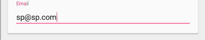
In addition to showing hints, you can display an error message below the
EditTextby
calling
setError().
Conclusion
That brings us to the end of this tutorial. The completed project for the tutorial can be downloaded here.For more on the Android Design Support Library, read the Android
developers blog.

Joyce
Echessa
I am a web developer who dabbles in mobile development from time to time. You can find me on Twitter @joyceechessa to
see what I’m up to.

相关文章推荐
- Android -- Facebook -- HashKey的生成
- Android Intent Action详解
- android 前置service
- android 6.0权限管理特性
- 关于android第三方包混淆的经验总结
- Android之switch控件的用法
- Android性能专项测试之Batterystats
- Android: ADT 23.0.2
- 捕android程序崩溃日志
- ETC1压缩纹理格式详解
- Xamarin.Android使用教程之Android项目结构
- Android实现跑马灯效果的方法
- Android 5.1 Keyguard初识
- Android textView 动态设置代码字号大小,支持单位选项 dp,sp or px
- Android 图片加载 —— ImageLoader
- android strings.xml的特殊字符
- Android4.3前后DNS解析简单研究
- Android显示图片崩溃的解决办法
- AsyncTask详细解析
- Android sdk更新缓慢最佳解决方案