Qt 学习之路 :动态视图
2015-09-15 21:00
603 查看
Repeater适用于少量的静态数据集。但是在实际应用中,数据模型往往是非常复杂的,并且数量巨大。这种情况下,
Repeater并不十分适合。于是,QtQuick 提供了两个专门的视图元素:
ListView和
GridView。这两个元素都继承自
Flickable,因此允许用户在一个很大的数据集中进行移动。同时,
ListView和
GridView能够复用创建的代理,这意味着,
ListView和
GridView不需要为每一个数据创建一个单独的代理。这种技术减少了大量代理的创建造成的内存问题。
由于
ListView和
GridView在使用上非常相似,因此我们以
ListView为例进行介绍。
ListView类似前面章节提到的
Repeater元素。
ListView使用模型提供数据,创建代理渲染数据。下面是
ListView的简单使用:
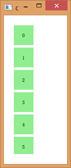
| 1 2 3 4 5 6 7 8 9 10 11 12 13 14 15 16 17 18 19 20 21 22 23 24 25 26 27 28 29 | import QtQuick 2.2 Rectangle { width: 80 height: 300 color: "white" ListView { anchors.fill: parent anchors.margins: 20 clip: true model: 100 delegate: numberDelegate spacing: 5 } Component { id: numberDelegate Rectangle { width: 40 height: 40 color: "lightGreen" Text { anchors.centerIn: parent font.pixelSize: 10 text: index } } } } |
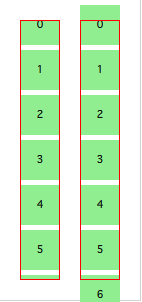
如果数据模型包含的数据不能在一屏显示完全,
ListView只会显示整个列表的一部分。但是,作为 QtQuick 的一种默认行为,
ListView并不能限制显示范围就在代理显示的区域内。这意味着,代理可能会在
ListView的外部显示出来。为避免这一点,我们需要设置
clip属性为
true,使得超出
ListView边界的代理能够被裁减掉。注意下图所示的行为(左面是设置了
clip的
ListView而右图则没有):
对于用户而言,
ListView是一个可滚动的区域。
ListView支持平滑滚动,这意味着它能够快速流畅地进行滚动。默认情况下,这种滚动具有在向下到达底部时会有一个反弹的特效。这一行为由
boundsBehavior属性控制。
boundsBehavior属性有三个可选值:
Flickable.StopAtBounds完全消除反弹效果;
Flickable.DragOverBounds在自由滑动时没有反弹效果,但是允许用户拖动越界;
Flickable.DragAndOvershootBounds则是默认值,意味着不仅用户可以拖动越界,还可以通过自由滑动越界。
当列表滑动结束时,列表可能停在任意位置:一个代理可能只显示一部分,另外部分被裁减掉。这一行为是由
snapMode属性控制的。
snapMode属性的默认值是
ListView.NoSnap,也就是可以停在任意位置;
ListView.SnapToItem会在某一代理的顶部停止滑动;
ListView.SnapOneItem则规定每次滑动时不得超过一个代理,也就是每次只滑动一个代理,这种行为在分页滚动时尤其有效。
默认情况下,列表视图是纵向的。通过
orientation属性可以将其改为横向。属性可接受值为
ListView.Vertical或
ListView.Horizontal。例如下面的代码:
| 1 2 3 4 5 6 7 8 9 10 11 12 13 14 15 16 17 18 19 20 21 22 23 24 25 26 27 28 29 30 31 32 | import QtQuick 2.2 Rectangle { width: 480 height: 80 color: "white" ListView { anchors.fill: parent anchors.margins: 20 clip: true model: 100 orientation: ListView.Horizontal delegate: numberDelegate spacing: 5 } Component { id: numberDelegate Rectangle { width: 40 height: 40 color: "lightGreen" Text { anchors.centerIn: parent font.pixelSize: 10 text: index } } } } |
layoutDirection属性可以修改这一设置。该属性的可选值为
Qt.LeftToRight或
Qt.RightToLeft。
在触摸屏环境下使用
ListView,默认的设置已经足够。但是,如果在带有键盘的环境下,使用方向键一般应该突出显示当前项。这一特性在 QML 中称为“高亮”。与普通的代理类似,视图也支持使用一个专门用于高亮的代理。这可以认为是一个额外的代理,只会被实例化一次,并且只会移动到当前项目的位置。
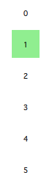
下面的例子设置了两个属性。第一,
focus属性应当被设置为
true,这允许
ListView接收键盘焦点。第二,
highlight属性被设置为一个被使用的高亮代理。这个高亮代理可以使用当前项目的
x、
y和
height属性;另外,如果没有指定
width属性,也可以使用当前项目的
width属性。在这个例子中,宽度是由
ListView.view.width附加属性提供的。我们会在后面的内容详细介绍这个附加属性。
| 1 2 3 4 5 6 7 8 9 10 11 12 13 14 15 16 17 18 19 20 21 22 23 24 25 26 27 28 29 30 31 32 33 34 35 36 37 38 39 | import QtQuick 2.2 Rectangle { width: 240 height: 300 color: "white" ListView { anchors.fill: parent anchors.margins: 20 clip: true model: 100 delegate: numberDelegate spacing: 5 highlight: highlightComponent focus: true } Component { id: highlightComponent Rectangle { width: ListView.view.width color: "lightGreen" } } Component { id: numberDelegate Item { width: 40 height: 40 Text { anchors.centerIn: parent font.pixelSize: 10 text: index } } } } |
在使用高亮时,QML 提供了很多属性,用于控制高亮的行为。例如,
highlightRangeMode设置高亮如何在视图进行显示。默认值
ListView.NoHighlightRange意味着高亮区域和项目的可视范围没有关联;
ListView.StrictlyEnforceRange则使高亮始终可见,如果用户试图将高亮区域从视图的可视区域移开,当前项目也会随之改变,以便保证高亮区域始终可见;介于二者之间的是
ListView.ApplyRange,它会保持高亮区域可视,但是并不强制,也就是说,如果必要的话,高亮区域也会被移出视图的可视区。
默认情况下,高亮的移动是由视图负责的。这个移动速度和大小的改变都是可控的,相关属性有
highlightMoveSpeed,
highlightMoveDuration,
highlightResizeSpeed以及
highlightResizeDuration。其中,速度默认为每秒 400 像素;持续时间被设置为 -1,意味着持续时间由速度和距离控制。同时设置速度和持续时间则由系统选择二者中较快的那个值。有关高亮更详细的设置则可以通过将
highlightFollowCurrentItem属性设置为
false达到。这表示视图将不再负责高亮的移动,完全交给开发者处理。下面的例子中,高亮代理的
y属性被绑定到
ListView.view.currentItem.y附加属性。这保证了高亮能够跟随当前项目。但是,我们不希望视图移动高亮,而是由自己完全控制,因此在
y属性上面应用了一个
Behavior。下面的代码将这个移动的过程分成三步:淡出、移动、淡入。注意,
SequentialAnimation和
PropertyAnimation可以结合
NumberAnimation实现更复杂的移动。有关动画部分,将在后面的章节详细介绍,这里只是先演示这一效果。
| 1 2 3 4 5 6 7 8 9 10 11 12 13 14 15 16 17 18 19 20 21 22 | Component { id: highlightComponent Item { width: ListView.view.width height: ListView.view.currentItem.height y: ListView.view.currentItem.y Behavior on y { SequentialAnimation { PropertyAnimation { target: highlightRectangle; property: "opacity"; to: 0; duration: 200 } NumberAnimation { duration: 1 } PropertyAnimation { target: highlightRectangle; property: "opacity"; to: 1; duration: 200 } } } Rectangle { id: highlightRectangle anchors.fill: parent color: "lightGreen" } } } |
ListView的 header 和 footer。header 和 footer 可以认为是两个特殊的代理。虽然取名为 header 和 footer,但是这两个部分实际会添加在第一个元素之前和最后一个元素之后。也就是说,对于一个从左到右的横向列表,header 会出现在最左侧而不是上方。下面的例子演示了 header 和 footer 的位置。header 和 footer 通常用于显示额外的元素,例如在最底部显示“加载更多”的按钮。
| 1 2 3 4 5 6 7 8 9 10 11 12 13 14 15 16 17 18 19 20 21 22 23 24 25 26 27 28 29 30 31 32 33 34 35 36 37 38 39 40 41 42 43 44 45 46 47 48 49 50 | import QtQuick 2.2 Rectangle { width: 80 height: 300 color: "white" ListView { anchors.fill: parent anchors.margins: 20 clip: true model: 4 delegate: numberDelegate spacing: 5 header: headerComponent footer: footerComponent } Component { id: headerComponent Rectangle { width: 40 height: 20 color: "yellow" } } Component { id: footerComponent Rectangle { width: 40 height: 20 color: "red" } } Component { id: numberDelegate Rectangle { width: 40 height: 40 color: "lightGreen" Text { anchors.centerIn: parent font.pixelSize: 10 text: index } } } } |
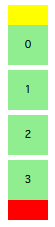
需要注意的是,header 和 footer 与
ListView之间没有预留间距。这意味着,header 和 footer 将紧贴着列表的第一个和最后一个元素。如果需要在二者之间留有一定的间距,则这个间距应该成为 header 和 footer 的一部分。
GridView与
ListView非常相似,唯一的区别在于,
ListView用于显示一维列表,
GridView则用于显示二维表格。相比列表,表格的元素并不依赖于代理的大小和代理之间的间隔,而是由
cellWidth和
cellHeight属性控制一个单元格。每一个代理都会被放置在这个单元格的左上角。
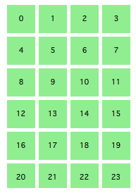
| 1 2 3 4 5 6 7 8 9 10 11 12 13 14 15 16 17 18 19 20 21 22 23 24 25 26 27 28 29 30 31 | import QtQuick 2.2 Rectangle { width: 240 height: 300 color: "white" GridView { anchors.fill: parent anchors.margins: 20 clip: true model: 100 cellWidth: 45 cellHeight: 45 delegate: numberDelegate } Component { id: numberDelegate Rectangle { width: 40 height: 40 color: "lightGreen" Text { anchors.centerIn: parent font.pixelSize: 10 text: index } } } } |
与
ListView类似,
GridView也可以设置 header 和 footer,也能够使用高亮代理和类似列表的边界行为。
GridView支持不同的显示方向,这需要使用
flow属性控制,可选值为
GridView.LeftToRight和
GridView.TopToBottom。前者按照先从左向右、再从上到下的顺序填充,滚动条出现在竖直方向;后者按照先从上到下、在从左到右的顺序填充,滚动条出现在水平方向。

相关文章推荐
- Qt Creator设置窗口布局
- Qt 学习之路 :Repeater
- Qt 学习之路:输入元素
- Qt入门学习——Qt 5 帮助文档的使用
- Qt 学习之路:元素布局
- Qt自带的软件安装包制作工具
- Qt 学习之路 2(80):定位器
- Qt 学习之路 2(79):QML 组件
- Qt 学习之路:QML 组件
- Qt 学习之路:QML 基本元素
- qt 学习之路 :QML 语法
- 转载:QTableView中嵌入可视化组件
- Qt 事件过滤器问题
- QT自动打包依赖dll
- Qt中字符编码问题-1
- Qt 学习之路:线程总结
- Qt 在VS下设置exe图标
- QT4.8.4+DirectFB1.4.3
- Qt 学习之路 :Qt 线程相关类
- Qt 学习之路:线程和事件循环