WPF 多项选择下拉菜单
2015-08-20 16:32
369 查看
背景
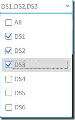
项目中有一个多项选择筛选的功能, 由于筛选条件太多, 用户又习惯在平板上进行操作, 所以要求我们把checkbox 放到一个combobox里面, 然后checkbox的选项要在combobox里面显示出来, 再加一个全选功能. 喏, 就是这种效果.

实现
首先, 实现思路是: 1. 自定义一个用户控件 2.添加一个combobox 3.重载combobox的item模板 4. 给模板中的checkbox添加点击事件.思路确定了,就开始实现功能.
第一步 编辑xaml文件
<Grid>
<ComboBox x:Name="CheckableCombo">
<ComboBox.ItemTemplate>
<HierarchicalDataTemplate>
<CheckBox Content="{Binding Title}"
IsChecked="{Binding IsSelected, Mode=TwoWay}"
Tag="{RelativeSource FindAncestor, AncestorType={x:Type ComboBox}}"
Click="Checkbox_OnClick"></CheckBox>
</HierarchicalDataTemplate>
</ComboBox.ItemTemplate>
<ComboBox.Template>
<ControlTemplate TargetType="ComboBox">
<Grid>
<ToggleButton Name="ToggleButton"
Style="{StaticResource ComboBoxToggleButton}"
Focusable="False"
IsChecked="{Binding Path=IsDropDownOpen, Mode=TwoWay, RelativeSource={RelativeSource TemplatedParent}}">
</ToggleButton>
<ContentPresenter x:Name="Presenter"
IsHitTestVisible="False"
Margin="3, 3, 23, 3"
VerticalAlignment="Center"
HorizontalAlignment="Left">
<ContentPresenter.Content>
<TextBlock TextTrimming="CharacterEllipsis"
Text="{Binding Path=Text, Mode=TwoWay, RelativeSource={RelativeSource Mode=FindAncestor, AncestorType=UserControl}}">
</TextBlock>
</ContentPresenter.Content>
</ContentPresenter>
<TextBox x:Name="EditableTextBox"
Style="{x:Null}"
Template="{StaticResource ComboBoxTextBox}"
HorizontalAlignment="Left"
VerticalAlignment="Center"
Margin="3,3,23,3"
Focusable="True"
Background="Transparent"
Visibility="Hidden"
IsReadOnly="{TemplateBinding IsReadOnly}"/>
<Popup
Name="Popup"
Placement="Bottom"
IsOpen="{TemplateBinding IsDropDownOpen}"
AllowsTransparency="True"
Focusable="False"
PopupAnimation="Slide">
<Grid
Name="DropDown"
SnapsToDevicePixels="True"
MinWidth="{TemplateBinding ActualWidth}"
MaxHeight="{TemplateBinding MaxDropDownHeight}">
<Border
x:Name="DropDownBorder"
Background="{StaticResource WindowBackgroundBrush}"
BorderThickness="1"/>
<ScrollViewer Margin="4,6,4,6" SnapsToDevicePixels="True" DataContext="{Binding}">
<StackPanel IsItemsHost="True" KeyboardNavigation.DirectionalNavigation="Contained" />
</ScrollViewer>
</Grid>
</Popup>
</Grid>
<ControlTemplate.Triggers>
<Trigger Property="HasItems" Value="false">
<Setter TargetName="DropDownBorder" Property="MinHeight" Value="95"/>
</Trigger>
<Trigger Property="IsEnabled" Value="false">
<Setter Property="Foreground" Value="{StaticResource DisabledForegroundBrush}"/>
</Trigger>
<Trigger Property="IsGrouping" Value="true">
<Setter Property="ScrollViewer.CanContentScroll" Value="false"/>
</Trigger>
<Trigger SourceName="Popup" Property="Popup.AllowsTransparency" Value="true">
<Setter TargetName="DropDownBorder" Property="CornerRadius" Value="4"/>
<Setter TargetName="DropDownBorder" Property="Margin" Value="0,2,0,0"/>
</Trigger>
<Trigger Property="IsEditable"
Value="true">
<Setter Property="IsTabStop" Value="false"/>
<Setter TargetName="EditableTextBox" Property="Visibility"    Value="Visible"/>
<Setter TargetName="Presenter" Property="Visibility" Value="Hidden"/>
</Trigger>
</ControlTemplate.Triggers>
</ControlTemplate>
</ComboBox.Template>
</ComboBox>
</Grid>
这里的重点在于ItemTemplate里的 checkbox 和 ComboBox.Template 里的 ContentPresenter.Content –> TextBlock 这么长的代码其实主要是重写这两个地方, 改变控件原有的功能. 其中checkbox 的content 绑定的Title和IsSelected 是从绑定的数据源里面提取. 通常itemsource绑定的都是IEnumerable类型, 所以要求你的数据源一定是一个很多具有这两个属性的实例的聚合.
第二步 写数据模型
public class MultipleCheckboxModel : ModelBase<MultipleCheckboxModel>
{
public Guid Id { get; set; }

public string Title { get; set; }

private bool _isSelected;

public bool IsSelected
{
get { return _isSelected; }
set
{
_isSelected = value;
NotifyPropertyChanged(x => x.IsSelected);
}
}
}
这里面的ModelBase 继承了INotifyPropertyChanged 用来实现数据联动. NotifyErrorsChanged 也是ModelBase里封装的方法. 因为这个不是本文章的重点, 就不贴出来了, 大家可以直接继承 INotifyPropertyChanged 来实现联动.
第三步 写依赖属性
#region Dependency Properties

public IEnumerable<MultipleCheckboxModel> ItemsSource
{
get { return (IEnumerable<MultipleCheckboxModel>)GetValue(ItemsSourceProperty); }
set
{
SetValue(ItemsSourceProperty, value);
SetText();
}
}

public static readonly DependencyProperty ItemsSourceProperty =
DependencyProperty.Register("ItemsSource", typeof(object), typeof(MultipleCheckbox), new FrameworkPropertyMetadata(null, ItemsSourcePropertyChangedCallback));

private static void ItemsSourcePropertyChangedCallback(DependencyObject dependencyObject, DependencyPropertyChangedEventArgs e)
{
var multioleCheckbox = dependencyObject as MultipleCheckbox;
if (multioleCheckbox == null) return;
multioleCheckbox.CheckableCombo.ItemsSource = multioleCheckbox.ItemsSource;
}

public string Text
{
get { return (string)GetValue(TextProperty); }
set { SetValue(TextProperty, value); }
}

public static readonly DependencyProperty TextProperty =
DependencyProperty.Register("Text", typeof(string), typeof(MultipleCheckbox), new FrameworkPropertyMetadata("", TextPropertyChangedCallback));

private static void TextPropertyChangedCallback(DependencyObject dependencyObject, DependencyPropertyChangedEventArgs dependencyPropertyChangedEventArgs)
{
var multioleCheckbox = dependencyObject as MultipleCheckbox;
if (multioleCheckbox == null) return;
}

public string DefaultText
{
get { return (string)GetValue(DefaultTextProperty); }
set { SetValue(DefaultTextProperty, value); }
}

public static readonly DependencyProperty DefaultTextProperty =
DependencyProperty.Register("DefaultText", typeof(string), typeof(MultipleCheckbox), new UIPropertyMetadata(string.Empty));

#endregion
依赖属性主要就这三个 使用时可以直接在view端进行binding没什么好说的
第四步 checkbox的点击事件
#region Event

private void Checkbox_OnClick(object sender, RoutedEventArgs e)
{
var checkbox = sender as CheckBox;
if (checkbox == null) return;
if ((string) checkbox.Content == "All")
{
Text = "";
if (checkbox.IsChecked != null && checkbox.IsChecked.Value)
{
ItemsSource.ForEach(x =>
{
x.IsSelected = true;
Text = "All";
});
}
else
{
ItemsSource.ForEach(x =>
{
x.IsSelected = false;
Text = "None";
});
}
}
else
{
SetText();
}

}

#endregion
这里的All 就是实现全选功能的, 感觉实现方式有些low, (。>ㅅ<。) 主要是时间有点急, 稍后慢慢优化.
然后是前面用到的私有方法
#region Private Method

private void SetText()
{
Text = "";
var all = ItemsSource.FirstOrDefault(x => x.Title == "All");
foreach (var item in ItemsSource)
{

if (item.IsSelected && item.Title != "All")
{
Text += item.Title + ",";
}
else if(all != null)
{
if (all.IsSelected)
all.IsSelected = false;
}
}

Text = string.IsNullOrEmpty(Text) ? DefaultText : Text.TrimEnd(new[] { ',' });
}

#endregion
至此控件功能完成了
第五步就是使用
<user:MultipleCheckbox DefaultText="Choose" ItemsSource="{Binding OtBeds}" />private ObservableCollection<MultipleCheckboxModel> _otBeds;
public ObservableCollection<MultipleCheckboxModel> OtBeds
{
get { return _otBeds ?? (_otBeds = new ObservableCollection<MultipleCheckboxModel>()); }
}
// 初始化OtBeds的时候 不要忘了加一个
OtBeds.Add(new MultipleCheckboxModel {Id = Guid.Empty, Title = "All", IsSelected = true}); //惨不忍睹 这个应该写在 控件里面附录 前面xaml用到的样式
<UserControl.Resources>
<LinearGradientBrush x:Key="NormalBrush" StartPoint="0,0" EndPoint="0,1">
<GradientBrush.GradientStops>
<GradientStopCollection>
<GradientStop Color="#FFF" Offset="0.0"/>
<GradientStop Color="#CCC" Offset="1.0"/>
</GradientStopCollection>
</GradientBrush.GradientStops>
</LinearGradientBrush>

<LinearGradientBrush x:Key="NormalBorderBrush" StartPoint="0,0" EndPoint="0,1">
<GradientBrush.GradientStops>
<GradientStopCollection>
<GradientStop Color="#CCC" Offset="0.0"/>
<GradientStop Color="#444" Offset="1.0"/>
</GradientStopCollection>
</GradientBrush.GradientStops>
</LinearGradientBrush>

<SolidColorBrush x:Key="GlyphBrush" Color="#444" />

<LinearGradientBrush x:Key="DarkBrush" StartPoint="0,0" EndPoint="0,1">
<GradientBrush.GradientStops>
<GradientStopCollection>
<GradientStop Color="#FFF" Offset="0.0"/>
<GradientStop Color="#AAA" Offset="1.0"/>
</GradientStopCollection>
</GradientBrush.GradientStops>
</LinearGradientBrush>

<LinearGradientBrush x:Key="PressedBrush" StartPoint="0,0" EndPoint="0,1">
<GradientBrush.GradientStops>
<GradientStopCollection>
<GradientStop Color="#BBB" Offset="0.0"/>
<GradientStop Color="#EEE" Offset="0.1"/>
<GradientStop Color="#EEE" Offset="0.9"/>
<GradientStop Color="#FFF" Offset="1.0"/>
</GradientStopCollection>
</GradientBrush.GradientStops>
</LinearGradientBrush>

<SolidColorBrush x:Key="DisabledForegroundBrush" Color="#888" />

<SolidColorBrush x:Key="DisabledBackgroundBrush" Color="#EEE" />

<SolidColorBrush x:Key="WindowBackgroundBrush" Color="#FFF" />

<SolidColorBrush x:Key="SelectedBackgroundBrush" Color="#DDD" />

<SolidColorBrush x:Key="ComboBox.Static.Border" Color="#FFACACAC"/>

<SolidColorBrush x:Key="ComboBox.Static.Editable.Background" Color="#FFFFFFFF"/>

<SolidColorBrush x:Key="ComboBox.Static.Editable.Border" Color="#FFABADB3"/>

<SolidColorBrush x:Key="ComboBox.Static.Editable.Button.Background" Color="Transparent"/>

<SolidColorBrush x:Key="ComboBox.Static.Editable.Button.Border" Color="Transparent"/>

<SolidColorBrush x:Key="ComboBox.MouseOver.Glyph" Color="#FF000000"/>

<LinearGradientBrush x:Key="ComboBox.MouseOver.Background" EndPoint="0,1" StartPoint="0,0">
<GradientStop Color="#FFECF4FC" Offset="0.0"/>
<GradientStop Color="#FFDCECFC" Offset="1.0"/>
</LinearGradientBrush>

<SolidColorBrush x:Key="ComboBox.MouseOver.Border" Color="#FF7EB4EA"/>

<SolidColorBrush x:Key="ComboBox.MouseOver.Editable.Background" Color="#FFFFFFFF"/>

<SolidColorBrush x:Key="ComboBox.MouseOver.Editable.Border" Color="#FF7EB4EA"/>

<LinearGradientBrush x:Key="ComboBox.MouseOver.Editable.Button.Background" EndPoint="0,1" StartPoint="0,0">
<GradientStop Color="#FFEBF4FC" Offset="0.0"/>
<GradientStop Color="#FFDCECFC" Offset="1.0"/>
</LinearGradientBrush>

<SolidColorBrush x:Key="ComboBox.MouseOver.Editable.Button.Border" Color="#FF7EB4EA"/>

<SolidColorBrush x:Key="ComboBox.Pressed.Glyph" Color="#FF000000"/>

<LinearGradientBrush x:Key="ComboBox.Pressed.Background" EndPoint="0,1" StartPoint="0,0">
<GradientStop Color="#FFDAECFC" Offset="0.0"/>
<GradientStop Color="#FFC4E0FC" Offset="1.0"/>
</LinearGradientBrush>

<SolidColorBrush x:Key="ComboBox.Pressed.Border" Color="#FF569DE5"/>

<SolidColorBrush x:Key="ComboBox.Pressed.Editable.Background" Color="#FFFFFFFF"/>

<SolidColorBrush x:Key="ComboBox.Pressed.Editable.Border" Color="#FF569DE5"/>

<LinearGradientBrush x:Key="ComboBox.Pressed.Editable.Button.Background" EndPoint="0,1" StartPoint="0,0">
<GradientStop Color="#FFDAEBFC" Offset="0.0"/>
<GradientStop Color="#FFC4E0FC" Offset="1.0"/>
</LinearGradientBrush>

<SolidColorBrush x:Key="ComboBox.Pressed.Editable.Button.Border" Color="#FF569DE5"/>

<SolidColorBrush x:Key="ComboBox.Disabled.Glyph" Color="#FFBFBFBF"/>

<SolidColorBrush x:Key="ComboBox.Disabled.Background" Color="#FFF0F0F0"/>

<SolidColorBrush x:Key="ComboBox.Disabled.Border" Color="#FFD9D9D9"/>

<SolidColorBrush x:Key="ComboBox.Disabled.Editable.Background" Color="#FFFFFFFF"/>

<SolidColorBrush x:Key="ComboBox.Disabled.Editable.Border" Color="#FFBFBFBF"/>

<SolidColorBrush x:Key="ComboBox.Disabled.Editable.Button.Background" Color="Transparent"/>

<SolidColorBrush x:Key="ComboBox.Disabled.Editable.Button.Border" Color="Transparent"/>

<SolidColorBrush x:Key="ComboBox.Static.Glyph" Color="#FF3C77DD"/>

<ControlTemplate x:Key="ComboBoxTextBox" TargetType="TextBox">
<Border x:Name="PART_ContentHost" Focusable="False" Background="{TemplateBinding Background}" />
</ControlTemplate>
<Style x:Key="ComboBoxToggleButton" TargetType="ToggleButton">
<Setter Property="OverridesDefaultStyle" Value="true"/>
<Setter Property="IsTabStop" Value="false"/>
<Setter Property="Focusable" Value="false"/>
<Setter Property="ClickMode" Value="Press"/>
<Setter Property="Template">
<Setter.Value>
<ControlTemplate TargetType="{x:Type ToggleButton}">
<Border x:Name="templateRoot" CornerRadius="5" BorderBrush="{StaticResource ComboBox.Static.Border}" BorderThickness="{TemplateBinding BorderThickness}" SnapsToDevicePixels="true" Background="White">
<Border x:Name="splitBorder"  BorderBrush="Transparent" BorderThickness="1" HorizontalAlignment="Right" Margin="0,0,2,0" SnapsToDevicePixels="true" Width="{DynamicResource {x:Static SystemParameters.VerticalScrollBarWidthKey}}">
<Path x:Name="arrow"  Data="F1 M 0,0 L 3.667,2.66665 L 7.3334,0 L 7.3334,-1.78168 L 3.6667,0.88501 L0,-1.78168 L0,0 Z" Fill="{StaticResource ComboBox.Static.Glyph}" HorizontalAlignment="Center"  VerticalAlignment="Center"/>
</Border>
</Border>
<ControlTemplate.Triggers>
<MultiDataTrigger>
<MultiDataTrigger.Conditions>
<Condition Binding="{Binding IsEditable, RelativeSource={RelativeSource AncestorType={x:Type ComboBox}}}" Value="true"/>
<Condition Binding="{Binding IsMouseOver, RelativeSource={RelativeSource Self}}" Value="false"/>
<Condition Binding="{Binding IsPressed, RelativeSource={RelativeSource Self}}" Value="false"/>
<Condition Binding="{Binding IsEnabled, RelativeSource={RelativeSource Self}}" Value="true"/>
</MultiDataTrigger.Conditions>
<Setter Property="Background" TargetName="templateRoot" Value="{StaticResource ComboBox.Static.Editable.Background}"/>
<Setter Property="BorderBrush" TargetName="templateRoot" Value="{StaticResource ComboBox.Static.Editable.Border}"/>
<Setter Property="Background" TargetName="splitBorder" Value="{StaticResource ComboBox.Static.Editable.Button.Background}"/>
<Setter Property="BorderBrush" TargetName="splitBorder" Value="{StaticResource ComboBox.Static.Editable.Button.Border}"/>
</MultiDataTrigger>
<Trigger Property="IsMouseOver" Value="true">
<Setter Property="Fill" TargetName="arrow" Value="{StaticResource ComboBox.MouseOver.Glyph}"/>
</Trigger>
<MultiDataTrigger>
<MultiDataTrigger.Conditions>
<Condition Binding="{Binding IsMouseOver, RelativeSource={RelativeSource Self}}" Value="true"/>
<Condition Binding="{Binding IsEditable, RelativeSource={RelativeSource AncestorType={x:Type ComboBox}}}" Value="false"/>
</MultiDataTrigger.Conditions>
<Setter Property="Background" TargetName="templateRoot" Value="{StaticResource ComboBox.MouseOver.Background}"/>
<Setter Property="BorderBrush" TargetName="templateRoot" Value="{StaticResource ComboBox.MouseOver.Border}"/>
</MultiDataTrigger>
<MultiDataTrigger>
<MultiDataTrigger.Conditions>
<Condition Binding="{Binding IsMouseOver, RelativeSource={RelativeSource Self}}" Value="true"/>
<Condition Binding="{Binding IsEditable, RelativeSource={RelativeSource AncestorType={x:Type ComboBox}}}" Value="true"/>
</MultiDataTrigger.Conditions>
<Setter Property="Background" TargetName="templateRoot" Value="{StaticResource ComboBox.MouseOver.Editable.Background}"/>
<Setter Property="BorderBrush" TargetName="templateRoot" Value="{StaticResource ComboBox.MouseOver.Editable.Border}"/>
<Setter Property="Background" TargetName="splitBorder" Value="{StaticResource ComboBox.MouseOver.Editable.Button.Background}"/>
<Setter Property="BorderBrush" TargetName="splitBorder" Value="{StaticResource ComboBox.MouseOver.Editable.Button.Border}"/>
</MultiDataTrigger>
<Trigger Property="IsPressed" Value="true">
<Setter Property="Fill" TargetName="arrow" Value="{StaticResource ComboBox.Pressed.Glyph}"/>
</Trigger>
<MultiDataTrigger>
<MultiDataTrigger.Conditions>
<Condition Binding="{Binding IsPressed, RelativeSource={RelativeSource Self}}" Value="true"/>
<Condition Binding="{Binding IsEditable, RelativeSource={RelativeSource AncestorType={x:Type ComboBox}}}" Value="false"/>
</MultiDataTrigger.Conditions>
<Setter Property="Background" TargetName="templateRoot" Value="{StaticResource ComboBox.Pressed.Background}"/>
<Setter Property="BorderBrush" TargetName="templateRoot" Value="{StaticResource ComboBox.Pressed.Border}"/>
</MultiDataTrigger>
<MultiDataTrigger>
<MultiDataTrigger.Conditions>
<Condition Binding="{Binding IsPressed, RelativeSource={RelativeSource Self}}" Value="true"/>
<Condition Binding="{Binding IsEditable, RelativeSource={RelativeSource AncestorType={x:Type ComboBox}}}" Value="true"/>
</MultiDataTrigger.Conditions>
<Setter Property="Background" TargetName="templateRoot" Value="{StaticResource ComboBox.Pressed.Editable.Background}"/>
<Setter Property="BorderBrush" TargetName="templateRoot" Value="{StaticResource ComboBox.Pressed.Editable.Border}"/>
<Setter Property="Background" TargetName="splitBorder" Value="{StaticResource ComboBox.Pressed.Editable.Button.Background}"/>
<Setter Property="BorderBrush" TargetName="splitBorder" Value="{StaticResource ComboBox.Pressed.Editable.Button.Border}"/>
</MultiDataTrigger>
<Trigger Property="IsEnabled" Value="false">
<Setter Property="Fill" TargetName="arrow" Value="{StaticResource ComboBox.Disabled.Glyph}"/>
</Trigger>
<MultiDataTrigger>
<MultiDataTrigger.Conditions>
<Condition Binding="{Binding IsEnabled, RelativeSource={RelativeSource Self}}" Value="false"/>
<Condition Binding="{Binding IsEditable, RelativeSource={RelativeSource AncestorType={x:Type ComboBox}}}" Value="false"/>
</MultiDataTrigger.Conditions>
<Setter Property="Background" TargetName="templateRoot" Value="{StaticResource ComboBox.Disabled.Background}"/>
<Setter Property="BorderBrush" TargetName="templateRoot" Value="{StaticResource ComboBox.Disabled.Border}"/>
</MultiDataTrigger>
<MultiDataTrigger>
<MultiDataTrigger.Conditions>
<Condition Binding="{Binding IsEnabled, RelativeSource={RelativeSource Self}}" Value="false"/>
<Condition Binding="{Binding IsEditable, RelativeSource={RelativeSource AncestorType={x:Type ComboBox}}}" Value="true"/>
</MultiDataTrigger.Conditions>
<Setter Property="Background" TargetName="templateRoot" Value="{StaticResource ComboBox.Disabled.Editable.Background}"/>
<Setter Property="BorderBrush" TargetName="templateRoot" Value="{StaticResource ComboBox.Disabled.Editable.Border}"/>
<Setter Property="Background" TargetName="splitBorder" Value="{StaticResource ComboBox.Disabled.Editable.Button.Background}"/>
<Setter Property="BorderBrush" TargetName="splitBorder" Value="{StaticResource ComboBox.Disabled.Editable.Button.Border}"/>
</MultiDataTrigger>
</ControlTemplate.Triggers>
</ControlTemplate>
</Setter.Value>
</Setter>
</Style>
<Style x:Key="{x:Type ComboBoxItem}" TargetType="ComboBoxItem">
<Setter Property="SnapsToDevicePixels" Value="true"/>
<Setter Property="OverridesDefaultStyle" Value="true"/>
<Setter Property="Template">
<Setter.Value>
<ControlTemplate TargetType="ComboBoxItem">
<Border
Name="Border"
Padding="2"
SnapsToDevicePixels="true">
<ContentPresenter />
</Border>
<ControlTemplate.Triggers>
<Trigger Property="IsHighlighted" Value="true">
<Setter TargetName="Border" Property="Background" Value="{StaticResource SelectedBackgroundBrush}"/>
</Trigger>
<Trigger Property="IsEnabled" Value="false">
<Setter Property="Foreground" Value="{StaticResource DisabledForegroundBrush}"/>
</Trigger>
</ControlTemplate.Triggers>
</ControlTemplate>
</Setter.Value>
</Setter>
</Style>
</UserControl.Resources>
参考: http://blogs.microsoft.co.il/justguy/2009/01/19/wpf-combobox-with-checkboxes-as-items-it-will-even-update-on-the-fly/

相关文章推荐
- 序列化二进制方法的实现
- 在类Unix系统上开始Python3编程入门
- 虚拟化--003 利用vsphere client来开启esxi的ssh功能
- 9. 斐波那契数列
- 虚拟化--002 VMware vSphere 创建虚拟机时SCSI适配器的选择
- 神经网络编程入门
- 暑假-动态规划 III-I - Function Run Fun
- DOM(一)-18-(节点操作-删除节点)
- linux调试工具
- JVM查看命令
- 二叉树的链式存储
- (14)[Xamarin.Android] 异步的网络图片下载
- ios delegate 使用注意 assign,weak
- HA之heartbeat3.0.6安装配置
- static作用整理
- 分数加减法
- 函数作用域和声明提前
- 虚拟化--001 esxi新建vm 3种数据存储磁盘格式
- Web开发之PHP框架(一)-Laravel环境搭建
- 关于cocos2dx编写的游戏由vs2013项目打包成apk文件