web设计之无懈可击
2015-08-05 11:22
525 查看
无懈可击的web设计旨在尽可能地考虑页面元素在各个情况下都能够呈现最好的效果。
1. 思路总览
2. 灵活的文字
3. 可伸缩的导航栏
4. 可扩展的行
5. 自由的框式组件
6. 图片/标题/说明文字布局
7. 页面缺失图片或CSS的情况下仍然易写
8. 数据表格内容样式分离
9. 响应式布局
1. 思路总览 核心思想:结构和样式分离 HTML与CSS 只有充分将页面核心内容和外观设计相分离而获得的灵活性,才能顺利构建出能够满足每个web用户需要的最佳设计方案。 核心要求:灵活性 适应不同的浏览器,适应各种各样的设备和软件。 结构和样式设计方案能够轻松地适应不同的文字大小和内容数量,能够随着这些变化自动扩展或缩小。 并且网站修改内容时,更新及维护代码将会更加轻松,并不会影响设计效果。 例如在准备页面的国际化版本时,使用不同语言表达的内容长度千差万别,此时保证页面设计效果不受影响十分重要。 页面重构:代码复用,模块化布局 首先观察页面布局样式,抽象归纳出公共样式,例如渐变背景,浮动,统一编写类样式,再需要的结构上添加对应的类名 具有相同或形似的布局样式,则先编写相同部分样式,再利用父类命名空间不同各自不同的样式,达到代码服用,模块化布局, 准备工作:兼容HTML5新元素 IE8及更低版本不能识别完全在HTML5中引入的新元素,为了解决这个问题,需要在HTML头部添加以下JavaScript,这是一个简单的 document.createElement声明,利用条件注释针对IE来调用这个js文件。Opera,FireFox等其他非IE浏览器就会忽视这段代码, 也不会存在http请求。 注意:需要在页面<head>标签内引用
如果觉得担心页面打开速度,可以直接将该js文件写入页面
重置样式:
为了是web设计在所有浏览器都达到统一,尽量避免不同浏览器不同的设置造成的影响。
推荐normalize重置样式表,不建议完全照搬,根据项目需要而添加。
注意:使用HTML5时,要为新元素设置display:block很重要,避免不支持新元素而造成bug
2. 灵活的文字
最佳设计:可以让用户自由控制任何页面的文字大小。
浏览器中用户都是可以自定义默认的文字大小的,如果使用 px,用户自行在浏览器设置中改变了文字大小后,网页上是不会变化的。我们不能排除视障用户(如近视)、老年用户不会这么做.
利用CSS3的rem单位,避免了em相对父元素比例的嵌套问题,为了兼容IE低版本的需要添加px单位.
既然 rem 的可用性更好,是不是在所有地方都去使用呢?
通常在标题,正文等大面积文字的位置可以使用 rem。
但是在一些特殊的设计场景,rem 可能会导致布局错位,比如这样一个回顶部的按钮:
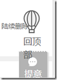
可以看到”回顶部”三个字通过放大已经改变的样式,这是不希望看到的,这了最好只用px.
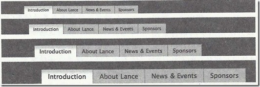
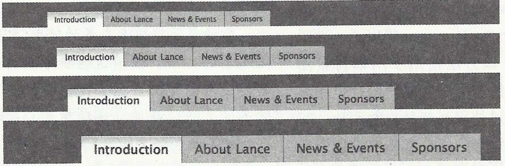
3. 可伸缩的导航栏
1. HTML5构建一个选项卡,需要<nav>标签包围一个无序列表,也可以添加role属性告诉辅助设备(如屏幕阅读器)这个元素所扮演的角色。
绝对不要基于图片的导航,对搜索引擎不友好,更新编辑也非常麻烦。
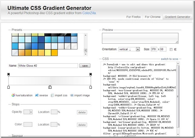
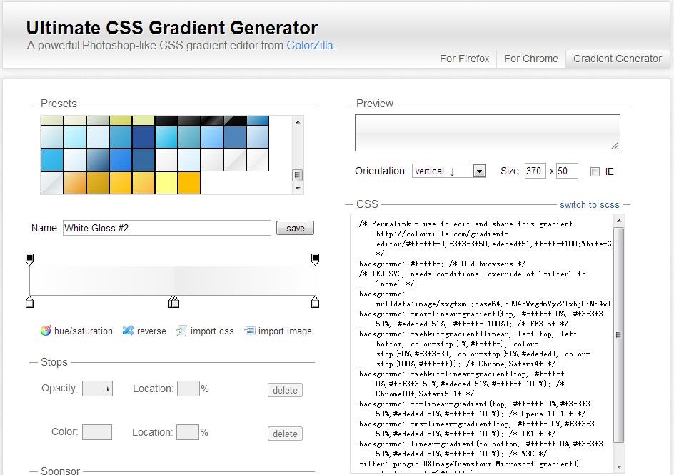
2. 如果有渐变,直接采用CSS3设置渐变,对于IE9以下版本需要采用过滤器,最好设置一个中间色纯色背景,留下很好的退路。正对IE9需要单独处理,并且利用SVG避免bug
推荐使用ColorZilla的渐变工具http://www.colorzilla.com/gradient-editor/, 可自动生成各个浏览器兼容的代码
2.1 渐变背景另一种做法是通过一条竖直的1px的背景图片进行平铺,非常重要的一点是该背景图片的高度要保证足够高,最下端设置为透明,并用css填充这部分透明区域。
这样可以保证当选项卡内容增加,高度增加时,也可以保持样式不变。(该作法也同样适用于其它背景渐变效果设置)
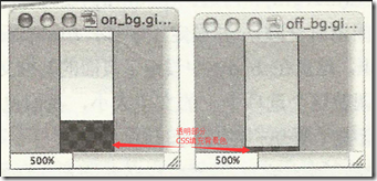
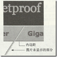
2.2 实在避免不了需要利用图片做背景图时,图片的高度也一定要保证足够高,便于内容高度变化时,设计样式任然保持不变。
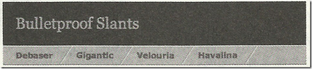
如下图所示选项卡背景利用图片制作而成,当文字大小发生改变时,也要保证背景图片高度有足够的灵活性。
3. 对于选项卡的外边距、内边距、行高等进行设置的时候可以使用rem,同字体大小设置一样,这样整体设计始终会保持比例。
这里需要设置整体ul的width和padding值,和内层a标签的padding值都为rem单位时所展示的效果。
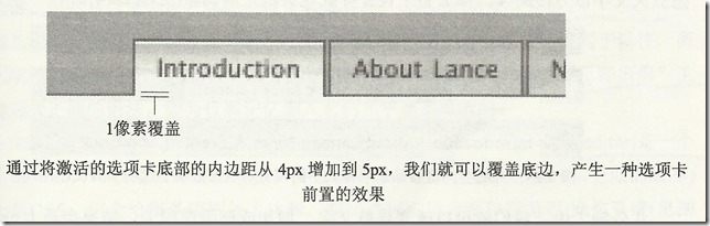
4. 选项卡切换小技巧,hover或active状态下,a标签的bottom-padding增加1px从而遮挡住ul底边,达到选项卡前置效果。
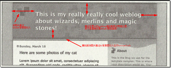
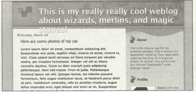
4. 可扩展的行
不要指定横向页面组件的高度,要让它们能够在纵向自由扩展。
常见的包含文章正文或大段文 字的区域,应该适应任何篇幅和大小的文字。
但是例如文章标题、登陆信息栏等也要考虑文字内容数量及高度的变化。
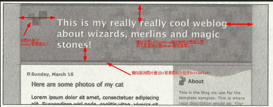
例如:下图中标题文字数量过多时固定高度就会破坏样式
如何修改:
1.HTML结构为:利用H5的header标签 role属性,标题采用h1,对搜索引擎友好
2.避免代码臃肿,不要再HTML标记中写不必要的图片代码,而是通过CSS设置背景图片来引入它们。
如有多个图片需要引入,则可以嵌套多个标签,每个标签引入不同的图片,文字内容需要放入最内层标签。
3.通过设置h1的padding值,而不是直接设定height值,避免固定宽高导致的不灵活性。
5. 自由的框式组件
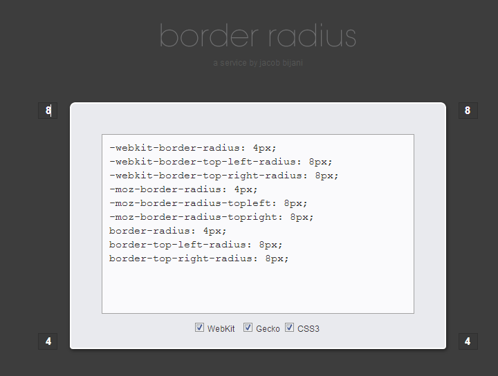
1. CSS3 border-radius 圆角矩形框
圆角矩形框组件是页面布局中常常用到的,利用CSS3的border-radius可非常方便的创建。
并且在横向纵向上面都有很好的扩展性和灵活性。
border-radius需要针对不用浏览器做兼容,-webkit-和-moz-部分语法还有些区别。
推荐http://border-radius.com/ 直接设置圆角,自动生成代码。
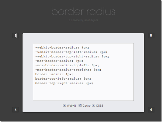
注意:IE8及以下版本不兼容border-radius,不是特别重要可以不用理会,实在要兼容则需要引入背景图片做圆角。
页面具有相同圆角的矩形框组件式,则统一设置类样式,方便管理和维护。
2. 背景引入图片制作圆角矩形框
如何通过引入图片也达到横向和纵向的扩展性。
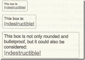
(1)需要有足够多的嵌套标签引入背景图片;
(2)背景图片要求足够的高度和宽度
(3)左上和左下角引入同一个背景图片,右上和右下角引入同一个背景图片。
结构标签为: 为别为.container .desc .link .link em 四个引入背景图片,分别位于右上,左上,左下,右下。
背景图片1,要求足够的高度,左上角和左下角引入的是同一张图片,背景图片分别位于左上角和左下角。
背景图片2,要求足够的宽度和高度,,右上角和右下角引入的同一张图片。背景图片分为位于右上角和右下角。
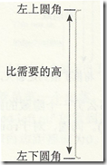
3. 灵活性的箭头
当文字大小改变时,文字周围空白和箭头的两边在比例上保持一致。
(1)HTML结构代码很简单
(2)需要一个尺寸很大的箭头背景图,设置背景图位置为上下居中50%位置,
(3)需要设置h2的width值,padding值都为rem单位
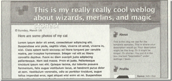
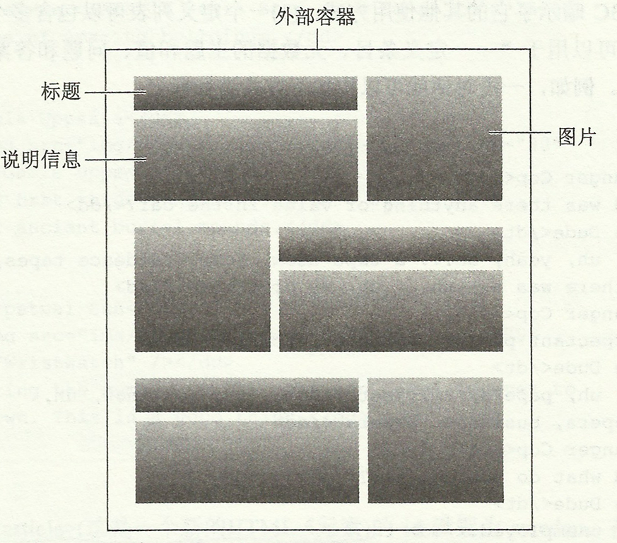
6. 图片/标题/说明文字布局
这个web中常见的单元布局,最好的布局方式就是利用float布局。
其中有个很关键的问题是需要清浮动。子集浮动是无法撑开父级的高度。
目前较完善的清浮动解决方案:在浮动的父级上添加.clear,达到清楚浮动的效果。
以上布局结构为: 可以利用dl dt dd结构
首先通过浮动布局和清浮动,做成以下布局样式,
再在需要反向浮动的dl标签上添加类名,设置反向样式。
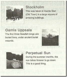
布局思想:先从整体布局相同或相似的,再通过局部命名空间不同设置私有特殊的样式。
图片也可以添加CSS3 box-shadow属性,对于不兼容的浏览器无法显示也没关系。
7. 页面缺失图片或CSS的情况下仍然易写
1. 在任何可能使用背景图片的地方应设置同样的颜色的背景色。
防止图片不能加载的情况下,页面内容同样保持较好可读性。
例如文字为白色,背景图为深色,如果不设置背景色,当背景图未成功加载,
而浏览器多数默认背景为白色,那么这是文字内容无法可读。
页面也需要设置背景色为白色,统一预防个别浏览器默认不是白色而造成意外。
2.当禁用CSS样式后,web仍然能够呈现很好地内容页面。
需要能够较好的保证页面核心内容与样式很好的分离。做到清晰易读的结构代码。
利用firebug等工具可进行实施观察,修改和调试。
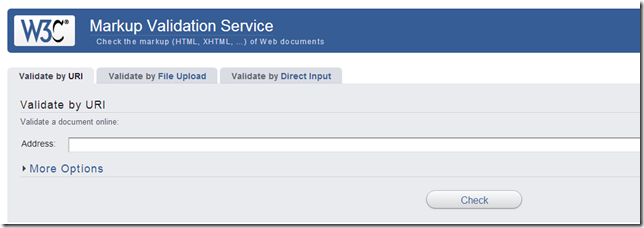
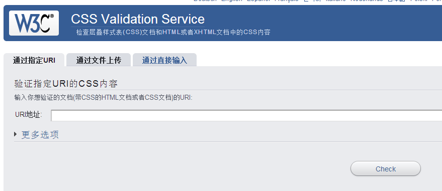
3.利用W3C的HTML代码验证器 http://validator.w3.org/
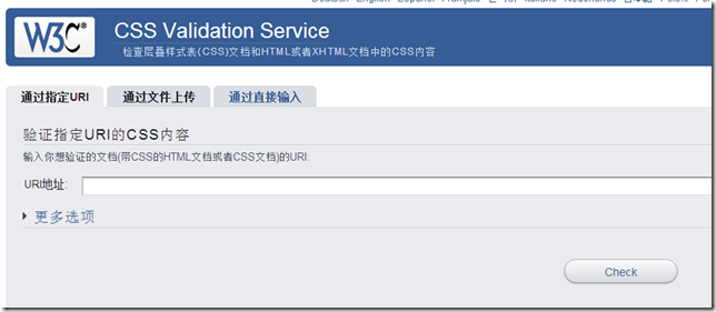
W3C的CSS代码验证器 http://jigsaw.w3.org/css-validator/
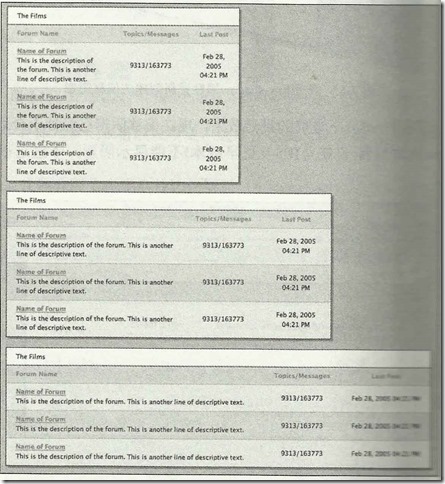
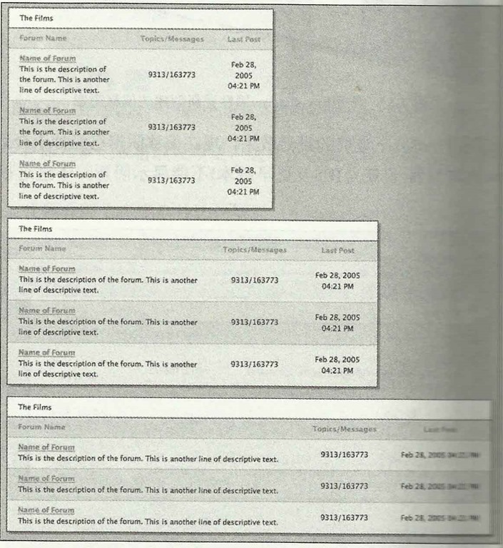
8. 数据表格内容样式分离
1.页面需要用到table的时候,样式重置CSS要设置:
2. HTML结构
2.1 使用caption正确表示标题
2.2 thead,tbofy,tfoot 三者配合一起使用,对表格数据进行分组
2.3 当表格数据过多时,最好将tfoot放置与tbody之前,这样浏览器就可以在收到所有数据前呈现页脚了。
2.4 thead中,设置属性scope=col,scope 属性定义将表头单元与数据单元相关联的方法,屏幕阅读器可以利用该属性。
3. 表格整体外边框和背景添加在table上。
4. 通过给th或td添加padding,border,color属性来修饰表格及内部文字样式。
5.通过使用CSS3的 :nth-child伪元素可以实现交替行背景色。
6.可以设置th,td的:first-child第一个实例文字居左对齐,且table的宽度为百分数,达到table可以自动伸缩来适应容器。
当然也可以通过jquery选择器来选择元素并添加样式。
效果如下:
9. 响应式布局
一个完整的页面和其中的组件该如何具备灵活性。
怎么样利用CSS来实现无论屏幕、窗口以及字体的大小如何变化,都可以自由扩展和收缩的分栏式页面。
利用响应式布局来实现:
优点:解决了设备之间的差异化展示
缺点:兼容性代码多,工作量大,加载速度受影响,对原网站布局会产生影响,用户判断未必精准
响应式布局设计原则:
移动优先:在设计的初期就要考虑的页面如何在多终端展示
渐进增强:(充分发挥硬件设备的最大功能)
实现响应式布局方法有:
CSS3-Media Query: 最简单的方法(推荐)移动设备基本都支持
借助原生JavaScript:成本高,不推荐
第三方框架:例如Boostrap
CSS3-Media Query 基本属性:
media query 查询不同的媒体设备
dvice-width, device-height 屏幕宽高
width, height 渲染窗口宽高
orientation 设备方向
resolution 设备分辨率(dpi)
以两列自适应宽度布局为例:
1. 通过浮动并且宽度设为百分数
主要区域content左浮动 (该区域内部如果有两栏则分别左右浮动)
旁边栏目sidebar右浮动
页脚footer区域注意清除两边浮动
设置宽度时设置为百分数,但是添加内边距时单位为px,会造成宽度过宽
解决方案:
在#main和#siderbar中添加box-sizing:border-box,表示width宽度包含border
IE8以下不兼容box-sizing,可以通过在#mian和#siderbar内部添加一个div,通过对div添加pading而不是对#main和#siderbar操作而达到目的。
2.可以设置max-width和min-width来限制页面范围 ,防止布局尺寸过大或过小。
对于有图片或宽度有限制的区域,可以通过max-width和min-width设置(IE6不支持)
对于页面内嵌入的图片或媒体,也可以通过设置max-width:100%来防止尺寸过大问题。
3.文字设为百分数单位,例如100%或62.5%,而对于line-height可设为倍数,例如1.3/1.4等,可保证字体有很好的灵活性。
4.媒体查询
对于多设备屏幕告知设备将布局的宽度设为与浏览器设备等宽
通过媒体查询设置不同页面宽度时的不同布局样式
1. 思路总览
2. 灵活的文字
3. 可伸缩的导航栏
4. 可扩展的行
5. 自由的框式组件
6. 图片/标题/说明文字布局
7. 页面缺失图片或CSS的情况下仍然易写
8. 数据表格内容样式分离
9. 响应式布局
1. 思路总览 核心思想:结构和样式分离 HTML与CSS 只有充分将页面核心内容和外观设计相分离而获得的灵活性,才能顺利构建出能够满足每个web用户需要的最佳设计方案。 核心要求:灵活性 适应不同的浏览器,适应各种各样的设备和软件。 结构和样式设计方案能够轻松地适应不同的文字大小和内容数量,能够随着这些变化自动扩展或缩小。 并且网站修改内容时,更新及维护代码将会更加轻松,并不会影响设计效果。 例如在准备页面的国际化版本时,使用不同语言表达的内容长度千差万别,此时保证页面设计效果不受影响十分重要。 页面重构:代码复用,模块化布局 首先观察页面布局样式,抽象归纳出公共样式,例如渐变背景,浮动,统一编写类样式,再需要的结构上添加对应的类名 具有相同或形似的布局样式,则先编写相同部分样式,再利用父类命名空间不同各自不同的样式,达到代码服用,模块化布局, 准备工作:兼容HTML5新元素 IE8及更低版本不能识别完全在HTML5中引入的新元素,为了解决这个问题,需要在HTML头部添加以下JavaScript,这是一个简单的 document.createElement声明,利用条件注释针对IE来调用这个js文件。Opera,FireFox等其他非IE浏览器就会忽视这段代码, 也不会存在http请求。 注意:需要在页面<head>标签内引用
<!--[if IE]>
<script src="http://html5shiv.googlecode.com/svn/trunk/html5.js"></script>
<![endif]-->
如果觉得担心页面打开速度,可以直接将该js文件写入页面
<!--[if IE]>
<script>
(function(){if(!/*@cc_on!@*/0)return;var e = "abbr,article,aside,audio,canvas,datalist,details,dialog,eventsource,figure,footer,header,hgroup,mark,menu,meter,nav,output,progress,section,time,video".split(','),i=e.length;while(i--){document.createElement(e[i])}})()
</script>
<![endif]-->重置样式:
为了是web设计在所有浏览器都达到统一,尽量避免不同浏览器不同的设置造成的影响。
推荐normalize重置样式表,不建议完全照搬,根据项目需要而添加。
注意:使用HTML5时,要为新元素设置display:block很重要,避免不支持新元素而造成bug
/*! normalize.css v3.0.2 | MIT License | git.io/normalize */

/**
* 1. Set default font family to sans-serif.
* 2. Prevent iOS text size adjust after orientation change, without disabling
*    user zoom.
*/

html {
font-family: sans-serif; /* 1 */
-ms-text-size-adjust: 100%; /* 2 */
-webkit-text-size-adjust: 100%; /* 2 */
}

/**
* Remove default margin.
*/

body {
margin: 0;
}

/* HTML5 display definitions
========================================================================== */

/**
* Correct `block` display not defined for any HTML5 element in IE 8/9.
* Correct `block` display not defined for `details` or `summary` in IE 10/11
* and Firefox.
* Correct `block` display not defined for `main` in IE 11.
*/

article,
aside,
details,
figcaption,
figure,
footer,
header,
hgroup,
main,
menu,
nav,
section,
summary {
display: block;
}

/**
* 1. Correct `inline-block` display not defined in IE 8/9.
* 2. Normalize vertical alignment of `progress` in Chrome, Firefox, and Opera.
*/

audio,
canvas,
progress,
video {
display: inline-block; /* 1 */
vertical-align: baseline; /* 2 */
}

/**
* Prevent modern browsers from displaying `audio` without controls.
* Remove excess height in iOS 5 devices.
*/

audio:not([controls]) {
display: none;
height: 0;
}

/**
* Address `[hidden]` styling not present in IE 8/9/10.
* Hide the `template` element in IE 8/9/11, Safari, and Firefox < 22.
*/

[hidden],
template {
display: none;
}

/* Links
========================================================================== */

/**
* Remove the gray background color from active links in IE 10.
*/

a {
background-color: transparent;
}

/**
* Improve readability when focused and also mouse hovered in all browsers.
*/

a:active,
a:hover {
outline: 0;
}

/* Text-level semantics
========================================================================== */

/**
* Address styling not present in IE 8/9/10/11, Safari, and Chrome.
*/

abbr[title] {
border-bottom: 1px dotted;
}

/**
* Address style set to `bolder` in Firefox 4+, Safari, and Chrome.
*/

b,
strong {
font-weight: bold;
}

/**
* Address styling not present in Safari and Chrome.
*/

dfn {
font-style: italic;
}

/**
* Address variable `h1` font-size and margin within `section` and `article`
* contexts in Firefox 4+, Safari, and Chrome.
*/

h1 {
font-size: 2em;
margin: 0.67em 0;
}

/**
* Address styling not present in IE 8/9.
*/

mark {
background: #ff0;
color: #000;
}

/**
* Address inconsistent and variable font size in all browsers.
*/

small {
font-size: 80%;
}

/**
* Prevent `sub` and `sup` affecting `line-height` in all browsers.
*/

sub,
sup {
font-size: 75%;
line-height: 0;
position: relative;
vertical-align: baseline;
}

sup {
top: -0.5em;
}

sub {
bottom: -0.25em;
}

/* Embedded content
========================================================================== */

/**
* Remove border when inside `a` element in IE 8/9/10.
*/

img {
border: 0;
}

/**
* Correct overflow not hidden in IE 9/10/11.
*/

svg:not(:root) {
overflow: hidden;
}

/* Grouping content
========================================================================== */

/**
* Address margin not present in IE 8/9 and Safari.
*/

figure {
margin: 1em 40px;
}

/**
* Address differences between Firefox and other browsers.
*/

hr {
-moz-box-sizing: content-box;
box-sizing: content-box;
height: 0;
}

/**
* Contain overflow in all browsers.
*/

pre {
overflow: auto;
}

/**
* Address odd `em`-unit font size rendering in all browsers.
*/

code,
kbd,
pre,
samp {
font-family: monospace, monospace;
font-size: 1em;
}

/* Forms
========================================================================== */

/**
* Known limitation: by default, Chrome and Safari on OS X allow very limited
* styling of `select`, unless a `border` property is set.
*/

/**
* 1. Correct color not being inherited.
*    Known issue: affects color of disabled elements.
* 2. Correct font properties not being inherited.
* 3. Address margins set differently in Firefox 4+, Safari, and Chrome.
*/

button,
input,
optgroup,
select,
textarea {
color: inherit; /* 1 */
font: inherit; /* 2 */
margin: 0; /* 3 */
}

/**
* Address `overflow` set to `hidden` in IE 8/9/10/11.
*/

button {
overflow: visible;
}

/**
* Address inconsistent `text-transform` inheritance for `button` and `select`.
* All other form control elements do not inherit `text-transform` values.
* Correct `button` style inheritance in Firefox, IE 8/9/10/11, and Opera.
* Correct `select` style inheritance in Firefox.
*/

button,
select {
text-transform: none;
}

/**
* 1. Avoid the WebKit bug in Android 4.0.* where (2) destroys native `audio`
*    and `video` controls.
* 2. Correct inability to style clickable `input` types in iOS.
* 3. Improve usability and consistency of cursor style between image-type
*    `input` and others.
*/

button,
html input[type="button"], /* 1 */
input[type="reset"],
input[type="submit"] {
-webkit-appearance: button; /* 2 */
cursor: pointer; /* 3 */
}

/**
* Re-set default cursor for disabled elements.
*/

button[disabled],
html input[disabled] {
cursor: default;
}

/**
* Remove inner padding and border in Firefox 4+.
*/

button::-moz-focus-inner,
input::-moz-focus-inner {
border: 0;
padding: 0;
}

/**
* Address Firefox 4+ setting `line-height` on `input` using `!important` in
* the UA stylesheet.
*/

input {
line-height: normal;
}

/**
* It's recommended that you don't attempt to style these elements.
* Firefox's implementation doesn't respect box-sizing, padding, or width.
*
* 1. Address box sizing set to `content-box` in IE 8/9/10.
* 2. Remove excess padding in IE 8/9/10.
*/

input[type="checkbox"],
input[type="radio"] {
box-sizing: border-box; /* 1 */
padding: 0; /* 2 */
}

/**
* Fix the cursor style for Chrome's increment/decrement buttons. For certain
* `font-size` values of the `input`, it causes the cursor style of the
* decrement button to change from `default` to `text`.
*/

input[type="number"]::-webkit-inner-spin-button,
input[type="number"]::-webkit-outer-spin-button {
height: auto;
}

/**
* 1. Address `appearance` set to `searchfield` in Safari and Chrome.
* 2. Address `box-sizing` set to `border-box` in Safari and Chrome
*    (include `-moz` to future-proof).
*/

input[type="search"] {
-webkit-appearance: textfield; /* 1 */
-moz-box-sizing: content-box;
-webkit-box-sizing: content-box; /* 2 */
box-sizing: content-box;
}

/**
* Remove inner padding and search cancel button in Safari and Chrome on OS X.
* Safari (but not Chrome) clips the cancel button when the search input has
* padding (and `textfield` appearance).
*/

input[type="search"]::-webkit-search-cancel-button,
input[type="search"]::-webkit-search-decoration {
-webkit-appearance: none;
}

/**
* Define consistent border, margin, and padding.
*/

fieldset {
border: 1px solid #c0c0c0;
margin: 0 2px;
padding: 0.35em 0.625em 0.75em;
}

/**
* 1. Correct `color` not being inherited in IE 8/9/10/11.
* 2. Remove padding so people aren't caught out if they zero out fieldsets.
*/

legend {
border: 0; /* 1 */
padding: 0; /* 2 */
}

/**
* Remove default vertical scrollbar in IE 8/9/10/11.
*/

textarea {
overflow: auto;
}

/**
* Don't inherit the `font-weight` (applied by a rule above).
* NOTE: the default cannot safely be changed in Chrome and Safari on OS X.
*/

optgroup {
font-weight: bold;
}

/* Tables
========================================================================== */

/**
* Remove most spacing between table cells.
*/

table {
border-collapse: collapse;
border-spacing: 0;
}

td,
th {
padding: 0;
}
2. 灵活的文字
最佳设计:可以让用户自由控制任何页面的文字大小。
浏览器中用户都是可以自定义默认的文字大小的,如果使用 px,用户自行在浏览器设置中改变了文字大小后,网页上是不会变化的。我们不能排除视障用户(如近视)、老年用户不会这么做.
利用CSS3的rem单位,避免了em相对父元素比例的嵌套问题,为了兼容IE低版本的需要添加px单位.
html {
font-size: 62.5%;/*10 ÷ 16 × 100% = 62.5%*/
}
body {
font-size:14px; /*兼容IE*/
font-size: 1.4rem;/*1.4 × 10px = 14px */
}
h1 {
font-size:24px; /*兼容IE*/
font-size: 2.4rem;/*2.4 × 10px = 24px*/
}
既然 rem 的可用性更好,是不是在所有地方都去使用呢?
通常在标题,正文等大面积文字的位置可以使用 rem。
但是在一些特殊的设计场景,rem 可能会导致布局错位,比如这样一个回顶部的按钮:
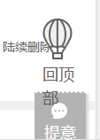
可以看到”回顶部”三个字通过放大已经改变的样式,这是不希望看到的,这了最好只用px.
3. 可伸缩的导航栏
1. HTML5构建一个选项卡,需要<nav>标签包围一个无序列表,也可以添加role属性告诉辅助设备(如屏幕阅读器)这个元素所扮演的角色。
绝对不要基于图片的导航,对搜索引擎不友好,更新编辑也非常麻烦。
<nav role="navigation">
<ul>
<li><a>...</a></li>
<li><a>...</a></li>
<li><a>...</a></li>
</ul>

</nav>
2. 如果有渐变,直接采用CSS3设置渐变,对于IE9以下版本需要采用过滤器,最好设置一个中间色纯色背景,留下很好的退路。正对IE9需要单独处理,并且利用SVG避免bug
推荐使用ColorZilla的渐变工具http://www.colorzilla.com/gradient-editor/, 可自动生成各个浏览器兼容的代码
/* Permalink - use to edit and share this gradient: http://colorzilla.com/gradient-editor/#e9f6fd+0,d3eefb+100;Blue+3D+%233 */
background: rgb(233,246,253); /* Old browsers */
/* IE9 SVG, needs conditional override of 'filter' to 'none' */
background: url(data:image/svg+xml;base64,PD94bWwgdmVyc2lvbj0iMS4wIiA/Pgo8c3ZnIHhtbG5zPSJodHRwOi8vd3d3LnczLm9yZy8yMDAwL3N2ZyIgd2lkdGg9IjEwMCUiIGhlaWdodD0iMTAwJSIgdmlld0JveD0iMCAwIDEgMSIgcHJlc2VydmVBc3BlY3RSYXRpbz0ibm9uZSI+CiAgPGxpbmVhckdyYWRpZW50IGlkPSJncmFkLXVjZ2ctZ2VuZXJhdGVkIiBncmFkaWVudFVuaXRzPSJ1c2VyU3BhY2VPblVzZSIgeDE9IjAlIiB5MT0iMCUiIHgyPSIwJSIgeTI9IjEwMCUiPgogICAgPHN0b3Agb2Zmc2V0PSIwJSIgc3RvcC1jb2xvcj0iI2U5ZjZmZCIgc3RvcC1vcGFjaXR5PSIxIi8+CiAgICA8c3RvcCBvZmZzZXQ9IjEwMCUiIHN0b3AtY29sb3I9IiNkM2VlZmIiIHN0b3Atb3BhY2l0eT0iMSIvPgogIDwvbGluZWFyR3JhZGllbnQ+CiAgPHJlY3QgeD0iMCIgeT0iMCIgd2lkdGg9IjEiIGhlaWdodD0iMSIgZmlsbD0idXJsKCNncmFkLXVjZ2ctZ2VuZXJhdGVkKSIgLz4KPC9zdmc+);
background: -moz-linear-gradient(top,  rgba(233,246,253,1) 0%, rgba(211,238,251,1) 100%); /* FF3.6+ */
background: -webkit-gradient(linear, left top, left bottom, color-stop(0%,rgba(233,246,253,1)), color-stop(100%,rgba(211,238,251,1))); /* Chrome,Safari4+ */
background: -webkit-linear-gradient(top,  rgba(233,246,253,1) 0%,rgba(211,238,251,1) 100%); /* Chrome10+,Safari5.1+ */
background: -o-linear-gradient(top,  rgba(233,246,253,1) 0%,rgba(211,238,251,1) 100%); /* Opera 11.10+ */
background: -ms-linear-gradient(top,  rgba(233,246,253,1) 0%,rgba(211,238,251,1) 100%); /* IE10+ */
background: linear-gradient(to bottom,  rgba(233,246,253,1) 0%,rgba(211,238,251,1) 100%); /* W3C */
filter: progid:DXImageTransform.Microsoft.gradient( startColorstr='#e9f6fd', endColorstr='#d3eefb',GradientType=0 ); /* IE6-8 */
Support for full multi-stop gradients with IE9 (using SVG).
Add a "gradient" class to all your elements that have a gradient, and add the following override to your HTML to complete the IE9 support:

<!--[if gte IE 9]>
<style type="text/css">
.gradient {
filter: none;
}
</style>
<![endif]-->
2.1 渐变背景另一种做法是通过一条竖直的1px的背景图片进行平铺,非常重要的一点是该背景图片的高度要保证足够高,最下端设置为透明,并用css填充这部分透明区域。
这样可以保证当选项卡内容增加,高度增加时,也可以保持样式不变。(该作法也同样适用于其它背景渐变效果设置)

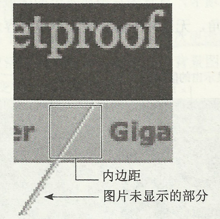
2.2 实在避免不了需要利用图片做背景图时,图片的高度也一定要保证足够高,便于内容高度变化时,设计样式任然保持不变。
如下图所示选项卡背景利用图片制作而成,当文字大小发生改变时,也要保证背景图片高度有足够的灵活性。

3. 对于选项卡的外边距、内边距、行高等进行设置的时候可以使用rem,同字体大小设置一样,这样整体设计始终会保持比例。
这里需要设置整体ul的width和padding值,和内层a标签的padding值都为rem单位时所展示的效果。
4. 选项卡切换小技巧,hover或active状态下,a标签的bottom-padding增加1px从而遮挡住ul底边,达到选项卡前置效果。

4. 可扩展的行
不要指定横向页面组件的高度,要让它们能够在纵向自由扩展。
常见的包含文章正文或大段文 字的区域,应该适应任何篇幅和大小的文字。
但是例如文章标题、登陆信息栏等也要考虑文字内容数量及高度的变化。
例如:下图中标题文字数量过多时固定高度就会破坏样式
如何修改:
1.HTML结构为:利用H5的header标签 role属性,标题采用h1,对搜索引擎友好
<header role="banner">
<h1>Sample Blog</h1>
</header>
2.避免代码臃肿,不要再HTML标记中写不必要的图片代码,而是通过CSS设置背景图片来引入它们。
如有多个图片需要引入,则可以嵌套多个标签,每个标签引入不同的图片,文字内容需要放入最内层标签。
3.通过设置h1的padding值,而不是直接设定height值,避免固定宽高导致的不灵活性。
5. 自由的框式组件
1. CSS3 border-radius 圆角矩形框
圆角矩形框组件是页面布局中常常用到的,利用CSS3的border-radius可非常方便的创建。
并且在横向纵向上面都有很好的扩展性和灵活性。
border-radius需要针对不用浏览器做兼容,-webkit-和-moz-部分语法还有些区别。
推荐http://border-radius.com/ 直接设置圆角,自动生成代码。
注意:IE8及以下版本不兼容border-radius,不是特别重要可以不用理会,实在要兼容则需要引入背景图片做圆角。
页面具有相同圆角的矩形框组件式,则统一设置类样式,方便管理和维护。
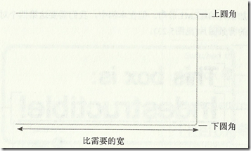
2. 背景引入图片制作圆角矩形框
如何通过引入图片也达到横向和纵向的扩展性。
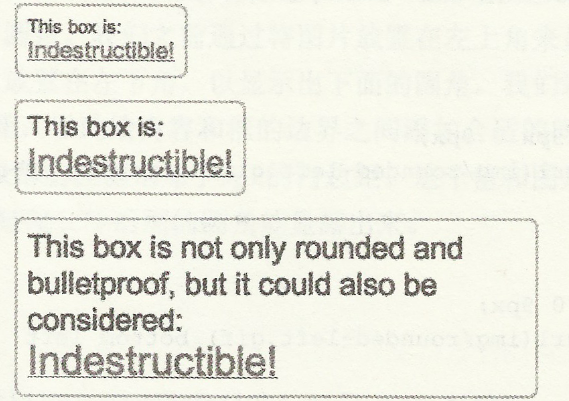
(1)需要有足够多的嵌套标签引入背景图片;
(2)背景图片要求足够的高度和宽度
(3)左上和左下角引入同一个背景图片,右上和右下角引入同一个背景图片。
结构标签为: 为别为.container .desc .link .link em 四个引入背景图片,分别位于右上,左上,左下,右下。
<div class="container">
<p class="desc">This box is:</p>
<p class="link"><em><a href="#">Indestructible!</a></em></p>
</div>
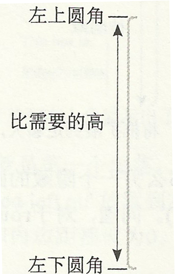
背景图片1,要求足够的高度,左上角和左下角引入的是同一张图片,背景图片分别位于左上角和左下角。
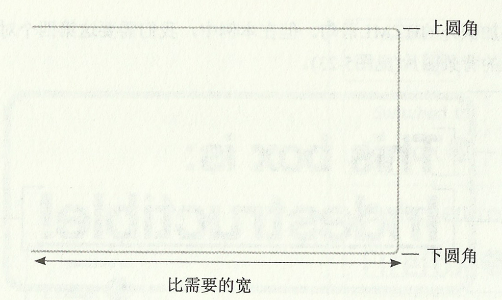
背景图片2,要求足够的宽度和高度,,右上角和右下角引入的同一张图片。背景图片分为位于右上角和右下角。
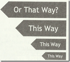
3. 灵活性的箭头
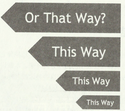
当文字大小改变时,文字周围空白和箭头的两边在比例上保持一致。
(1)HTML结构代码很简单
<h2>This way!</h2>
(2)需要一个尺寸很大的箭头背景图,设置背景图位置为上下居中50%位置,
(3)需要设置h2的width值,padding值都为rem单位
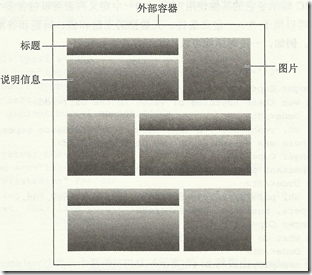
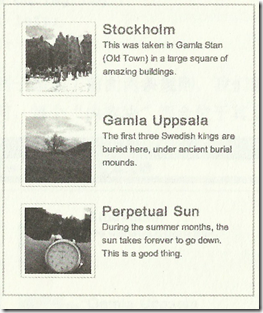
6. 图片/标题/说明文字布局
这个web中常见的单元布局,最好的布局方式就是利用float布局。
其中有个很关键的问题是需要清浮动。子集浮动是无法撑开父级的高度。
目前较完善的清浮动解决方案:在浮动的父级上添加.clear,达到清楚浮动的效果。
.clear{
*zoom:1;  /*利用CSS hack 触发IE6,7haslayout 解决bug */
}

.clear:after{
conten:'';
display:table;
clear:both;
}
以上布局结构为: 可以利用dl dt dd结构
<article id="sweden">
<dl>
<dt>...</dt>
<dd class="img"><img /></dd>
<dd>...</dd>
</dl>
<dl>
<dt>...</dt>
<dd class="img"><img /></dd>
<dd>...</dd>
</dl>
<dl>
<dt>...</dt>
<dd class="img"><img /></dd>
<dd>...</dd>
</dl>

</article>
首先通过浮动布局和清浮动,做成以下布局样式,

再在需要反向浮动的dl标签上添加类名,设置反向样式。

布局思想:先从整体布局相同或相似的,再通过局部命名空间不同设置私有特殊的样式。
图片也可以添加CSS3 box-shadow属性,对于不兼容的浏览器无法显示也没关系。
.shadow{-webkit-box-shadow:1px 2px 2px rgba(0,0,0,0.15);-moz-box-shadow:1px 2px 2px rgba(0,0,0,0.15);
box-shadow:1px 2px 2px rgba(0,0,0,0.15);   /*  分别表示纵向偏移,横向偏移,模糊偏移,颜色值rgba最后为透明度 */
}
7. 页面缺失图片或CSS的情况下仍然易写
1. 在任何可能使用背景图片的地方应设置同样的颜色的背景色。
防止图片不能加载的情况下,页面内容同样保持较好可读性。
例如文字为白色,背景图为深色,如果不设置背景色,当背景图未成功加载,
而浏览器多数默认背景为白色,那么这是文字内容无法可读。
页面也需要设置背景色为白色,统一预防个别浏览器默认不是白色而造成意外。
2.当禁用CSS样式后,web仍然能够呈现很好地内容页面。
需要能够较好的保证页面核心内容与样式很好的分离。做到清晰易读的结构代码。
利用firebug等工具可进行实施观察,修改和调试。
3.利用W3C的HTML代码验证器 http://validator.w3.org/

W3C的CSS代码验证器 http://jigsaw.w3.org/css-validator/
8. 数据表格内容样式分离
1.页面需要用到table的时候,样式重置CSS要设置:
table{
border-collapse: collapse;
border-spacing: 0;
}
2. HTML结构
<table>
<caption>标题</caption>
<thead>
<tr>
<th scope="col">...</th>
</tr>
</thead>
<tfoot>              /*tfoot在tbody之前,这样浏览器就可以在收到所有数据前呈现页脚了*/
<tr>
<td>...</td>
</tr>
</tfoot>
<tbody>
<tr>
<td>...</td>
</tr>
</tbody>

</table>
2.1 使用caption正确表示标题
2.2 thead,tbofy,tfoot 三者配合一起使用,对表格数据进行分组
2.3 当表格数据过多时,最好将tfoot放置与tbody之前,这样浏览器就可以在收到所有数据前呈现页脚了。
2.4 thead中,设置属性scope=col,scope 属性定义将表头单元与数据单元相关联的方法,屏幕阅读器可以利用该属性。
3. 表格整体外边框和背景添加在table上。
4. 通过给th或td添加padding,border,color属性来修饰表格及内部文字样式。
5.通过使用CSS3的 :nth-child伪元素可以实现交替行背景色。
6.可以设置th,td的:first-child第一个实例文字居左对齐,且table的宽度为百分数,达到table可以自动伸缩来适应容器。
当然也可以通过jquery选择器来选择元素并添加样式。
效果如下:
9. 响应式布局
一个完整的页面和其中的组件该如何具备灵活性。
怎么样利用CSS来实现无论屏幕、窗口以及字体的大小如何变化,都可以自由扩展和收缩的分栏式页面。
利用响应式布局来实现:
优点:解决了设备之间的差异化展示
缺点:兼容性代码多,工作量大,加载速度受影响,对原网站布局会产生影响,用户判断未必精准
响应式布局设计原则:
移动优先:在设计的初期就要考虑的页面如何在多终端展示
渐进增强:(充分发挥硬件设备的最大功能)
实现响应式布局方法有:
CSS3-Media Query: 最简单的方法(推荐)移动设备基本都支持
借助原生JavaScript:成本高,不推荐
第三方框架:例如Boostrap
CSS3-Media Query 基本属性:
media query 查询不同的媒体设备
dvice-width, device-height 屏幕宽高
width, height 渲染窗口宽高
orientation 设备方向
resolution 设备分辨率(dpi)
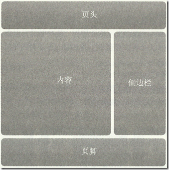
以两列自适应宽度布局为例:
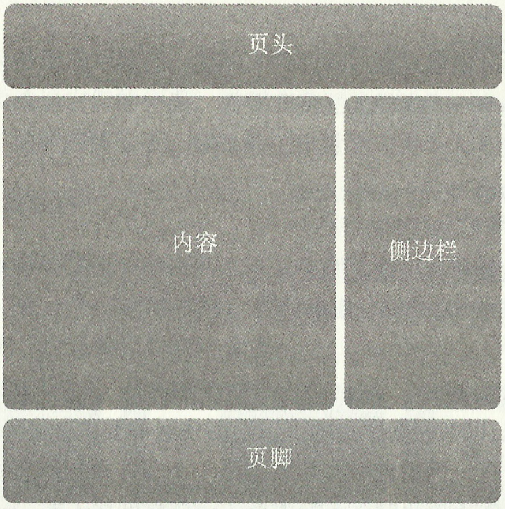
<div id="wrap">

<header role="banner">
<h1>Header Goes Here</h1>
</header>

<div id="content" role="main">
...content goes here...
</div>

<div id="sidebar" role="complementary">
...sidebar goes here...
</div>

<footer role="contentinfo">
...footer goes here...
</footer>

</div><!-- end #wrap -->
1. 通过浮动并且宽度设为百分数
主要区域content左浮动 (该区域内部如果有两栏则分别左右浮动)
旁边栏目sidebar右浮动
页脚footer区域注意清除两边浮动
设置宽度时设置为百分数,但是添加内边距时单位为px,会造成宽度过宽
解决方案:
在#main和#siderbar中添加box-sizing:border-box,表示width宽度包含border
-webkit-box-sizing:border-box;
-moz-box-sizing:border-box;
box-sizing:border-box;
IE8以下不兼容box-sizing,可以通过在#mian和#siderbar内部添加一个div,通过对div添加pading而不是对#main和#siderbar操作而达到目的。
2.可以设置max-width和min-width来限制页面范围 ,防止布局尺寸过大或过小。
对于有图片或宽度有限制的区域,可以通过max-width和min-width设置(IE6不支持)
#wrap{
max-width: 960px;
margin: 0 auto;
padding: 0 30px;
}
对于页面内嵌入的图片或媒体,也可以通过设置max-width:100%来防止尺寸过大问题。
3.文字设为百分数单位,例如100%或62.5%,而对于line-height可设为倍数,例如1.3/1.4等,可保证字体有很好的灵活性。
4.媒体查询
对于多设备屏幕告知设备将布局的宽度设为与浏览器设备等宽
<meta name="viewport" content="width=device-width" />
通过媒体查询设置不同页面宽度时的不同布局样式
/*当页面小于800px时,取消#mian和#sidebar的左右浮动,宽度自动,变为单列布局,减少字体行高等*/
@media screen and (max-width: 800px){
#main,#sidebar{
float: none;
width: auto;
padding: 0;
font-size: .9em;
line-height: 1.5;
}
}
/*当页面宽度小于550px时,常需要将logo居中对齐,两边设置少量空隙,改变字体行高等*/
@media screen and (max-width: 550px){
#wrap{
padding: 0 15px;
}
#special{
padding-left: 15px;
padding-right: 15px;
font-size: 1.2em;
line-height: 1.3;
}
#main h1{
font-size: 1.2em;
line-height: 1.4;
}
footer[role="contentinfo"] p{
margin-right: 20px;
margin-left: 20px;
}
}

相关文章推荐
- 设置后台传送json的response.setContentType()格式
- iPhone的恢复模式进入与退出
- Android LruCache初探
- Json数据的解析
- js(jQuery)获取时间的方法及常用时间类搜集
- 关于String内存分配的深入探讨
- DFS问题DfsrPrivate目录占用空间大
- JS+CSS实现表格高亮的方法
- 经典SQL语句大全
- html中利用table进行布局
- 【leetcode】 First Missing Positive
- 暑假-树状数组-B - Lost Cows
- android学习笔记之adb无法启动
- 生成随机数
- 黑马程序员_Java基础:多功能小窗口,swing,io,net综合应用
- 常见HTTP状态
- Date和String转换
- ListView在显示的时候出现一行行包名
- poj 3977 折半枚举二分搜索
- [备注]HDOJ题目分类