纯css画三角形/梯形(兼容ie6)
2015-07-18 19:40
751 查看
代码很简单也很容易理解,及用css盒模型来实现效果
实例:宽高为0的话是三角形,否则是梯形

当然也可以把另外三遍设为 *背景色*来实现效果,也可以尝试下把三边设为不同的颜色,宽度效果也很炫酷
为了兼容ie6,border-style和font-size,line-height,overflow都要改下
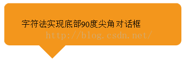
更通用的,不用考虑兼容性的写法,用字符实现三角形
<!DOCTYPE html>
<html lang="en">
<head>
<meta charset="UTF-8">
<title>Document</title>
<style>
.box{
height:80px;
width: 300px;
line-height:80px;
border-radius: 10px;
margin-bottom:30px;
padding-left:2em;
background:#f3961c;
position:relative;
}
.diamond{
height:60px;
line-height:60px;
font-size:60px;
color:#f3961c;
position:absolute;
z-index: -1;
left:60px;
bottom:-30px;
}
</style>
</head>
<body>
<div class="box">
<span class="diamond">◆</span>
字符法实现底部90度尖角对话框
</div>
</body>
</html>
效果:
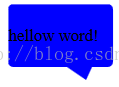
气泡框实例:
<!DOCTYPE html>
<html lang="en">
<head>
<meta charset="UTF-8">
<title>Document</title>
<style type="text/css">
.box{
position: relative;
width: 100px;
height: 60px;
line-height: 60px;
background: blue;
border-radius: 5px;
}
.box:after{
content: "";
width: 0;
overflow: hidden;
border-style: solid;
border-color: blue transparent transparent transparent;
position: absolute;
bottom: -32px;
right: 20px;
border-width: 12px 6px 20px 18px;
}
</style>
</head>
<body>
<div class="box">
hellow word!
</div>
</div>
</body>
</html>效果:
参考文章http://caibaojian.com/css-border-triangle.html#t7
实例:宽高为0的话是三角形,否则是梯形
<!DOCTYPE html>
<html lang="en">
<head>
<meta charset="UTF-8">
<title>Document</title>
<style type="text/css">
.triangle{
width: 0;
height: 0;
border-style: solid;
border-color: red transparent transparent transparent;
border-width: 12px;
}
.trapezoidal{
width: 12px;
height: 12px;
border-style: solid;
border-color: green transparent transparent transparent;
border-width: 12px;
}
</style>
</head>
<body>
<div class="triangle"></div>
<div class="trapezoidal"></div>
</body>
</html>效果:当然也可以把另外三遍设为 *背景色*来实现效果,也可以尝试下把三边设为不同的颜色,宽度效果也很炫酷
为了兼容ie6,border-style和font-size,line-height,overflow都要改下
#test {
height:0;
width:0;
overflow: hidden; /* 这里设置overflow, font-size, line-height */
font-size: 0;     /*是因为, 虽然宽高度为0, 但在IE6下会具有默认的 */
line-height: 0;  /* 字体大小和行高, 导致盒子呈现被撑开的长矩形 */
border-color:#FF9600 #3366ff #12ad2a #f0eb7a;
border-style:solid dashed dashed dashed;/*ie6不支持颜色透明,可将边框设为dotted或dashed*/
border-width:20px;
}效果同上更通用的,不用考虑兼容性的写法,用字符实现三角形
<!DOCTYPE html>
<html lang="en">
<head>
<meta charset="UTF-8">
<title>Document</title>
<style>
.box{
height:80px;
width: 300px;
line-height:80px;
border-radius: 10px;
margin-bottom:30px;
padding-left:2em;
background:#f3961c;
position:relative;
}
.diamond{
height:60px;
line-height:60px;
font-size:60px;
color:#f3961c;
position:absolute;
z-index: -1;
left:60px;
bottom:-30px;
}
</style>
</head>
<body>
<div class="box">
<span class="diamond">◆</span>
字符法实现底部90度尖角对话框
</div>
</body>
</html>
效果:
气泡框实例:
<!DOCTYPE html>
<html lang="en">
<head>
<meta charset="UTF-8">
<title>Document</title>
<style type="text/css">
.box{
position: relative;
width: 100px;
height: 60px;
line-height: 60px;
background: blue;
border-radius: 5px;
}
.box:after{
content: "";
width: 0;
overflow: hidden;
border-style: solid;
border-color: blue transparent transparent transparent;
position: absolute;
bottom: -32px;
right: 20px;
border-width: 12px 6px 20px 18px;
}
</style>
</head>
<body>
<div class="box">
hellow word!
</div>
</div>
</body>
</html>效果:
参考文章http://caibaojian.com/css-border-triangle.html#t7

相关文章推荐
- Web布局连载——两栏固定布局(五)
- [div+css]晒晒最新制作专题推广页模板
- 在Windows 8.1的IE 11中屏蔽双击放大功能
- 纯CSS制作的新闻网站中的文章列表
- 10条影响CSS渲染速度的写法与使用建议第1/3页
- 通过Mootools 1.2来操纵HTML DOM元素
- BS项目中的CSS架构_仅加载自己需要的CSS
- 很不错的 CSS Hack 又学了一招
- 发一个css比较清爽的写法
- CSS expression控制图片自动缩放效果代码[兼容 IE,Firefox]
- css布局网页水平居中常用方法
- CSS经典技巧十则第1/2页
- css 兼容性问题this.style.cursor=''hand''
- IE6不能正常解析CSS文件问题的解决方法及原因分析
- 欲练CSS ,必先解决IE的一些细节分析
- CSS文字截取功能实现代码
- 支持IE6 IE7 Firefox 的纯CSS的下拉菜单
- WEB标准网页布局中尽量不要使用的HTML标签
- 不同版本IE使用不同css(css条件注释语句用法)