CSS3 Transform Matrix
2015-06-15 10:15
609 查看
css3中的transform让我们操作变形变得很简单,诸如,translate–移动,scale–缩放,rotate–旋转,skew–斜切。这几个属性很方便,也很简单,但是其中matrix我们就不常使用了吧。-webkit-transform: matrix(1, 0, 0, 1, 100, 100)看到这样一句css,你也许很讨厌怎么一堆的数字,你也许斜视matrix–css也能搞出这货?这篇文章我们一起探讨一下transform中的matrix。
一、初识matrix
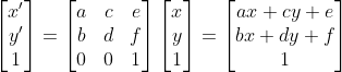
2d matrix提供6个参数啊a,b,c,d,d,e,f其基本写法如下:

回顾一下高中数学,或者线性代数,即可知道matrix计算方法。x和y是元素初始的坐标,x’ 和y’则是通过矩阵变换后得到新的坐标。通过中间的那个3×3的变换矩阵,对原先的坐标施加变换,就能得到新的坐标了。依据矩阵变换规则即可得到: x’=ax+cy+e
y’=bx+dy+f。
transform中translate,scale,rotate,skew背后实现原理也对应着matrix变化,下边依次解释:
变换矩阵公式可参考变换矩阵wiki(http://zh.wikipedia.org/zh-cn/%E5%8F%98%E6%8D%A2%E7%9F%A9%E9%98%B5)
二、移动translate
移动matrix参数为:matrix(1,0,0,1,Δx,Δy)(Δx,Δy分别对应x和y轴的增量)。由此公式可知:
-webkit-transform: translate(100px,100px);即对应着-webkit-transform: matrix(1, 0, 0, 1, 100, 100);
推算出: x’ = 1*x+0 [b]* y+100 = x+100 [/b], y’ = 0 [b]* x+1 * y+100 = y+100。[/b]

三、缩放scale
缩放matrix参数为:matrix(kx*x,0,0,ky*y,0,0)(kx,和ky分别对应x和y轴缩放比率)。由此公式可知:
-webkit-transform: scale(1.5,1.5);及对应着 -webkit-transform: matrix(1.5, 0, 0, 1.5, 0, 0);
推算出: x’ = 1.5*x+0 [b]* y+0 = 1.5 * x [/b], y’ = 0 [b]* x+1.5 * y+0 =1.5 * y。[/b]

四、旋转rotate
旋转matrix参数为:matrix(cosθ,sinθ,-sinθ,cosθ,0,0),由此可知
-webkit-transform: rotate(45deg);即对应着 -webkit-transform: matrix(0.53, 0.85, -0.85, 0.53, 0, 0);
(sin(45′)=0.85,cos(45′)=0.53)
推算: x’ = x*cos(45′)-y*sin(45′)+0 = x*cos(45′)-y*sin(45′),y’ = x*sin(45′)+y*cos(45′)+0 = x*sin(45′)+y*cos(45′)

五、斜切skew
斜切matrix参数为matrix(1,tan(θy),tan(θx),1,0,0),由此可知
-webkit-transform: skew(45deg);即对应着 -webkit-transform: matrix(1,0,1,1,0,0);
(tan(45′)=1)
推算出 x’ = x+y*tan( [b]45′ )+0 = x+y*tan( 45′ ), [/b]y’ = x*tan( [b]45′ )+y+0 = x*tan( 45′)+y[/b]

六、镜相对称
镜像对称没有相应的简化操作。终于有一个只能用matrix实现得了。。。
假设对称轴为y=kx直线,那么以这条直线对称的图形matrix为
matrix(2*ux^2-1,2*ux*uy,2*ux*uy,2*uy^2-1,0,0)
求解过程为:
假设(ux,uy)为直线方向的单位向量。也就是说,如果直线方程是y=kx,那么ux=1/sqrt(1+k^2),uy=k/sqrt(1+k^2),
推算出: x’ = (2*ux^2-1)*x+2*ux*uy*y
y’ = 2*ux*uy*x+(2*uy^2-1)*y。

七、3d变换矩阵
3d矩阵即为透视投影,推算方法与2d矩阵相类似

3d变换矩阵代码示例,matrix变为matrix3d
-webkit-transform: matrix3d(1, 0, 0, 0, 0, 1, 0, 0, 0, 0, 1, 0, 0, 0, 0, 1)

八、ie matrix滤镜
ie matrix滤镜仅能实现旋转和拉伸,具体写法为:
filter: progid:DXImageTransform.Microsoft.Matrix( enabled= bEnabled , SizingMethod= sMethod , FilterType= sType , Dx= fDx , Dy= fDy , M11= fM11 , M12= fM12 , M21= fM21 , M22= fM22 )
其中M11, M12, M21, M22分别对应2d矩阵中的a,c,b,d。
1’ 所以旋转实现即为:
M11=cos(roation),M12=-sin(roation),M21=sin(roation),M22=cos(roation)
对应此段代码ie7下截图为:
filter: progid:DXImageTransform.Microsoft.Matrix( enabled= bEnabled , SizingMethod=’auto expand’, FilterType= sType , M11= 0.53 , M12= -0.85 , M21= 0.85 , M22= 0.53 )

2‘ ie7缩放实现对应截图:
filter: progid:DXImageTransform.Microsoft.Matrix( enabled= bEnabled , SizingMethod=’auto expand’, FilterType= sType , M11=1.5 , M12= 0 , M21= 0 , M22=1.5 )

其他变换可以发挥想想啦。。。。
参考文章: http://zh.wikipedia.org/zh-cn/%E5%8F%98%E6%8D%A2%E7%9F%A9%E9%98%B5 http://www.w3.org/TR/css3-2d-transforms/ http://dev.opera.com/articles/view/understanding-the-css-transforms-matrix/ http://msdn.microsoft.com/en-us/library/ms533014(v=vs.85).aspx
一、初识matrix
2d matrix提供6个参数啊a,b,c,d,d,e,f其基本写法如下:
回顾一下高中数学,或者线性代数,即可知道matrix计算方法。x和y是元素初始的坐标,x’ 和y’则是通过矩阵变换后得到新的坐标。通过中间的那个3×3的变换矩阵,对原先的坐标施加变换,就能得到新的坐标了。依据矩阵变换规则即可得到: x’=ax+cy+e
y’=bx+dy+f。
transform中translate,scale,rotate,skew背后实现原理也对应着matrix变化,下边依次解释:
变换矩阵公式可参考变换矩阵wiki(http://zh.wikipedia.org/zh-cn/%E5%8F%98%E6%8D%A2%E7%9F%A9%E9%98%B5)
二、移动translate
移动matrix参数为:matrix(1,0,0,1,Δx,Δy)(Δx,Δy分别对应x和y轴的增量)。由此公式可知:
-webkit-transform: translate(100px,100px);即对应着-webkit-transform: matrix(1, 0, 0, 1, 100, 100);
推算出: x’ = 1*x+0 [b]* y+100 = x+100 [/b], y’ = 0 [b]* x+1 * y+100 = y+100。[/b]
三、缩放scale
缩放matrix参数为:matrix(kx*x,0,0,ky*y,0,0)(kx,和ky分别对应x和y轴缩放比率)。由此公式可知:
-webkit-transform: scale(1.5,1.5);及对应着 -webkit-transform: matrix(1.5, 0, 0, 1.5, 0, 0);
推算出: x’ = 1.5*x+0 [b]* y+0 = 1.5 * x [/b], y’ = 0 [b]* x+1.5 * y+0 =1.5 * y。[/b]
四、旋转rotate
旋转matrix参数为:matrix(cosθ,sinθ,-sinθ,cosθ,0,0),由此可知
-webkit-transform: rotate(45deg);即对应着 -webkit-transform: matrix(0.53, 0.85, -0.85, 0.53, 0, 0);
(sin(45′)=0.85,cos(45′)=0.53)
推算: x’ = x*cos(45′)-y*sin(45′)+0 = x*cos(45′)-y*sin(45′),y’ = x*sin(45′)+y*cos(45′)+0 = x*sin(45′)+y*cos(45′)
五、斜切skew
斜切matrix参数为matrix(1,tan(θy),tan(θx),1,0,0),由此可知
-webkit-transform: skew(45deg);即对应着 -webkit-transform: matrix(1,0,1,1,0,0);
(tan(45′)=1)
推算出 x’ = x+y*tan( [b]45′ )+0 = x+y*tan( 45′ ), [/b]y’ = x*tan( [b]45′ )+y+0 = x*tan( 45′)+y[/b]
六、镜相对称
镜像对称没有相应的简化操作。终于有一个只能用matrix实现得了。。。
假设对称轴为y=kx直线,那么以这条直线对称的图形matrix为
matrix(2*ux^2-1,2*ux*uy,2*ux*uy,2*uy^2-1,0,0)
求解过程为:
假设(ux,uy)为直线方向的单位向量。也就是说,如果直线方程是y=kx,那么ux=1/sqrt(1+k^2),uy=k/sqrt(1+k^2),
推算出: x’ = (2*ux^2-1)*x+2*ux*uy*y
y’ = 2*ux*uy*x+(2*uy^2-1)*y。
七、3d变换矩阵
3d矩阵即为透视投影,推算方法与2d矩阵相类似
3d变换矩阵代码示例,matrix变为matrix3d
-webkit-transform: matrix3d(1, 0, 0, 0, 0, 1, 0, 0, 0, 0, 1, 0, 0, 0, 0, 1)
八、ie matrix滤镜
ie matrix滤镜仅能实现旋转和拉伸,具体写法为:
filter: progid:DXImageTransform.Microsoft.Matrix( enabled= bEnabled , SizingMethod= sMethod , FilterType= sType , Dx= fDx , Dy= fDy , M11= fM11 , M12= fM12 , M21= fM21 , M22= fM22 )
其中M11, M12, M21, M22分别对应2d矩阵中的a,c,b,d。
1’ 所以旋转实现即为:
M11=cos(roation),M12=-sin(roation),M21=sin(roation),M22=cos(roation)
对应此段代码ie7下截图为:
filter: progid:DXImageTransform.Microsoft.Matrix( enabled= bEnabled , SizingMethod=’auto expand’, FilterType= sType , M11= 0.53 , M12= -0.85 , M21= 0.85 , M22= 0.53 )
2‘ ie7缩放实现对应截图:
filter: progid:DXImageTransform.Microsoft.Matrix( enabled= bEnabled , SizingMethod=’auto expand’, FilterType= sType , M11=1.5 , M12= 0 , M21= 0 , M22=1.5 )
其他变换可以发挥想想啦。。。。
参考文章: http://zh.wikipedia.org/zh-cn/%E5%8F%98%E6%8D%A2%E7%9F%A9%E9%98%B5 http://www.w3.org/TR/css3-2d-transforms/ http://dev.opera.com/articles/view/understanding-the-css-transforms-matrix/ http://msdn.microsoft.com/en-us/library/ms533014(v=vs.85).aspx

相关文章推荐
- CSS3实现倒影
- (转)CSS定义字体间距 字体行与行间距
- css思维导图
- CSS从大图中抠取小图完整教程(background-position应用)
- css学习笔记-1
- css布局之图片被拉伸问题
- CSS小知识---回到顶部
- 关于css中两层div的水平垂直居中问题
- CSS3知识点
- CSS入门教程——定位(positon)
- 什么是CSS清除浮动?
- CSS清除浮动_清除float浮动
- 你所不知的 CSS ::before 和 ::after 伪元素用法
- background:-webkit-gradient()背景渐变属性
- CSS控制print打印样式
- css3 盒模型
- css 动画效果
- CSS多行文本固定高度的居中
- CSS强制换行和禁止换行代码
- CSS跑马灯