First steps of using googleVis on shiny
2015-04-17 11:17
519 查看
The guys at RStudio have done a fantastic job with
shiny. It is really easy to build web apps with
R using shiny. With the help of Joe Cheng from RStudio we figured out a way to make
googleVis work on shiny as well. This allows you to make use of the
Google Charts Tools in your shiny app directly from R. What I present here are three initial examples which seem to work in most browsers. The third example
even uses a neat trick to create an animated geo chart.
However, before we upload the next version of googleVis to CRAN we decided to present a preview of version 0.4.0 here, asking for
feedback. It would not be fair on the guys behind CRAN to release something into the wild, only to be told by users within a few days that we missed something. Hence, you can get the new version of googleVis only from
the download page of our project site for the time being.
You may have read the
post on RStudio's blog that the shiny API changed slightly: the
To run the following examples you need shiny version 0.4.0 and googleVis version 0.4.0 or higher.

view raw
server.R hosted with ❤ by
GitHub
view raw
ui.R hosted with ❤ by
GitHub
You can run the app locally via:
in the header. I am not aware of any other option in R to create interactive tables.

view raw
server.R hosted with ❤ by
GitHub
view raw
ui.R hosted with ❤ by
GitHub
You can run the app locally via:
I use a

view raw
server.R hosted with ❤ by
GitHub
view raw
ui.R hosted with ❤ by
GitHub
You can run the app locally via:
in the background.
We will be most curious to see how you use the two packages combined for your work. Please let us know how you have used googleVis with shiny, e.g. via a comment below with a link to your app, or send us your
feedback via email and/or file
issues on our project site.
As mentioned above the apps of this post are hosted on RStudio's server, as part of their
shiny beta testing programme. Thanks to
RStudio again.
gvis*()$html$chart vector changed. The positions of jsChart and
jsFooter have been swapped.
The load mechanism for the Google API changed from http to https
again. Thanks to Jacques Philip.
The package dependencies changed to imports statements in DESCRIPTION.
Thanks to Suraj Gupta for pointing this out.
The R.rsp example in demo googleVis has been moved into its own demo Rrsp.
A FAQ and shiny section has been added to the vignette.
Bug Fixes
jsDisplayChart didn't check if the google visualization function is already
loaded. Many thanks to Mark Melling for reporting the issue and
providing a solution.
The demo WorldBank didn't download all data but only the first 12000 records. Many thanks to John Maindonald reporting this issue.
shiny. It is really easy to build web apps with
R using shiny. With the help of Joe Cheng from RStudio we figured out a way to make
googleVis work on shiny as well. This allows you to make use of the
Google Charts Tools in your shiny app directly from R. What I present here are three initial examples which seem to work in most browsers. The third example
even uses a neat trick to create an animated geo chart.

However, before we upload the next version of googleVis to CRAN we decided to present a preview of version 0.4.0 here, asking for
feedback. It would not be fair on the guys behind CRAN to release something into the wild, only to be told by users within a few days that we missed something. Hence, you can get the new version of googleVis only from
the download page of our project site for the time being.
You may have read the
post on RStudio's blog that the shiny API changed slightly: the
reactivePlotand
reactiveTextfunctions have been renamed to
renderPlotand
renderTextwith simplified input parameters. Thanks to Joe, there is now also a
renderGvisfunction as part of the googleVis package, which works in very much the same way as the other two.
To run the following examples you need shiny version 0.4.0 and googleVis version 0.4.0 or higher.
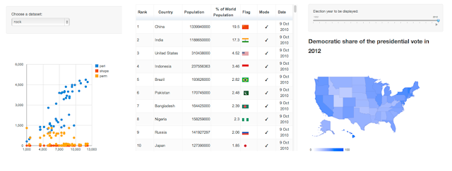
Example 1: Select data for a scatter chart
In this example the user can select different data to be displayed via a scatter chart. I use therenderGvisfunction in the same way as I would use
renderPlotor
renderText.
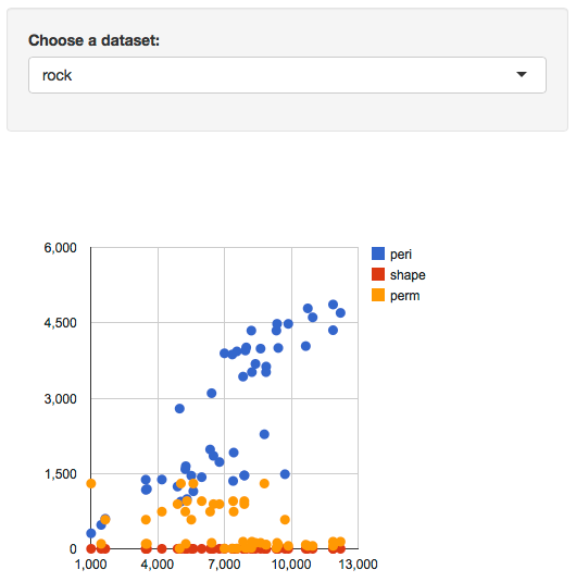
| 1234567891011121314151617 | # Contributed by Joe Cheng, February 2013 # Requires googleVis version 0.4.0 and shiny 0.4.0 or higher # server.R library(googleVis) library(shiny) shinyServer(function(input, output) { datasetInput <- reactive({ switch(input$dataset, "rock" = rock, "pressure" = pressure, "cars" = cars) }) output$view <- renderGvis({ gvisScatterChart(datasetInput(), options=list(width=400, height=450)) }) }) |
server.R hosted with ❤ by
GitHub
| 1234567891011 | # ui.R shinyUI(pageWithSidebar( headerPanel("Example 1: scatter chart"), sidebarPanel( selectInput("dataset", "Choose a dataset:", choices = c("rock", "pressure", "cars")) ), mainPanel( htmlOutput("view") ) )) |
ui.R hosted with ❤ by
GitHub
You can run the app locally via:
library(googleVis)
library(shiny)
runGist(4970975)
Example 2: Interactive table
The second example is quite simple as well, it displays a table. However, I am using the Google Chart table, which means that I can make it pageable and allow the user to choose how many rows of data to be shown. Of course, columns can be sorted by clickingin the header. I am not aware of any other option in R to create interactive tables.

| 1234567891011121314151617 | ## Diego de Castillo, February 2013 library(datasets) library(googleVis) library(shiny) shinyServer(function(input, output) { myOptions <- reactive({ list( page=ifelse(input$pageable==TRUE,'enable','disable'), pageSize=input$pagesize, width=550 ) }) output$myTable <- renderGvis({ gvisTable(Population,options=myOptions()) }) }) |
server.R hosted with ❤ by
GitHub
| 123456789101112 | shinyUI(pageWithSidebar( headerPanel("Example 4: pageable table"), sidebarPanel( checkboxInput(inputId = "pageable", label = "Pageable"), conditionalPanel("input.pageable==true", numericInput(inputId = "pagesize", label = "Countries per page",10)) ), mainPanel( htmlOutput("myTable") ) )) |
ui.R hosted with ❤ by
GitHub
You can run the app locally via:
library(googleVis)
library(shiny)
runGist("eda98b0dfdaec284f271")
Example 3: Animated geo chart
The third example plots the results of the US presidential elections from 1932 - 2012 as a geo chart, showing the share of democratic votes by state.I use a
slidebarPanelto enable users to browse the data. The really clever bit is that the function
slideInputhas an argument
animate, which when set to
TRUE, allows the user to animate the geo chart. Hit the play button in the bottom right hand side of the slider panel.

| 12345678910111213141516171819202122232425262728293031323334 | # Markus Gesmann, February 2013 require(googleVis) require(shiny) ## Prepare data to be displayed ## Load presidential election data by state from 1932 - 2012 library(RCurl) url <- "https://raw.githubusercontent.com/mages/diesunddas/master/Data/US%20Presidential%20Elections.csv" dat <- getURL(url, ssl.verifypeer=0L, followlocation=1L) dat <- read.csv(text=dat) ## Add min and max values to the data datminmax = data.frame(state=rep(c("Min", "Max"),21), demVote=rep(c(0, 100),21), year=sort(rep(seq(1932,2012,4),2))) dat <- rbind(dat[,1:3], datminmax) shinyServer(function(input, output) { myYear <- reactive({ input$Year }) output$year <- renderText({ paste("Democratic share of the presidential vote in", myYear()) }) output$gvis <- renderGvis({ myData <- subset(dat, (year > (myYear()-1)) & (year < (myYear()+1))) gvisGeoChart(myData, locationvar="state", colorvar="demVote", options=list(region="US", displayMode="regions", resolution="provinces", width=500, height=400, colorAxis="{colors:['#FFFFFF', '#0000FF']}" )) }) }) |
server.R hosted with ❤ by
GitHub
| 123456789101112131415 | require(shiny) shinyUI(pageWithSidebar( headerPanel("Example 3: animated geo chart"), sidebarPanel( sliderInput("Year", "Election year to be displayed:", min=1932, max=2012, value=2012, step=4, format="###0",animate=TRUE) ), mainPanel( h3(textOutput("year")), htmlOutput("gvis") ) ) ) |
ui.R hosted with ❤ by
GitHub
You can run the app locally via:
library(googleVis)
library(shiny)
runGist(4642963)
Conclusions
Finally, with version 0.4.0 of googleVis and shiny, both packages have found together. I think, this marks a big step forward for both projects as it becomes even easier to develop true interactive data analysis applications for the web using the power of Rin the background.
We will be most curious to see how you use the two packages combined for your work. Please let us know how you have used googleVis with shiny, e.g. via a comment below with a link to your app, or send us your
feedback via email and/or file
issues on our project site.
As mentioned above the apps of this post are hosted on RStudio's server, as part of their
shiny beta testing programme. Thanks to
RStudio again.
Further changes in googleVis 0.4.0
In order to support shiny the order of the elements of thegvis*()$html$chart vector changed. The positions of jsChart and
jsFooter have been swapped.
The load mechanism for the Google API changed from http to https
again. Thanks to Jacques Philip.
The package dependencies changed to imports statements in DESCRIPTION.
Thanks to Suraj Gupta for pointing this out.
The R.rsp example in demo googleVis has been moved into its own demo Rrsp.
A FAQ and shiny section has been added to the vignette.
Bug Fixes
jsDisplayChart didn't check if the google visualization function is already
loaded. Many thanks to Mark Melling for reporting the issue and
providing a solution.
The demo WorldBank didn't download all data but only the first 12000 records. Many thanks to John Maindonald reporting this issue.
Session Info
R version 2.15.2 (2012-10-26)
Platform: x86_64-apple-darwin9.8.0/x86_64 (64-bit)

locale:
[1] en_GB.UTF-8/en_GB.UTF-8/en_GB.UTF-8/C/en_GB.UTF-8/en_GB.UTF-8

attached base packages:
[1] stats     graphics  grDevices utils     datasets  methods   base

other attached packages:
[1] shiny_0.4.0     googleVis_0.4.0

loaded via a namespace (and not attached):
[1] bitops_1.0-4.2   caTools_1.14     digest_0.6.1     RJSONIO_1.0-1    websockets_1.1.7 xtable_1.7-0

相关文章推荐
- Using C++ std::equal on a container of shared_ptr
- PatentTips - Method and system for browsing things of internet of things on ip using web platform
- Using freewheel.labs.autodesk.com to auto generate preview images of DWF files on your web site
- SUMO使用:Vehicle '**' is not allowed to depart on any lane of its first edge.
- 第一次外国人在qq上找我聊天【为了找php程序员】The first time of foreigners in qq chat on me.
- Problem 19 of How many Sundays fell on the first of the month during the twentieth century
- Breif steps of installing Weblogic on Linux
- Example Source Code: Using Face Detection To Create The Illusion Of Real 3D On iOS Devices
- Figure out lots of I/O being generated on a particular LUN using esxtop
- Grading of Gliomas by Using Radiomic Features on Multiple Magnetic Resonance Imaging (MRI) Sequences
- My first experience of using unbuntu
- First Round of Google Phone screen interview backup
- [论文笔记] On Construction of Cloud IaaS for VM Live Migration Using KVM and OpenNebula (ICA3PP, 2012)
- First Impression on BBED: explore block structure using map command
- [译]Why do people write #!/usr/bin/env python on the first line of a Python script?
- Description of the default C and C++ libraries that a program will link with when built by using Vis
- Get to the Top on Google: Tips and Techniques to Get Your Site to the Top of the Search Engine Ranki
- [note]First draft of a report on the EDVAC (1~2)
- windows下python 安装igraph库报错 Cannot find the C core of igraph on this system using pkg-config.的解决
- Example of Using Google Maps Service and GPS in Android