css实现三角形
2015-02-20 00:04
344 查看
今天给大家带来 CSS 三角形绘制方法
代码如下:
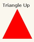
#triangle-up {
width: 0;
height: 0;
border-left: 50px solid transparent;
border-right: 50px solid transparent;
border-bottom: 100px solid red;
}
代码如下:
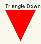
#triangle-down {
width: 0;
height: 0;
border-left: 50px solid transparent;
border-right: 50px solid transparent;
border-top: 100px solid red;
}
代码如下:
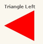
#triangle-left {
width: 0;
height: 0;
border-top: 50px solid transparent;
border-right: 100px solid red;
border-bottom: 50px solid transparent;
}
代码如下:
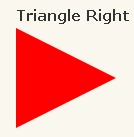
#triangle-right {
width: 0;
height: 0;
border-top: 50px solid transparent;
border-left: 100px solid red;
border-bottom: 50px solid transparent;
}

代码如下:
#triangle-topleft {
width: 0;
height: 0;
border-top: 100px solid red;
border-right: 100px solid transparent;
}
代码如下:
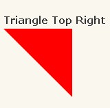
#triangle-topright {
width: 0;
height: 0;
border-top: 100px solid red;
border-left: 100px solid transparent;
}
代码如下:
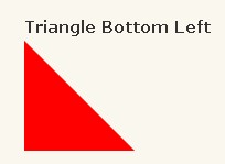
#triangle-bottomleft {
width: 0;
height: 0;
border-bottom: 100px solid red;
border-right: 100px solid transparent;
}
代码如下:
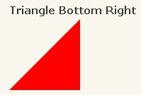
#triangle-bottomright {
width: 0;
height: 0;
border-bottom: 100px solid red;
border-left: 100px solid transparent;
}
代码如下:
#triangle-up {
width: 0;
height: 0;
border-left: 50px solid transparent;
border-right: 50px solid transparent;
border-bottom: 100px solid red;
}
代码如下:
#triangle-down {
width: 0;
height: 0;
border-left: 50px solid transparent;
border-right: 50px solid transparent;
border-top: 100px solid red;
}
代码如下:
#triangle-left {
width: 0;
height: 0;
border-top: 50px solid transparent;
border-right: 100px solid red;
border-bottom: 50px solid transparent;
}
代码如下:
#triangle-right {
width: 0;
height: 0;
border-top: 50px solid transparent;
border-left: 100px solid red;
border-bottom: 50px solid transparent;
}
代码如下:
#triangle-topleft {
width: 0;
height: 0;
border-top: 100px solid red;
border-right: 100px solid transparent;
}
代码如下:
#triangle-topright {
width: 0;
height: 0;
border-top: 100px solid red;
border-left: 100px solid transparent;
}
代码如下:
#triangle-bottomleft {
width: 0;
height: 0;
border-bottom: 100px solid red;
border-right: 100px solid transparent;
}
代码如下:
#triangle-bottomright {
width: 0;
height: 0;
border-bottom: 100px solid red;
border-left: 100px solid transparent;
}

相关文章推荐
- CSS技巧之圆角背景与三角形实现方法
- CSS实现三角形
- 纯CSS实现小圆点和三角形图案
- 纯CSS实现箭头、气泡让提示功能具有三角形图标
- CSS实现DIV三角形
- css实现无图片三角形垂直导航条
- css实现三角形及应用示例
- 纯 CSS 实现三角形尖角箭头的实例
- 纯 CSS 实现三角形尖角箭头的实例
- CSS和字符串实现三角形
- 纯CSS实现“三角形箭头”布局的代码
- css实现三角形 兼容主流浏览器
- css实现三角形
- 纯CSS 实现三角形图标
- css实现三角形 圆形
- css实现三角形
- css绘画三角形,实现一些图形
- 三种纯css方式实现三角形
- 用css实现三角形
- 三角形变形记之纯css实现的分布导航条效果