Shopping cart analysis with R(-1) – Multi-layer pie chart
2015-01-30 09:07
302 查看
In this post, we will review a very interesting type of visualization – the multi-layer pie chart – and use it for one marketing analytics task – the shopping cart analysis. We will go from the initial data preprocessing to the
shopping cart analysis visualization. I will share the R code in that you shouldn’t write R code for every layer of chart. You can also find an example about how to create a multi-layer pie chart
here.
So, suppose we have a list of 1st orders/carts that were bought by our clients. Each order consists one or several products/category of products. Also, we want to visualise a relationship between products and see the share of orders
that includes each product or combination of products. The multi-layer pie chart can help us draw each product and its intersections with others.
After we loaded the necessary libraries with the following code:
we will simulate an example of the data set. Suppose we sell 4 products (or product categories):
a, b, c and d and each product can be sold with a different probability. Also, a client can purchase any combinations of products, e.g. only “a” or “a,b,a,d” and so on. Let’s do this with the
following code:
After this, we remove the duplicates. For example, if the order consists of more than one similar product (“a,b,a,d”), we want to exclude the effect of quantity.
Let’s see on our data set:
In case you use real data, you should start with the following code (don’t forget to load libraries):
We have just created a product matrix. Note that, if you have more or fewer than 4 products, you should specify all of them instead of
a, b, c and d in the mutate() function.
The head of product matrix we obtain is:
After this, we need to calculate the total number of combinations:
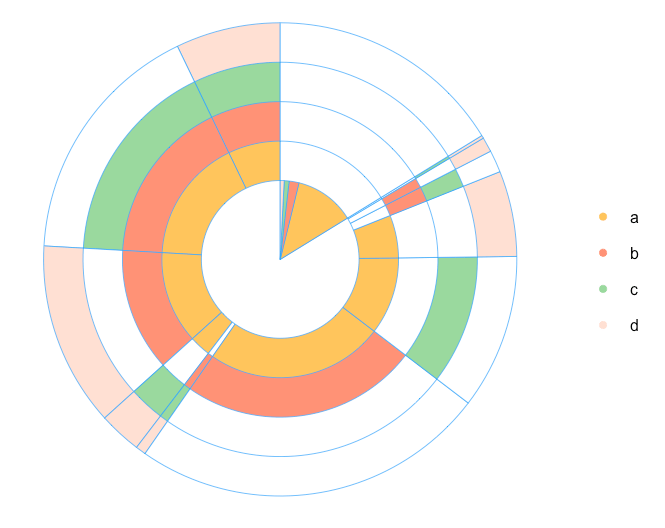
From this point we start working on our multi-layer pie chart. My idea is to place one-product order inside the chart. Therefore, we are calculating the total number of products in every combination. Note: I will do this by using
the simple nchar() function, because we used a,
b, c, and d as product names. In case you use real names, you can combine the names with a symbol. For example, “a-b-c-d” and count the number of “-” symbols.
Because I want a chart to start from the maximum combination of products, I arranged the sev.prod data set with the last function. Therefore, the data is ready for plotting. We are defining parameters for the chart:
Note: if you have more than 4 products, you should add extra colors into the palette
all.colors. Finally, our chart:

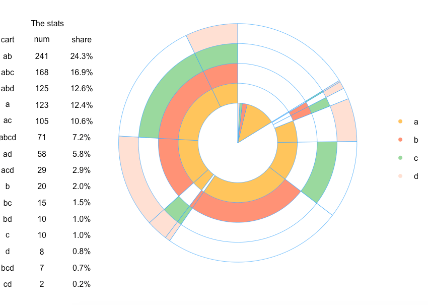
In case you want to add some statistics on plot, e.g. total number of each combination or share of combinations in total amount, we just need to create this table and add it on plot with the following code:

Therefore, we visualized the relationship between the products in the orders. However, this is just an example of using multi-layer pie chart. Feel free to share your ideas or comments!
shopping cart analysis visualization. I will share the R code in that you shouldn’t write R code for every layer of chart. You can also find an example about how to create a multi-layer pie chart
here.
So, suppose we have a list of 1st orders/carts that were bought by our clients. Each order consists one or several products/category of products. Also, we want to visualise a relationship between products and see the share of orders
that includes each product or combination of products. The multi-layer pie chart can help us draw each product and its intersections with others.
After we loaded the necessary libraries with the following code:
a, b, c and d and each product can be sold with a different probability. Also, a client can purchase any combinations of products, e.g. only “a” or “a,b,a,d” and so on. Let’s do this with the
following code:
##   orderId product
## 1       1       a
## 2       1       b
## 3       2       a
## 4       2       c
## 5       3       a
## 6       4       a
In case you use real data, you should start with the following code (don’t forget to load libraries):
a, b, c and d in the mutate() function.
The head of product matrix we obtain is:
##   orderId a   b    c    d    cart
## 1       1 a   b   <NA> <NA>  ab
## 2       2 a  <NA>  c   <NA>  ac
## 3       3 a  <NA> <NA> <NA>  a
## 4       4 a   b   <NA> <NA>  ab
## 5       5 a   b   <NA>  d    abd
## 6       6 a   b    c   <NA>  abc
After this, we need to calculate the total number of combinations:
## Source: local data frame [6 x 2]
##
##   cart num
## 1 a    123
## 2 ab   241
## 3 abc  168
## 4 abcd  71
## 5 abd  125
## 6 ac   105
From this point we start working on our multi-layer pie chart. My idea is to place one-product order inside the chart. Therefore, we are calculating the total number of products in every combination. Note: I will do this by using
the simple nchar() function, because we used a,
b, c, and d as product names. In case you use real names, you can combine the names with a symbol. For example, “a-b-c-d” and count the number of “-” symbols.
all.colors. Finally, our chart:
In case you want to add some statistics on plot, e.g. total number of each combination or share of combinations in total amount, we just need to create this table and add it on plot with the following code:
Therefore, we visualized the relationship between the products in the orders. However, this is just an example of using multi-layer pie chart. Feel free to share your ideas or comments!

相关文章推荐
- How to Scan a Shopping Cart with an Automated Security Scanner
- ChartDirector 5.0 for python 笔记【4】Multi-Depth Pie Chart
- Dynamically creating a pie chart with ASP.NET and GDI+
- How to display values with in piechart using Jfreechart(values in sector )
- ChartDirector 5.0 for python 笔记【8】Pie Chart with Legend 下篇
- Sequence of shopping carts in-depth analysis with R(1)
- Sequence of shopping carts in-depth analysis with R(2) – Clustering
- Sequence of shopping carts in-depth analysis with R(3)– Sequence of events
- Sequence of shopping carts analysis with R(0) – Sankey diagram
- 多下标哈希表——Fast Exact Search in Hamming Space with Multi-Index Hashing
- 行人属性“Fully-adaptive Feature Sharing in Multi-Task Networks with Applications in Person Attribute Cl”
- Draw Line and Bar Chart with Matplotlib 画线和图表
- 「POJ3311」Hie with the Pie
- Synchronization in Multithreaded Applications with MFC
- poj 3311 -- Hie with the Pie
- POJ3311 Hie with the Pie
- CCColorLayer [[[self alloc] initWithColor:color]报错
- iOS: CGContext的函数CGContextBeginTransparencyLayerWithRect
- SoftmaxWithLossLayer 详细讲解
- POJ 3311 Hie with the Pie 先用floyd预处理,再状态压缩