一款基于TweenMax跟随鼠标单击移动的div
2014-11-23 14:54
531 查看
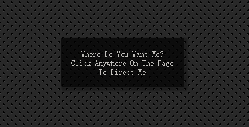
今天给大家分享一款基于TweenMax跟随鼠标单击移动的div。在这款实例中你可以单击任意位置,div会移动到你单击的位置。效果图如下:
在线预览 源码下载
实现的代码。
html代码:
css代码:
在线预览 源码下载
实现的代码。
html代码:
<html ng-app="app" ng-click="moveblock($event)">
<body>
<block class="block">Where Do You Want Me?<br />Click Anywhere On The Page<br /> To Direct Me</block>
</body>
<!--Doesn't properly work with touch; working on a fix for that and will update if/when I get it right.. !-->
<script src='angular.min.js'></script>
<script src='TweenMax.min.js'></script>
<script src='angular-animate.min.js'></script>
<script>        //cue : highlight mouse click position
(function () {
var cue = document.createElement('div'),
pressed = false;
cue.id = 'cue';
document.body.appendChild(cue);
var offset = cue.offsetWidth / 2;
document.addEventListener('mousedown', function (ev) {
document.body.classList.add('down');
pressed = true;
movecue(ev.pageX, ev.pageY);
}, false);
document.addEventListener('mouseup', function (ev) {
document.body.classList.remove('down');
pressed = false;
}, false);
function movecue(x, y) {
cue.style.left = x - offset + 'px';
cue.style.top = y - offset + 'px';
}
document.addEventListener('mousemove', function (ev) {
if (pressed) { movecue(ev.pageX, ev.pageY); }
}, false);
})();
//********************
//app directive
angular
.module("app", ["ngAnimate"])
.directive("block", blockDirective)
.animation(".block", blockAnimation);

//  Move Block
function blockDirective($animate) {

return {
restrict: "EA",
link: function (scope, element, attrs) {

var radius = element[0].offsetWidth / 2;

TweenMax.set(element, {
x: window.innerWidth / 2 - radius,
y: window.innerHeight / 2 - radius
});

scope.moveblock = function ($event) {

$animate.animate(element, {}, {
x: $event.pageX - radius,
y: $event.pageY - radius
});
};
}
};
}
function blockAnimation() {

return {
animate: function (element, className, from, to, done) {

TweenMax.to(element, 0.5, {
x: to.x,
y: to.y,
ease: Back.easeOut,
force3D: true,
onStart: done
});
}
};
}
//@ sourceURL=pen.js
</script>
css代码:
html
{
cursor: pointer;
}
body
{
font-family: 'Lato' , sans-serif;
font-size: 1em;
margin: 0;
background: radial-gradient(black 15%,
transparent 16%) 0 0, radial-gradient(black 15%,
transparent 16%) 8px 8px, radial-gradient(rgba(255,255,255,.1)
15%, transparent 20%) 0 1px, radial-gradient(rgba(255,255,255,.1)
15%, transparent 20%) 8px 9px;
background-color: #282828;
background-size: 16px 16px;
overflow: hidden;
}

.block
{
width: 250px;
color: #F7F6F2;
text-align: center;
padding-top: 1.5em;
height: 100px;
position: absolute;
background: #000;
opacity: 0.7;
border-radius: 2px;
border: none;
-moz-box-sizing: border-box;
-webkit-box-sizing: border-box;
box-sizing: border-box;
box-shadow: 4px 4px 4px 4px rgba(0,0,0,0.4);
-moz-shadow: 4px 4px 4px 4px rgba(0,0,0,0.4);
-webkit-shadow: 4px 4px 4px 4px rgba(0,0,0,0.4);
box-shadow: -4px 4px -4px 4px rgba(0,0,0,0.4);
-moz-shadow: -4px 4px -4px 4px rgba(0,0,0,0.4);
-webkit-shadow: -4px 4px -4px 4px rgba(0,0,0,0.4);
}
#cue
{
background: rgba(255, 255, 10, 0.5 );
width: 100px;
height: 100px;
position: absolute;
border-radius: 100px;
-webkit-transition: -webkit-transform 1s;
-moz-transition: -moz-transform 1s;
-ms-transition: -ms-transform 1s;
-o-transition: -o-transform 1s;
transition: transform 1s;
-webkit-transform: scale( 0,0 );
-moz-transform: scale( 0,0 );
-ms-transform: scale( 0,0 );
-o-transform: scale( 0,0 );
transform: scale( 0,0 );
}
.down #cue
{
-webkit-transform: scale( 1, 1 );
-moz-transform: scale( 1, 1 );
-ms-transform: scale( 1, 1 );
-o-transform: scale( 1, 1 );
transform: scale( 1, 1 );
}
相关文章推荐
- 一款基于TweenMax跟随鼠标单击移动的div
- 跟随鼠标单击移动的div
- GridView实现跟随鼠标移动及单击高亮显示
- jquery div 跟随鼠标移动
- jQuery实现div跟随鼠标移动
- 第3课 02 JS中级课程-event-事件(跟随鼠标移动的div)
- 鼠标拖动div,div跟随鼠标移动效果
- 基于jquery的用鼠标画出可移动的div
- javascript DIV跟随鼠标移动
- 如何让一个div跟随鼠标移动
- 让div跟随鼠标移动
- js中实现div跟随鼠标移动
- [JavaScript]跟随鼠标移动的DIV
- jquery div 跟随 鼠标 移动
- [Js]跟随鼠标移动的div
- Event—跟随鼠标移动的div实例阻止冒泡
- javascript DIV跟随鼠标移动
- 百度地图弹出层中的div跟随鼠标移动