CSS实现DIV三角形
2014-09-30 16:46
323 查看
本文内容收集来自网络
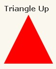

#triangle-up {
width: 0;
height: 0;
border-left: 50px solid transparent;
border-right: 50px solid transparent;
border-bottom: 100px solid red;
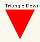
}#triangle-down {
width: 0;
height: 0;
border-left: 50px solid transparent;
border-right: 50px solid transparent;
border-top: 100px solid red;
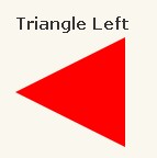
}#triangle-left {
width: 0;
height: 0;
border-top: 50px solid transparent;
border-right: 100px solid red;
border-bottom: 50px solid transparent;
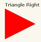
}#triangle-right {
width: 0;
height: 0;
border-top: 50px solid transparent;
border-left: 100px solid red;
border-bottom: 50px solid transparent;
}#triangle-topleft {
width: 0;
height: 0;
border-top: 100px solid red;
border-right: 100px solid transparent;
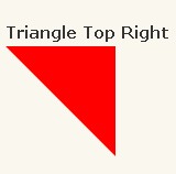
}#triangle-topright {
width: 0;
height: 0;
border-top: 100px solid red;
border-left: 100px solid transparent;
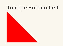
}#triangle-bottomleft {
width: 0;
height: 0;
border-bottom: 100px solid red;
border-right: 100px solid transparent;
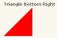
}#triangle-bottomright {
width: 0;
height: 0;
border-bottom: 100px solid red;
border-left: 100px solid transparent;
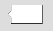
}<!-- 外框 --> <div class="mod-container"> <!-- 小三角部分 --> <div class="mod-triangle"> <div class="t-border"></div> <div class="t-inset"></div> </div> </div>
/*外框容器*/
.mod-container {
width:100px;
height:60px;
border:1px solid #000;
margin:20px;
background:#fff;
}
/*小三角部分*/
.mod-triangle {
display:block;
position:relative;
left:-23px;
top:18px;
z-index:20;
}
.mod-triangle .t-border,
.mod-triangle .t-inset{
left:0px;
top:0px;
width:0;
height:0;
font-size:0;
overflow:hidden;
position:absolute;
border-width:12px;
/*可在此处更改小三角方向:上-右-下-左(solid的位置)*/
border-style:dashed solid dashed dashed;
}
/*小三角的边框,如果不需要,可将颜色值改变*/
.mod-triangle .t-border{
border-color:transparent #000 transparent transparent;
left:-1px;
}
.mod-triangle .t-inset{
border-color: transparent #fff transparent transparent;
}

相关文章推荐
- DIV+CSS实现左侧带三角形的提示框
- CSS实现DIV三角形
- CSS实现DIV三角形
- div+CSS实现三角形
- div css 伪类 不固定图片大小 居中, css div 实现三角形
- DIV+CSS实现的拖动+隐藏/显示效果+背景变暗
- div+css实现圆角边框
- 用js实现的DIV+CSS编辑器代码
- 用js实现的DIV+CSS编辑器代码
- 使用IE条件注释 实现兼容 IE, Opera, Firefox 的 DIV+CSS 表格布局 By shawl.qiu
- DIV+CSS实现alt属性效果
- div+css实现鼠标放上去,背景跟图片都会变化。
- 用css+div如何实现表格显示
- 用css+div实现表格的每行显示3列的功能
- div+css实现Firefox与IE6兼容的手形鼠标指针
- div+css使用!important标记实现Firefox和IE6处理padding尺寸上的兼容
- Div+css+js实现高度适应浏览器,做出的效果像winform
- JS轻松实现CSS设置,DIV+CSS常用CSS设置
- 用DIV+CSS如何实现这种表格效果
- div+css实现的滑动门,简洁,新手上路 (小鸽子系列)