css3实现的鼠标经过按钮特效
2014-09-10 22:18
786 查看
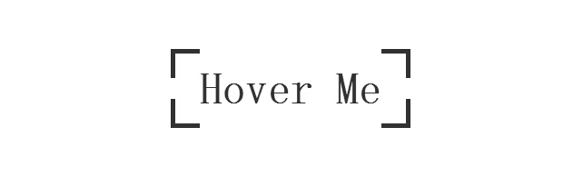
今天要为各网友再带来一款css实现的鼠标经过按钮的特效。按钮初始时,边框为断开的按钮,当鼠标经过按钮时动画变为封闭的边框。效果图如下:
在线预览 源码下载
我们一起看下实现的代码:
html代码:
css代码:
注:本文爱编程原创文章,转载请注明原文地址:/article/1211849.html
在线预览 源码下载
我们一起看下实现的代码:
html代码:
<body>
<a target="_blank" class="btn-edge" href="http://www.w2bc.com/shili">Hover Me</a>
</body>
css代码:
*, *:before, *:after
{
margin: 0;
padding: 0;
-webkit-box-sizing: border-box;
-moz-box-sizing: border-box;
box-sizing: border-box;
}

body
{
padding-top: 10%;
text-align: center;
overflow-x: hidden;
}

.btn-edge
{
position: relative;
display: inline-block;
padding: 1rem 2rem;
font-family: 'Titillium Web' , sans-serif;
font-weight: 700;
text-decoration: none;
font-size: 3rem;
color: #333;
background-image: -webkit-gradient(linear, left top, left bottom, from(#333), to(#333)), -webkit-gradient(linear, left top, left bottom, from(#333), to(#333)), -webkit-gradient(linear, left top, left bottom, from(#333), to(#333)), -webkit-gradient(linear, left top, left bottom, from(#333), to(#333)), -webkit-gradient(linear, left top, left bottom, from(#333), to(#333)), -webkit-gradient(linear, left top, left bottom, from(#333), to(#333)), -webkit-gradient(linear, left top, left bottom, from(#333), to(#333)), -webkit-gradient(linear, left top, left bottom, from(#333), to(#333));
background-image: -webkit-linear-gradient(#333, #333), -webkit-linear-gradient(#333, #333), -webkit-linear-gradient(#333, #333), -webkit-linear-gradient(#333, #333), -webkit-linear-gradient(#333, #333), -webkit-linear-gradient(#333, #333), -webkit-linear-gradient(#333, #333), -webkit-linear-gradient(#333, #333);
background-image: linear-gradient(#333, #333), linear-gradient(#333, #333), linear-gradient(#333, #333), linear-gradient(#333, #333), linear-gradient(#333, #333), linear-gradient(#333, #333), linear-gradient(#333, #333), linear-gradient(#333, #333);
background-repeat: no-repeat;
-webkit-background-size: 2rem 5px, 2rem 5px, 2rem 5px, 2rem 5px, 5px 2rem, 5px 2rem, 5px 2rem, 5px 2rem;
background-size: 2rem 5px, 2rem 5px, 2rem 5px, 2rem 5px, 5px 2rem, 5px 2rem, 5px 2rem, 5px 2rem;
background-position: 0 0, 100% 0, 0 100%, 100% 100%;
-webkit-box-shadow: inset 0 0 0 5px rgba(255, 99, 71, 0);
box-shadow: inset 0 0 0 5px rgba(255, 99, 71, 0);
-webkit-transition: background-size 1s .4s, -webkit-box-shadow .4s, color .4s;
transition: background-size 1s .4s, box-shadow .4s, color .4s;
-webkit-transform: translateZ(0);
transform: translateZ(0);
}
.btn-edge:hover
{
color: tomato;
-webkit-background-size: 100% 5px, 100% 5px, 100% 5px, 100% 5px, 5px 100%, 5px 100%, 5px 100%, 5px 100%;
background-size: 100% 5px, 100% 5px, 100% 5px, 100% 5px, 5px 100%, 5px 100%, 5px 100%, 5px 100%;
-webkit-box-shadow: inset 0 0 0 5px tomato;
box-shadow: inset 0 0 0 5px tomato;
-webkit-transition: background-size 1s, -webkit-box-shadow .4s .6s, color .4s .6s;
transition: background-size 1s, box-shadow .4s .6s, color .4s .6s;
}注:本文爱编程原创文章,转载请注明原文地址:/article/1211849.html

相关文章推荐
- 一款纯css3实现的鼠标经过按钮特效教程
- 一款纯css3实现的鼠标经过按钮特效
- 一款纯css3实现的鼠标经过按钮特效
- css3实现的鼠标经过按钮特效
- 30款css3实现的鼠标经过图片显示描述特效
- 一款纯css3实现的鼠标经过图片显示描述特效(二)
- 30款css3实现的鼠标经过图片显示描述特效
- 9款基于CSS3 Transitions实现的鼠标经过图标悬停特效
- 一款css实现的鼠标经过按钮的特效
- 30款css3实现的鼠标经过图片显示描述特效
- 30款css3实现的鼠标经过图片显示描述特效
- 30款css3实现的鼠标经过图片显示描述特效
- 9款基于CSS3 Transitions实现的鼠标经过图标悬停特效
- 纯css3实现的鼠标悬停动画按钮
- 使用mouse事件实现简单的鼠标经过特效
- 一款利用css3的鼠标经过动画显示详情特效的实例教程
- 【示例代码】CSS3实现多种颜色的底部阴影按钮特效
- 纯css3实现的鼠标悬停动画按钮
- 一款纯css3实现的非常实用的鼠标悬停特效演示
- css3实现的4种动画特效按钮