安卓中自定义按钮风格文本教程
2014-09-10 21:19
190 查看
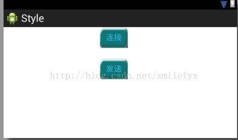
在安卓中有时需要自定义按钮风格显示,本例中界面上有两个按钮,用以显示自定义的按钮风格,设计界面如下:
除外为了完成自定义风格按钮的设计,我用photoshop简单设计了几张不同颜色的图片用以在按钮不同状态时显示,图片如下

图片名: ic_radiobutton.png,正常状态下按钮风格

图片名:ic_radiobuttonpressed.png,按钮被按下时候的风格

图片名:ic_radiobuttonselect.png,按钮被选中时候的风格

图片名:ic_radiobuttondisable.png,按钮不可用时候的风格
因为笔者美工有限所以图片仅为代码演示用,名字随便取得,仅供参考用。好了将以上几张图片放到工程drawable中,当然为了考虑不同的分辨率你可能需要准备不同大小的图片,放置后刷新,使其在工程中可见。随后就开始代码的设计啦。
在安卓中控件不同状态的不同背景由selector定义,在drawable中创建一个xml文件,名字可以根据爱好取,比如笔者使用button_selector_mybutton.xml,然后再文件中添加以下代码定义按钮不同状态下的风格:代码如下
<?xml version="1.0" encoding="utf-8"?>
<selector xmlns:android="http://schemas.android.com/apk/res/android" >
<item android:state_pressed="true"
android:drawable="@drawable/ic_radiobuttonpressed"></item>
<item android:state_focused="true"
android:state_enabled="true"
android:drawable="@drawable/ic_radiobuttonselect"/>
<item android:state_enabled="true"
android:drawable="@drawable/ic_radiobutton"></item>
<item android:state_focused="true"
android:drawable="@drawable/ic_radiobutton"/>
<item android:drawable="@drawable/ic_radiobutton"></item>
</selector>
然后再Style.xml文件中定义按钮样式,笔者代码如下:在Style.xml文件中添加如下信息:
<resources xmlns:android="http://schemas.android.com/apk/res/android">
<!--
Base application theme, dependent on API level. This theme is replaced
by AppBaseTheme from res/values-vXX/styles.xml on newer devices.
-->
<style name="AppBaseTheme" parent="android:Theme.Light">
<!--
Theme customizations available in newer API levels can go in
res/values-vXX/styles.xml, while customizations related to
backward-compatibility can go here.
-->
</style>
<!-- Application theme. -->
<style name="AppTheme" parent="AppBaseTheme">
<!-- All customizations that are NOT specific to a particular API-level can go here. -->
</style>
<style name="ButtonShap">
<item name="android:background">@drawable/button_selector_mybutton</item>
<item name="android:focusable">true</item>
<item name="android:clickable">true</item>
<item name="android:padding">10dip</item>
<item name="android:textColor">@android:color/black</item>
</style>
</resources>
之后再界面布局文件中指定按钮的style就可以啦!笔者代码如下:
<RelativeLayout xmlns:android="http://schemas.android.com/apk/res/android"
xmlns:tools="http://schemas.android.com/tools"
android:layout_width="match_parent"
android:layout_height="match_parent"
tools:context=".MainActivity" >
<Button
android:id="@+id/btn_send"
style="@style/ButtonShap"
android:layout_width="wrap_content"
android:layout_height="wrap_content"
android:layout_alignParentLeft="true"
android:layout_below="@+id/btn_conn"
android:layout_marginLeft="220dp"
android:layout_marginTop="24dp"
android:gravity="center"
android:text="@string/btn_send"
android:textColor="@android:color/holo_blue_light" />
<Button
android:id="@+id/btn_conn"
style="@style/ButtonShap"
android:layout_width="wrap_content"
android:layout_height="wrap_content"
android:layout_alignLeft="@+id/btn_send"
android:layout_alignParentTop="true"
android:gravity="center"
android:text="@string/btn_conn"
android:textColor="@android:color/holo_blue_light" />
</RelativeLayout>
除外为了完成自定义风格按钮的设计,我用photoshop简单设计了几张不同颜色的图片用以在按钮不同状态时显示,图片如下
图片名: ic_radiobutton.png,正常状态下按钮风格
图片名:ic_radiobuttonpressed.png,按钮被按下时候的风格
图片名:ic_radiobuttonselect.png,按钮被选中时候的风格
图片名:ic_radiobuttondisable.png,按钮不可用时候的风格
因为笔者美工有限所以图片仅为代码演示用,名字随便取得,仅供参考用。好了将以上几张图片放到工程drawable中,当然为了考虑不同的分辨率你可能需要准备不同大小的图片,放置后刷新,使其在工程中可见。随后就开始代码的设计啦。
在安卓中控件不同状态的不同背景由selector定义,在drawable中创建一个xml文件,名字可以根据爱好取,比如笔者使用button_selector_mybutton.xml,然后再文件中添加以下代码定义按钮不同状态下的风格:代码如下
<?xml version="1.0" encoding="utf-8"?>
<selector xmlns:android="http://schemas.android.com/apk/res/android" >
<item android:state_pressed="true"
android:drawable="@drawable/ic_radiobuttonpressed"></item>
<item android:state_focused="true"
android:state_enabled="true"
android:drawable="@drawable/ic_radiobuttonselect"/>
<item android:state_enabled="true"
android:drawable="@drawable/ic_radiobutton"></item>
<item android:state_focused="true"
android:drawable="@drawable/ic_radiobutton"/>
<item android:drawable="@drawable/ic_radiobutton"></item>
</selector>
然后再Style.xml文件中定义按钮样式,笔者代码如下:在Style.xml文件中添加如下信息:
<resources xmlns:android="http://schemas.android.com/apk/res/android">
<!--
Base application theme, dependent on API level. This theme is replaced
by AppBaseTheme from res/values-vXX/styles.xml on newer devices.
-->
<style name="AppBaseTheme" parent="android:Theme.Light">
<!--
Theme customizations available in newer API levels can go in
res/values-vXX/styles.xml, while customizations related to
backward-compatibility can go here.
-->
</style>
<!-- Application theme. -->
<style name="AppTheme" parent="AppBaseTheme">
<!-- All customizations that are NOT specific to a particular API-level can go here. -->
</style>
<style name="ButtonShap">
<item name="android:background">@drawable/button_selector_mybutton</item>
<item name="android:focusable">true</item>
<item name="android:clickable">true</item>
<item name="android:padding">10dip</item>
<item name="android:textColor">@android:color/black</item>
</style>
</resources>
之后再界面布局文件中指定按钮的style就可以啦!笔者代码如下:
<RelativeLayout xmlns:android="http://schemas.android.com/apk/res/android"
xmlns:tools="http://schemas.android.com/tools"
android:layout_width="match_parent"
android:layout_height="match_parent"
tools:context=".MainActivity" >
<Button
android:id="@+id/btn_send"
style="@style/ButtonShap"
android:layout_width="wrap_content"
android:layout_height="wrap_content"
android:layout_alignParentLeft="true"
android:layout_below="@+id/btn_conn"
android:layout_marginLeft="220dp"
android:layout_marginTop="24dp"
android:gravity="center"
android:text="@string/btn_send"
android:textColor="@android:color/holo_blue_light" />
<Button
android:id="@+id/btn_conn"
style="@style/ButtonShap"
android:layout_width="wrap_content"
android:layout_height="wrap_content"
android:layout_alignLeft="@+id/btn_send"
android:layout_alignParentTop="true"
android:gravity="center"
android:text="@string/btn_conn"
android:textColor="@android:color/holo_blue_light" />
</RelativeLayout>

相关文章推荐
- [教程]自定义sencha touch主题风格
- clayui界面库系列教程之一:做一个苹果风格的按钮
- ckeditor学习笔记4——解决自定义按钮文本问题
- Lance老师UI系列教程第五课->自定义风格单选多选对话框的实现
- Win8系统怎么自定义电源按钮图文教程
- 用CSS风格的文本和图形构建网页实用按钮
- android - 自定义标题栏(在标题栏中增加按钮和文本居中)
- linux GTK教程(消息机制/标签/按钮/图像/文本/对话框/菜单/容器)
- Windows 8实例教程系列 - 自定义应用风格 推荐
- Windows 8实例教程系列 - 自定义应用风格
- ActionScript自定义苹果风格圆角按钮
- Lance老师UI系列教程第五课->自定义风格单选多选对话框的实现
- (转自ztp800201) Android - 自定义标题栏(在标题栏中增加按钮和文本居中)
- winform 关于Messagebox自动定时关闭和自定义提示框总按钮上文本的问题的整理
- Windows 8实例教程系列 - 自定义应用风格
- 在Android中自定义IOS风格的按钮
- android - 自定义标题栏(在标题栏中增加按钮和文本居中)
- 安卓自定义按钮的实现
- 安卓自定义带图片按钮的实现
- 安卓自定义按钮图片 和形状