纯css3实现的圆形旋转分享按钮
2014-08-24 22:39
861 查看
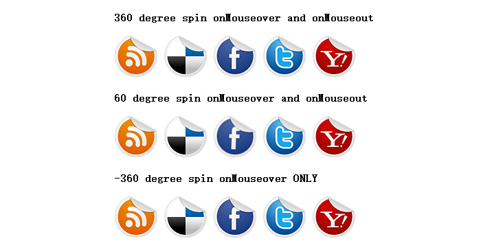
之前已经为大家介绍了好几款css3按钮,今天要为大家介绍的是一款纯css3实现的圆形旋转分享按钮。旋转的角度可以自己调整。在demo中演示了三个角度旋转。360度,60度,-360度。如图:
在线预览 源码下载
看下实现代码:
html代码:
css代码:
注:本文爱编程原创文章,转载请注明原文地址:/article/1211886.html
在线预览 源码下载
看下实现代码:
html代码:
<b>360 degree spin onMouseover and onMouseout</b></p>
<p id="socialicons">
<a href="http://www.w2bc.com/">
<img border="0" src="rss.png" /></a> <a href="http://www.w2bc.com/">
<img border="0" src="delicious.png" /></a> <a href="http://www.w2bc.com/">
<img border="0" src="facebook.png" /></a> <a href="http://www.w2bc.com/">
<img border="0" src="twitter.png" /></a> <a href="http://www.w2bc.com/">
<img border="0" src="yahoo.png" /></a>
</p>
<p>
<b>60 degree spin onMouseover and onMouseout</b></p>
<p id="socialicons2">
<a href="http://www.w2bc.com/">
<img border="0" src="rss.png" /></a> <a href="http://www.w2bc.com/">
<img border="0" src="delicious.png" /></a> <a href="http://www.w2bc.com/">
<img border="0" src="facebook.png" /></a> <a href="http://www.w2bc.com/">
<img border="0" src="twitter.png" /></a> <a href="http://www.w2bc.com/">
<img border="0" src="yahoo.png" /></a>
</p>
<p>
<b>-360 degree spin onMouseover ONLY</b></p>
<p id="socialicons3">
<a href="http://www.w2bc.com/">
<img border="0" src="rss.png" /></a> <a href="http://www.w2bc.com/">
<img border="0" src="delicious.png" /></a> <a href="http://www.w2bc.com/">
<img border="0" src="facebook.png" /></a> <a href="http://www.w2bc.com/">
<img border="0" src="twitter.png" /></a> <a href="http://www.w2bc.com/">
<img border="0" src="yahoo.png" /></a>
</p>
css代码:
p#socialicons img
{
/* 1st set of icons. Rotate them 360deg onmouseover and out */
-moz-transition: all 0.8s ease-in-out;
-webkit-transition: all 0.8s ease-in-out;
-o-transition: all 0.8s ease-in-out;
-ms-transition: all 0.8s ease-in-out;
transition: all 0.8s ease-in-out;
}

p#socialicons img:hover
{
-moz-transform: rotate(360deg);
-webkit-transform: rotate(360deg);
-o-transform: rotate(360deg);
-ms-transform: rotate(360deg);
transform: rotate(360deg);
}

p#socialicons2 img
{
/* 2nd set of icons. Rotate them 60deg onmouseover and out */
-moz-transition: all 0.2s ease-in-out;
-webkit-transition: all 0.2s ease-in-out;
-o-transition: all 0.2s ease-in-out;
-ms-transition: all 0.2s ease-in-out;
transition: all 0.2s ease-in-out;
}

p#socialicons2 img:hover
{
-moz-transform: rotate(70deg);
-webkit-transform: rotate(70deg);
-o-transform: rotate(70deg);
-ms-transform: rotate(70deg);
transform: rotate(70deg);
}

p#socialicons3 img
{
/* 3rd set of icons. Rotate them -360deg onmouseover ONLY. Note where the "transition prop is added */
}

p#socialicons3 img:hover
{
-moz-transition: all 0.5s ease-in-out;
-webkit-transition: all 0.5s ease-in-out;
-o-transition: all 0.5s ease-in-out;
-ms-transition: all 0.5s ease-in-out;
transition: all 0.5s ease-in-out;
-moz-transform: rotate(-360deg);
-webkit-transform: rotate(-360deg);
-o-transform: rotate(-360deg);
-ms-transform: rotate(-360deg);
transform: rotate(-360deg);
}注:本文爱编程原创文章,转载请注明原文地址:/article/1211886.html

相关文章推荐
- 一款纯css3实现的圆形旋转分享按钮旋转角度可自己调整
- 纯CSS3实现的顶部社会化分享按钮
- css3实现顶部社会化分享按钮示例
- 纯CSS3发光分享按钮的实现教程
- 【微信支付】分享一个失败的案例 跨域405(Method Not Allowed)问题 关于IM的一些思考与实践 基于WebSocketSharp 的IM 简单实现 【css3】旋转倒计时 【Html5】-- 塔台管制 H5情景意识 --飞机 谈谈转行
- 仿网易聚合新闻 - 超简单实现 - 刷新按钮CSS3旋转效果
- 一款基于jquery和css3实现的摩天轮式分享按钮
- 纯CSS3发光分享按钮的实现教程
- 用CSS3来实现社交分享按钮
- 用css3实现社交分享按钮
- 纯CSS3发光分享按钮的实现教程
- 使用jQuery和CSS3实现的“加载中”效果按钮 极客标签 - 做最棒的极客知识分享平台
- [HTML5-SVG]使用raphaeljs:代替css3实现qq空间关闭按钮旋转特效
- 分享来自Zocial的72个超棒免费CSS3按钮
- 分享10个实用的超绚CSS3按钮设计
- 推荐12个漂亮的 CSS3 按钮实现方案
- 分享一个CSS3实现的动态内容标签页切换效果教程
- 分享一个CSS3实现的动态内容标签页切换效果教程