TOP 10 PROGRAMMING FONTS
2014-04-18 12:39
411 查看
TOP 10 PROGRAMMING FONTS
SUNDAY, 17 MAY 2009 • PERMALINK
Update: This postwas written back in 2009, and much has changed since then. I’ve also written afew subsequent posts about alternative programming fonts, like this
one about Anonymous Pro.
I’m a typefacegeek, and when it comes to selecting a font I’ll stare at all day, I tend to bepretty picky. Recently, when I discovered that a friend was using a sub partypeface (too horrible to name here) for his
Terminal and coding windows, myjaw dropped, my heart sank a little, and I knew it was due time for me tocompose this article.
What follows isa round-up of the top 10 readily-available monospace fonts. Many of these fontsare bundled along with modern operating systems, but most are free for downloadon the web. A few, notably Consolas, are
part of commercial software.
A NOTE ABOUT ANTI-ALIASING
In the past,we’ve had to decide between tiny monospace fonts or jagged edges. But today,modern operating systems do a great job of anti-aliasing, making monospacefonts look great at any size. It’s not 1990 anymore.
Give your tired eyes abreak and bump up that font size.
If you have anydoubt that anti-aliased fonts are apropos for code, note that even thevenerable BBEdit — which for years has shipped with un-aliased Monaco 9 set asthe default — has made the jump. The app now ships
with a specially licensedversion of the Consolas font from Ascender, bumped up in size, and withanti-aliasing on by default. Panicincludes a special anti-aliased
font(Panic Sans, which is actually just a version of Deja Vu Sans Mono) with itspopular Coda application.
Unless otherwisenoted, I’ve used a larger size font, 15-point in fact, for the examples here toillustrate their legibility at larger sizes and with anti-aliasing turned on.
10. COURIER
All systems shipwith a version of Courier (sometimes Courier New), and unfortunately, many haveit set as the default font for terminal and editor windows. It does the job,but it’s a bit dull and boring, lacking style
and class. I don’t recommend thisfont if you have any other choice — and fortunately, you do. If you use thisfont, please bump the size and turn on anti-aliasing.
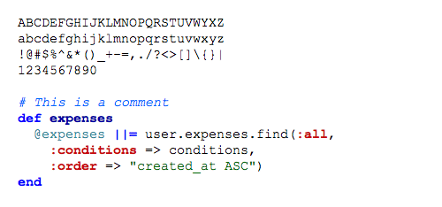
Figure 1 Courier New
9. ANDALE MONO
A bit betterthan the Courier family, Andale Mono is still relegated to the “default font”category as it ships with some systems, and you wouldn’t want to download oruse it if it wasn’t already there. The character-spacing
is a bit too clumsyand the letters are a bit too wide for my tastes.
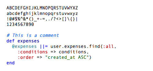
Figure 2 Andale Mono
8. MONACO
Monaco is thedefault monospace font on the Mac and has been since its inclusion in System6. It’s
a solid, workhorse font that really shines at smaller fontsizes with anti-aliasing turned off. I loved this typeface backwhen my eyes could tolerate staring at a 9-point font for hours, but those daysare behind me. This font looks great at 9 or 10-points
(Figure 4), and doesn’tlook too shabby anti-aliased at higher sizes (Figure 3).
As far as Iknow, you can only get Monaco as a part of Mac OS, but there are alternatives,so keep reading.
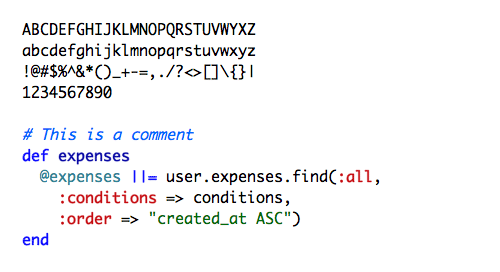
Figure 3 Monaco

Figure 4 Monaco 9-point, without anti-aliasing
7. PROFONT
Profont isa Monaco-like bitmap font available for Mac, Windows, and Linux (there’s also a modifiedversion
for Mac OS X called ProFontX by a different author).They’re best at smaller sizes, and make a great alternative to Monaco if you’reon a non-Mac platform and want really tiny fonts and the eyestrain that goesalong with them.
Profont (andProFontX) is intended for use at 9-points with anti-aliasing turned off.
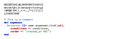
Figure 5 Profont 9-point, without anti-aliasing
6. MONOFUR
原文地址:http://hivelogic.com/articles/top-10-programming-fonts点击打开链接
Monofur isa unique monospace font that looks great anti-aliased at all sizes. It’s a funfont with
a distinct look that is vaguely reminiscent of Sun’s OPEN LOOK windowmanager, which ran Solaris (aka SunOS) systems back in the late 80’s.
If you’relooking for something a bit different, try this font, but make sure you haveanti-aliasing turned on, even at small sizes.
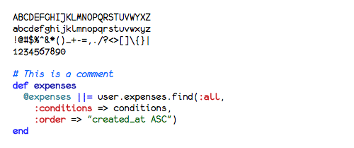
Figure 6 Monofur
5. PROGGY
Proggy is a clean monospace font thatseems to be favored by Windows users, although
it works fine on a Mac. It’s aclean font intended to be used only at smaller points, and withoutanti-aliasing.
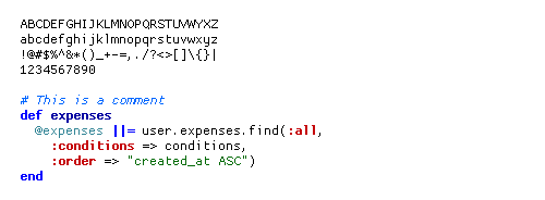
Figure 7 Proggy Clean at 15-point (yes, 15-point), without anti-aliasing
4. DROID SANS MONO
The Droidfont family (available for download here)
is a nice font family designed for useon the small screens of mobile handsets, like Android,and licensed under the Apache license.
Droid Sans Monomakes for a great programming font. It’s got a bit of flair, and stands outamong the other monospace fonts I’ve listed, and its only real flaw is the lackof a slashed zero.
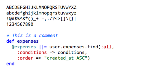
Figure 8 Droid Sans Mono
3. DEJA VU SANS MONO
The Deja Vu family of fonts are one of myfavorite free font families, based on
the excellent Vera Font family.The Deja Vu fonts have been updated with a wider range of characters whilemaintaining a similar look and feel to that
of Vera.
This was mygo-to font family for many years. It looks great at any size with anti-aliasingturned on.
Panic shipsa font with it’s Coda application called “Panic Sans” which is based on thisfont. Gruber saysvia
email that when he compared Panic Sans against Vera, he noted that “Panichad noticeably crisper punctuation chars” and that it seemed like they hadimproved the hinting on some characters as well.
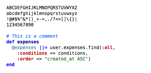
Figure 9 Deja Vu Sans Mono
2. CONSOLAS
Consolas suddenly appeared on my Macafter I installed Microsoft Office, along
with a handful of other new fontsfrom Microsoft.
This font wasdesigned by Luc(as) de Groot for Microsoft’sClearType font family
(there’s a nice write-up with samples of each of the newMicrosoft fonts here). Consolas is a commercial
font, but isbundled with many Microsoft products, so there’s a good chance you mightalready have it on your system.
You’ll absolutelywant to have anti-aliasing turned on if you’re using Consolas, because it’lllook terrible without it.
Too bad it’s notfree … if it was, it would be #1 on this list.
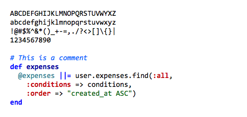
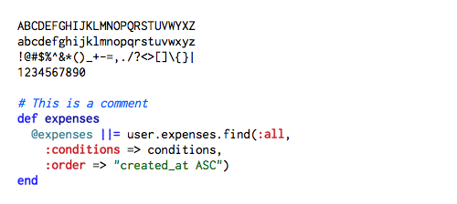
Figure 10 Consolas
1. INCONSOLATA
Inconsolata is my favorite monospacedfont, and it’s free. Shortly after discovering
it, it quickly supplanted DejaVu Sans Mono as my go-to programming font. I use it everywhere, from Terminalwindows to code editors. It has a certain sublime style that’s unique withoutbeing over the top, and it looks fantastic at both large and small sizes.
I usethis font when I show code samples in a presentation, and it’s the font we usein Terminal and TextMate windows when filming PeepCode screencasts.
Inconsolata isdesigned to be used with anti-aliasing enabled, but it’s surprisingly legibleeven at very small sizes. A big thanks to Raph
Levienfor creating this font, and formaking it free.
SUNDAY, 17 MAY 2009 • PERMALINK
Update: This postwas written back in 2009, and much has changed since then. I’ve also written afew subsequent posts about alternative programming fonts, like this
one about Anonymous Pro.
I’m a typefacegeek, and when it comes to selecting a font I’ll stare at all day, I tend to bepretty picky. Recently, when I discovered that a friend was using a sub partypeface (too horrible to name here) for his
Terminal and coding windows, myjaw dropped, my heart sank a little, and I knew it was due time for me tocompose this article.
What follows isa round-up of the top 10 readily-available monospace fonts. Many of these fontsare bundled along with modern operating systems, but most are free for downloadon the web. A few, notably Consolas, are
part of commercial software.
A NOTE ABOUT ANTI-ALIASING
In the past,we’ve had to decide between tiny monospace fonts or jagged edges. But today,modern operating systems do a great job of anti-aliasing, making monospacefonts look great at any size. It’s not 1990 anymore.
Give your tired eyes abreak and bump up that font size.
If you have anydoubt that anti-aliased fonts are apropos for code, note that even thevenerable BBEdit — which for years has shipped with un-aliased Monaco 9 set asthe default — has made the jump. The app now ships
with a specially licensedversion of the Consolas font from Ascender, bumped up in size, and withanti-aliasing on by default. Panicincludes a special anti-aliased
font(Panic Sans, which is actually just a version of Deja Vu Sans Mono) with itspopular Coda application.
Unless otherwisenoted, I’ve used a larger size font, 15-point in fact, for the examples here toillustrate their legibility at larger sizes and with anti-aliasing turned on.
10. COURIER
All systems shipwith a version of Courier (sometimes Courier New), and unfortunately, many haveit set as the default font for terminal and editor windows. It does the job,but it’s a bit dull and boring, lacking style
and class. I don’t recommend thisfont if you have any other choice — and fortunately, you do. If you use thisfont, please bump the size and turn on anti-aliasing.
Figure 1 Courier New
9. ANDALE MONO
A bit betterthan the Courier family, Andale Mono is still relegated to the “default font”category as it ships with some systems, and you wouldn’t want to download oruse it if it wasn’t already there. The character-spacing
is a bit too clumsyand the letters are a bit too wide for my tastes.
Figure 2 Andale Mono
8. MONACO
Monaco is thedefault monospace font on the Mac and has been since its inclusion in System6. It’s
a solid, workhorse font that really shines at smaller fontsizes with anti-aliasing turned off. I loved this typeface backwhen my eyes could tolerate staring at a 9-point font for hours, but those daysare behind me. This font looks great at 9 or 10-points
(Figure 4), and doesn’tlook too shabby anti-aliased at higher sizes (Figure 3).
As far as Iknow, you can only get Monaco as a part of Mac OS, but there are alternatives,so keep reading.
Figure 3 Monaco
Figure 4 Monaco 9-point, without anti-aliasing
7. PROFONT
Profont isa Monaco-like bitmap font available for Mac, Windows, and Linux (there’s also a modifiedversion
for Mac OS X called ProFontX by a different author).They’re best at smaller sizes, and make a great alternative to Monaco if you’reon a non-Mac platform and want really tiny fonts and the eyestrain that goesalong with them.
Profont (andProFontX) is intended for use at 9-points with anti-aliasing turned off.
Figure 5 Profont 9-point, without anti-aliasing
6. MONOFUR
原文地址:http://hivelogic.com/articles/top-10-programming-fonts点击打开链接
Monofur isa unique monospace font that looks great anti-aliased at all sizes. It’s a funfont with
a distinct look that is vaguely reminiscent of Sun’s OPEN LOOK windowmanager, which ran Solaris (aka SunOS) systems back in the late 80’s.
If you’relooking for something a bit different, try this font, but make sure you haveanti-aliasing turned on, even at small sizes.
Figure 6 Monofur
5. PROGGY
Proggy is a clean monospace font thatseems to be favored by Windows users, although
it works fine on a Mac. It’s aclean font intended to be used only at smaller points, and withoutanti-aliasing.
Figure 7 Proggy Clean at 15-point (yes, 15-point), without anti-aliasing
4. DROID SANS MONO
The Droidfont family (available for download here)
is a nice font family designed for useon the small screens of mobile handsets, like Android,and licensed under the Apache license.
Droid Sans Monomakes for a great programming font. It’s got a bit of flair, and stands outamong the other monospace fonts I’ve listed, and its only real flaw is the lackof a slashed zero.
Figure 8 Droid Sans Mono
3. DEJA VU SANS MONO
The Deja Vu family of fonts are one of myfavorite free font families, based on
the excellent Vera Font family.The Deja Vu fonts have been updated with a wider range of characters whilemaintaining a similar look and feel to that
of Vera.
This was mygo-to font family for many years. It looks great at any size with anti-aliasingturned on.
Panic shipsa font with it’s Coda application called “Panic Sans” which is based on thisfont. Gruber saysvia
email that when he compared Panic Sans against Vera, he noted that “Panichad noticeably crisper punctuation chars” and that it seemed like they hadimproved the hinting on some characters as well.
Figure 9 Deja Vu Sans Mono
2. CONSOLAS
Consolas suddenly appeared on my Macafter I installed Microsoft Office, along
with a handful of other new fontsfrom Microsoft.
This font wasdesigned by Luc(as) de Groot for Microsoft’sClearType font family
(there’s a nice write-up with samples of each of the newMicrosoft fonts here). Consolas is a commercial
font, but isbundled with many Microsoft products, so there’s a good chance you mightalready have it on your system.
You’ll absolutelywant to have anti-aliasing turned on if you’re using Consolas, because it’lllook terrible without it.
Too bad it’s notfree … if it was, it would be #1 on this list.
Figure 10 Consolas
1. INCONSOLATA
Inconsolata is my favorite monospacedfont, and it’s free. Shortly after discovering
it, it quickly supplanted DejaVu Sans Mono as my go-to programming font. I use it everywhere, from Terminalwindows to code editors. It has a certain sublime style that’s unique withoutbeing over the top, and it looks fantastic at both large and small sizes.
I usethis font when I show code samples in a presentation, and it’s the font we usein Terminal and TextMate windows when filming PeepCode screencasts.
Inconsolata isdesigned to be used with anti-aliasing enabled, but it’s surprisingly legibleeven at very small sizes. A big thanks to Raph
Levienfor creating this font, and formaking it free.

相关文章推荐
- 10 篇对初学者和专家都有用的 Linux 命令教程
- Linux 与 Windows 对UNICODE 的处理方式
- Ubuntu12.04下QQ完美走起啊!走起啊!有木有啊!
- 解決Linux下Android开发真机调试设备不被识别问题
- 运维入门
- 运维提升
- Linux 自检和 SystemTap
- Ubuntu Linux使用体验
- c语言实现hashmap(转载)
- Linux 信号signal处理机制
- linux下mysql添加用户
- Scientific Linux 5.5 图形安装教程
- 基于 Linux 集群环境上 GPFS 的问题诊断
- 谁是桌面王者?Win PK Linux三大镇山之宝
- vivi下重新调整分区
- Linux VS Unix:Linux欲一统天下 Unix不死
- MyEclipse Web Project转Eclipse Dynamic Web Project
- Windows Clang开发环境备忘
- linux下设定环境变量