2014-2-3TextView及其子类1
2014-02-03 19:37
113 查看
1. 文本框TextView
TextView直接继承了View,它还是EditText、Button两个UI组件类的父类。
TextView是显示文本,EditText可以允许用户编辑文本。
TextView还派生了一个CheckedTextView,增加了checked(可勾选)状态。
另外,TextView还派生出Button类。
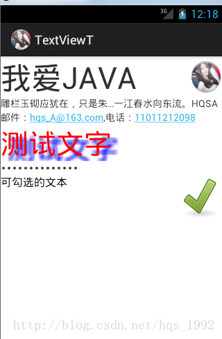
实例:不同颜色、字体、带链接的文本
Xml代码清单:
<?xml
version="1.0"encoding="utf-8"?>
<LinearLayout
xmlns:android="http://schemas.android.com/apk/res/android"
android:layout_width="match_parent"
android:layout_height="match_parent"
android:orientation="vertical">
<!--
设置字号为20pt,文本框结尾处绘制图片 -->
<TextView
android:layout_width="fill_parent"
android:layout_height="wrap_content"
android:text="我爱JAVA"
android:textSize="20pt"
android:drawableEnd="@drawable/ic_launcher"
/>
<!--
设置中间省略,所有字母大写 -->
<TextView
android:layout_width="fill_parent"
android:layout_height="wrap_content"
android:singleLine="true"
android:text="雕栏玉砌应犹在,只是朱颜改。问君能有几多愁?恰似一江春水向东流。hqsA"
android:textAllCaps="true"
android:ellipsize="middle"
/>
<!--
对邮件、电话添加链接 -->
<TextView
android:layout_width="fill_parent"
android:layout_height="wrap_content"
android:singleLine="true"
android:text="邮件:hqs_A@163.com,电话:11011212098"
android:autoLink="email|phone"
/>
<!--
设置文字颜色、大小,并使用阴影 -->
<TextView
android:layout_width="fill_parent"
android:layout_height="wrap_content"
android:text="测试文字"
android:shadowColor="#00f"
android:shadowDx="10.0"
android:shadowDy="8.0"
android:shadowRadius="3.0"
android:textColor="#F00"
android:textSize="18pt"
/>
<!--
测试密码框 -->
<TextView
android:id="@+id/password"
android:layout_width="fill_parent"
android:layout_height="wrap_content"
android:text="@string/hello"
android:password="true"
/>
<CheckedTextView
android:layout_width="fill_parent"
android:layout_height="wrap_content"
android:text="可勾选的文本"
android:checkMark="@drawable/ok"
/>"
</LinearLayout>
JAVA代码清单略
效果图:
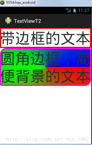
2.圆角边框、渐变背景TextView
TextView是不带边框的,如果想为TextView添加边框,只能“曲线救国”——为TextView设置一个背景,该DrawView只是一个边框,就可实现带边框的TextView.
实例:
Xml界面布局文件代码清单:
<?xml
version="1.0"encoding="utf-8"?>
<LinearLayout
xmlns:android="http://schemas.android.com/apk/res/android"
android:orientation="vertical"
android:layout_width="fill_parent"
android:layout_height="fill_parent"
>
<!--
通过android:background指定背景 -->
<TextView
android:layout_width="fill_parent"
android:layout_height="wrap_content"
android:text="带边框的文本"
android:textSize="24pt"
android:background="@drawable/bg_border"
/>
<!--
通过android:drawable绘制一张图片 -->
<TextView
android:layout_width="fill_parent"
android:layout_height="wrap_content"
android:text="圆角边框,简便背景的文本"
android:textSize="24pt"
android:background="@drawable/bg_border2"
/>
</LinearLayout>
上面代码定义了两个TextView,其中第一个指定背景,第二个指定使用圆角边框、渐变背景。第一个文本框指定的背景是由xml文件定义的,将该文件放在drawable_mdpi文件夹内,该xml文件也可当成Drawable使用。代码为:
<?xml
version="1.0"encoding="utf-8"?>
<shape
xmlns:android="http://schemas.android.com/apk/res/android">
<!--
设置背景色为透明色 -->
<solid
android:color="#0000"/>
<!--
设置红色边框 -->
<stroke
android:width="4px"android:color="#f00"
/>
</shape>
第二个文本框指定背景由xml文件定义的,将该文件放在drawable_mdpi文件夹内,该xml文件也可当成Drawable使用。代码为:
<?xml
version="1.0"encoding="utf-8"?>
<shape
xmlns:android="http://schemas.android.com/apk/res/android"
android:shape="rectangle">
<!--
指定圆角矩形的4个圆角的半径 -->
<corners
android:topLeftRadius="20px"
android:topRightRadius="5px"
android:bottomRightRadius="20px"
android:bottomLeftRadius="5px"/>
<!--
指定边框线条的宽带和颜色 -->
<stroke
android:width="4px"android:color="#f0f"/>
<!--
指定使用渐变背景色,使用sweep类型的渐变
颜色从红色→绿色→蓝色 -->
<gradient
android:startColor="#f00"
android:centerColor="#0f0"
android:endColor="#00f"
android:type="sweep"/>
</shape>
效果:
TextView直接继承了View,它还是EditText、Button两个UI组件类的父类。
TextView是显示文本,EditText可以允许用户编辑文本。
TextView还派生了一个CheckedTextView,增加了checked(可勾选)状态。
另外,TextView还派生出Button类。
实例:不同颜色、字体、带链接的文本
Xml代码清单:
<?xml
version="1.0"encoding="utf-8"?>
<LinearLayout
xmlns:android="http://schemas.android.com/apk/res/android"
android:layout_width="match_parent"
android:layout_height="match_parent"
android:orientation="vertical">
<!--
设置字号为20pt,文本框结尾处绘制图片 -->
<TextView
android:layout_width="fill_parent"
android:layout_height="wrap_content"
android:text="我爱JAVA"
android:textSize="20pt"
android:drawableEnd="@drawable/ic_launcher"
/>
<!--
设置中间省略,所有字母大写 -->
<TextView
android:layout_width="fill_parent"
android:layout_height="wrap_content"
android:singleLine="true"
android:text="雕栏玉砌应犹在,只是朱颜改。问君能有几多愁?恰似一江春水向东流。hqsA"
android:textAllCaps="true"
android:ellipsize="middle"
/>
<!--
对邮件、电话添加链接 -->
<TextView
android:layout_width="fill_parent"
android:layout_height="wrap_content"
android:singleLine="true"
android:text="邮件:hqs_A@163.com,电话:11011212098"
android:autoLink="email|phone"
/>
<!--
设置文字颜色、大小,并使用阴影 -->
<TextView
android:layout_width="fill_parent"
android:layout_height="wrap_content"
android:text="测试文字"
android:shadowColor="#00f"
android:shadowDx="10.0"
android:shadowDy="8.0"
android:shadowRadius="3.0"
android:textColor="#F00"
android:textSize="18pt"
/>
<!--
测试密码框 -->
<TextView
android:id="@+id/password"
android:layout_width="fill_parent"
android:layout_height="wrap_content"
android:text="@string/hello"
android:password="true"
/>
<CheckedTextView
android:layout_width="fill_parent"
android:layout_height="wrap_content"
android:text="可勾选的文本"
android:checkMark="@drawable/ok"
/>"
</LinearLayout>
JAVA代码清单略
效果图:
2.圆角边框、渐变背景TextView
TextView是不带边框的,如果想为TextView添加边框,只能“曲线救国”——为TextView设置一个背景,该DrawView只是一个边框,就可实现带边框的TextView.
实例:
Xml界面布局文件代码清单:
<?xml
version="1.0"encoding="utf-8"?>
<LinearLayout
xmlns:android="http://schemas.android.com/apk/res/android"
android:orientation="vertical"
android:layout_width="fill_parent"
android:layout_height="fill_parent"
>
<!--
通过android:background指定背景 -->
<TextView
android:layout_width="fill_parent"
android:layout_height="wrap_content"
android:text="带边框的文本"
android:textSize="24pt"
android:background="@drawable/bg_border"
/>
<!--
通过android:drawable绘制一张图片 -->
<TextView
android:layout_width="fill_parent"
android:layout_height="wrap_content"
android:text="圆角边框,简便背景的文本"
android:textSize="24pt"
android:background="@drawable/bg_border2"
/>
</LinearLayout>
上面代码定义了两个TextView,其中第一个指定背景,第二个指定使用圆角边框、渐变背景。第一个文本框指定的背景是由xml文件定义的,将该文件放在drawable_mdpi文件夹内,该xml文件也可当成Drawable使用。代码为:
<?xml
version="1.0"encoding="utf-8"?>
<shape
xmlns:android="http://schemas.android.com/apk/res/android">
<!--
设置背景色为透明色 -->
<solid
android:color="#0000"/>
<!--
设置红色边框 -->
<stroke
android:width="4px"android:color="#f00"
/>
</shape>
第二个文本框指定背景由xml文件定义的,将该文件放在drawable_mdpi文件夹内,该xml文件也可当成Drawable使用。代码为:
<?xml
version="1.0"encoding="utf-8"?>
<shape
xmlns:android="http://schemas.android.com/apk/res/android"
android:shape="rectangle">
<!--
指定圆角矩形的4个圆角的半径 -->
<corners
android:topLeftRadius="20px"
android:topRightRadius="5px"
android:bottomRightRadius="20px"
android:bottomLeftRadius="5px"/>
<!--
指定边框线条的宽带和颜色 -->
<stroke
android:width="4px"android:color="#f0f"/>
<!--
指定使用渐变背景色,使用sweep类型的渐变
颜色从红色→绿色→蓝色 -->
<gradient
android:startColor="#f00"
android:centerColor="#0f0"
android:endColor="#00f"
android:type="sweep"/>
</shape>
效果:

相关文章推荐
- Android用户界面 UI组件--TextView及其子类(三) EditView以及各种Span文字样式讲解
- 1. 2 Textview 及其子类
- AndroidUI控件之TextView及其子类
- Android用户界面 UI组件--TextView及其子类(三) EditView以及各种Span文字样式讲解
- Android用户界面 UI组件--TextView及其子类(五) DigitalClock,AnalogClock,RadioButton,CheckBox,ToggleButton汇总
- 2014-2-6TextView及其子类3
- Android用户界面 UI组件--TextView及其子类(四) Chronometer计时器
- Android用户界面 UI组件--TextView及其子类(五) DigitalClock,AnalogClock,RadioButton,CheckBox,ToggleButton汇总
- Android用户界面 UI组件--TextView及其子类(四) Chronometer计时器
- UI组件(2):TextView及其子类
- UI组件之TextView及其子类(一)TextView和EditText
- UI组件之TextView及其子类(四)AnalogClock,DigitalClock
- android基础-TextView及其子类、ImageView及其子类
- Android用户界面 UI组件--TextView及其子类(一) TextView
- 二、Android应用的界面编程(七)ViewAnimator及其子类[ ViewSwitcher、ImageSwitcher、TextSwitcher、ViewFlipper ]
- Android控件之TextView及其子类
- TextView及其子类
- Android用户界面 UI组件--TextView及其子类(一) TextView
- UI组件之TextView及其子类(三)ToggleButton和Switch
- UI组件之TextView及其子类(一)