flot - jQuery 图表插件(jquery.flot)使用
2014-01-02 20:37
344 查看
Flot是纯Javascript实现的基于jQuery的图表插件,主要支持线状图和柱状图的绘制(通过插件也可以支持饼状图)。
它的特点是使用简单、图形美观,支持鼠标跟踪及缩放功能。
Flot是基于canvas进行图表的绘制,可以在IE6+/Firefox2+/Safari3+/Opera9.5+/Chrome等主流浏览器上运行;其中IE9以下浏览器不支持canvas标记,需要额外引用excanvas库(VML)来实现。
首先,在页面头部引用脚本:
在页面中创建一个html标记,如div,然后通过样式来指定图表的大小:
最后,在DOM Ready事件中调用Flot的绘制方法$.plot:
这样就简单的绘制了一条线。
flot的数据格式是数组,数组中包含多个系列的数据,每个系列的数据对应一条线:
每一个系列的数据可以是一个数组或者对象。
数组格式的数据,每一个点都是一个数组(分x/y轴):
如下定义了三个点:
绘制图表的时候,会把这三个点连接起来;假如中间有个点使用了空值即null,这个点的两边则不会连接起来:
需要注意的是,每个点的数据必须是数字,如果是字符串,可能会得到奇怪的错误。
对象格式的数据,如下:
通常不需要关心其他选项,只需要指定label和data:
对象格式的数据提供更大的灵活性,也更有利于代码的可读性,如下定义了两个系列即两条线:
所有的选项都是可选的,改变某个属性,只需要指定特定的属性名称:
通过legend参数的labelFormatter参数来格式化图例的显示,其中series为一个对象(属性参考对象格式的数据):
自定义刻度的显示,可以通过ticks参数来设置,如下定义X轴:
这样轴上只会显示以上定义的刻度。当有时候数据超出这个范围时,部分刻度会被隐藏,这时候就需要手动指定min/max参数,如下:
ticks参数还可以定制刻度显示的文字:
最强大的还是通过自定义函数,通过tickFormatter参数:
如下,绘制两个y轴,同时需要在数据中指定属于哪个轴:
使用时间格式的数据需要引用jquery.flot.time.js,它支持以下格式的时间格式化:
还支持自定义月份、一周中每一天的名称:
使用如下:
当然,如果不使用timeformat的话,也可以用tickFormatter来格式化显示:
可能需要在同一个点上进行时间的对比,比如x轴:
在以上方法中,把x轴和x轴刻度的值一一对应,当然也可以换成y轴。
通过series参数,可以控制线的填充、点的显示(点默认是不显示的):
flot有多个参数都用到了颜色,均可以通过定义单个、或多个颜色来控制每个数据呈现的颜色:
再比如网格的背景色:
颜色还有更加详细的选项来定义:
主要有鼠标移动和点击事件,需要先开启相应开关:
然后再绑定相应的事件,如点击事件:
plothover事件的的绑定也一样。item对象主要有以下属性:
highlight(series, datapoint):高亮显示point
unhighlight(series, datapoint) or unhighlight():取消高亮point,没有参数则取消高亮当前的point
setData(data):重新设置数据,需要调用draw()方法来重绘
setupGrid():重新计算坐标、轴,需要调用draw()方法来重绘
draw():重绘图表
triggerRedrawOverlay():更新可交互的区域,如point
width()/height():获取宽高
offset():获取偏移
pointOffset({ x: xpos, y: ypos }):获取某个点相对于placeholder的div的偏移
resize():调整图表的大小
shutdown():清理即取消绑定所有事件处理函数
还有一些其他函数,但需要你比较了解flot内部运作,否则可能产生不好的结果:
getData():获取数据,即在$.plot方法中定义的数据
getAxes():获取坐标轴
getPlaceholder():获取placeholder元素
getCanvas():获取canvas对象
getPlotOffset():获取偏移
getOptions():获取设置的选项
如highlight方法,就可以在click事件中使用:
flot还提供了一些函数,用于在绘图各个流程步骤中进行一些额外的处理,这里不再列出。
它的特点是使用简单、图形美观,支持鼠标跟踪及缩放功能。
Flot是基于canvas进行图表的绘制,可以在IE6+/Firefox2+/Safari3+/Opera9.5+/Chrome等主流浏览器上运行;其中IE9以下浏览器不支持canvas标记,需要额外引用excanvas库(VML)来实现。
基本使用
首先,在页面头部引用脚本:<div id="placeholder" style="width:600px;height:300px;"></div>
最后,在DOM Ready事件中调用Flot的绘制方法$.plot:
$(function () {
$.plot($("#placeholder"), [[[0, 0], [1, 2]]]);
});
这样就简单的绘制了一条线。
数据格式
flot的数据格式是数组,数组中包含多个系列的数据,每个系列的数据对应一条线:[ series1, series2, ... ]
每一个系列的数据可以是一个数组或者对象。
数组格式的数据,每一个点都是一个数组(分x/y轴):
[ [x1, y1], [x2, y2], ... ]
如下定义了三个点:
[ [1, 3], [2, 14.01], [3.5, 3.14] ]
绘制图表的时候,会把这三个点连接起来;假如中间有个点使用了空值即null,这个点的两边则不会连接起来:
[ [1, 3], [2, 14.01], null, [3.5, 3.14], [5, 8] ]
需要注意的是,每个点的数据必须是数字,如果是字符串,可能会得到奇怪的错误。
对象格式的数据,如下:
{
color: color or number  //颜色,如果不设置会自动生成
data: rawdata //数据
label: string //用于图例说明
lines: specific lines options
bars: specific bars options
points: specific points options
xaxis: number
yaxis: number
clickable: boolean
hoverable: boolean
shadowSize: number
highlightColor: color or number
}
通常不需要关心其他选项,只需要指定label和data:
{
label: "y = 3",
data: [[0, 3], [10, 3]]
}
对象格式的数据提供更大的灵活性,也更有利于代码的可读性,如下定义了两个系列即两条线:
[ { label: "Foo", data: [ [10, 1], [17, -14], [30, 5] ] },
{ label: "Bar", data: [ [11, 13], [19, 11], [30, -7] ] }
]
选项设置
所有的选项都是可选的,改变某个属性,只需要指定特定的属性名称:{
// 自定义数据系列
series: {
//共有属性:点、线、柱状图的显示方式
lines, points, bars: {
// 是否显示
show: boolean
// 线宽度
lineWidth: number
// 是否填充
fill: boolean or number
// 填充色,如rgba(255, 255, 255, 0.8)
fillColor: null or color/gradient
}
// 只针对点的属性
points: {
//点的半径
radius: number
// 绘制点的方法,默认为内置的圆形,可以通过自定义函数来定义其他形状
symbol: "circle" or function
}
// 只针对柱状图的属性
bars: {
barWidth: number
align: "left", "right" or "center"
horizontal: boolean
}
// 只针对线的属性
lines: {
// 指定两个点之间是用水平线还是垂直线连接
steps: boolean
}
// 设置阴影的大小,0消除阴影
shadowSize: number
// 鼠标悬停时的颜色
highlightColor: color or number
}
// 设置各个对应的数据序列,即线的颜色
colors: [ color1, color2, ... ]
// 网格设置
grid: {
// 是否显示格子
show: boolean
// 数据的线是否绘制在网格线下
aboveData: boolean
// 网格线颜色
color: color
// 网格背景颜色
backgroundColor: color/gradient or null
margin: number or margin object({top,left,bottom,right})
// 刻度与网格间距
labelMargin: number
axisMargin: number
markings: array of markings or (fn: axes -> array of markings)
// 边框宽度
borderWidth: number
// 边框颜色
borderColor: color or null
minBorderMargin: number or null
// 监听鼠标点击,会生成plotclick事件
clickable: boolean
// 监听鼠标移动,会生成plothover事件
hoverable: boolean
// 鼠标附近元素高亮显示
autoHighlight: boolean
mouseActiveRadius: number
}
interaction: {
// 最大重绘延迟
redrawOverlayInterval: number or -1
}
// x,y轴的设置
xaxis, yaxis: {
show: null or true/false
// 刻度文字显示的位置
position: "bottom" or "top" or "left" or "right"
// 设置成time类型时可以用时间作为数据
mode: null or "time" ("time" requires jquery.flot.time.js plugin)
// 时区,仅用于time模式
timezone: null, "browser" or timezone (only makes sense for mode: "time")
// 轴文字和刻度文字颜色
color: null or color spec
// 单独定义刻度文字颜色
tickColor: null or color spec
font: null or font spec object
// 最大最小只范围,不设置则自动计算
min: null or number
max: null or number
autoscaleMargin: null or number
// 对数据进行计算后再绘制
transform: null or fn: number -> number
inverseTransform: null or fn: number -> number
// 用于自定义刻度显示
ticks: null or number or ticks array or (fn: axis -> ticks array)
tickSize: number or array
minTickSize: number or array
// 格式化刻度显示
tickFormatter: (fn: number, object -> string) or string
// 刻度显示精确度,即小数位数
tickDecimals: null or number
// 刻度区域大小
labelWidth: null or number
labelHeight: null or number
reserveSpace: null or true
tickLength: null or number
alignTicksWithAxis: null or number
}
// 定义多个坐标轴
xaxes: []
yaxes: []
// 图例
legend: {
show: boolean
// 格式化图例的显示
labelFormatter: null or (fn: string, series object -> string)
labelBoxBorderColor: color
noColumns: number
position: "ne" or "nw" or "se" or "sw"
margin: number of pixels or [x margin, y margin]
backgroundColor: null or color
backgroundOpacity: number between 0 and 1//图例的容器,用于从图表中分离 container: null or jQuery object/DOM element/jQuery expression sorted: null/false, true, "ascending", "descending" or a comparator } }
格式化图例的显示
通过legend参数的labelFormatter参数来格式化图例的显示,其中series为一个对象(属性参考对象格式的数据):labelFormatter: function (label, series) {
// series is the series object for the label
return '<a href="#' + label + '" title="' + series.label + '">' + label + '</a>';
}
轴的设置
自定义刻度的显示,可以通过ticks参数来设置,如下定义X轴:xaxis: {
ticks: [0, 2, 4, 8, 10, 15]
}这样轴上只会显示以上定义的刻度。当有时候数据超出这个范围时,部分刻度会被隐藏,这时候就需要手动指定min/max参数,如下:
$.plot($("#placeholder"),
[{ label: "Foo", data: [[10, 1], [17, -14], [30, 5]] },
{ label: "Bar", data: [[11, 13], [19, 11], [30, -7]] }
],
{
xaxis: {
ticks: [0, 2, 4, 8, 10, 15],
min: 0,
max: 30
}
}
);
ticks参数还可以定制刻度显示的文字:
ticks: [[0, "零"], [2, "二"], [4, "四"], [8, "八"], [10, "十"], [15, "十五"]]
最强大的还是通过自定义函数,通过tickFormatter参数:
tickFormatter: function(axis) {
return "数字" + axis.toString();
}
绘制多个刻度轴
如下,绘制两个y轴,同时需要在数据中指定属于哪个轴:$.plot($("#placeholder"),
[ { label: "Foo", data: [[10, 1], [17, -14], [30, 5]] },
{ label: "Bar", data: [[11, 13], [19, 11], [30, -7]] },
{ label: "Three", data: [[2, 6], [5, 8], [18, 15]], yaxis: 2 },
],
{
xaxes: [{ position: "bottom" }],
yaxes: [{ position: "left" }, { position: "right", min: 2 }]
}
);
时间格式的数据
使用时间格式的数据需要引用jquery.flot.time.js,它支持以下格式的时间格式化:%a: weekday name (customizable) %b: month name (customizable) %d: day of month, zero-padded (01-31) %e: day of month, space-padded ( 1-31) %H: hours, 24-hour time, zero-padded (00-23) %I: hours, 12-hour time, zero-padded (01-12) %m: month, zero-padded (01-12) %M: minutes, zero-padded (00-59) %S: seconds, zero-padded (00-59) %y: year (two digits) %Y: year (four digits) %p: am/pm %P: AM/PM (uppercase version of %p) %w: weekday as number (0-6, 0 being Sunday)
还支持自定义月份、一周中每一天的名称:
monthNames: ["jan", "feb", "mar", "apr", "maj", "jun", "jul", "aug", "sep", "okt", "nov", "dec"]
dayNames: ["dim", "lun", "mar", "mer", "jeu", "ven", "sam"]
使用如下:
$.plot($("#placeholder"),
[{ label: "Foo", data: [[new Date(2010, 1, 1), 1], [new Date(2010, 5, 1), -14], [new Date(2010, 10, 1), 5]] },
{ label: "Bar", data: [[new Date(2010, 2, 1), 13], [new Date(2010, 6, 1), 11], [new Date(2010, 12, 1), -7]] }
],
{
xaxis: {
mode: "time",
timeformat: "%y/%m/%d"
}
}
);
当然,如果不使用timeformat的话,也可以用tickFormatter来格式化显示:
tickFormatter: function (val, axis) {
var d = new Date(val);
console.log(val)
return (d.getUTCMonth() + 1) + "/" + d.getUTCDate() + "/" + d.getFullYear();
}
特殊的显示需求
可能需要在同一个点上进行时间的对比,比如x轴:$.plot($("#placeholder"),
[ { label: "Foo", data: [[1, new Date(2010, 1, 1)], [2, new Date(2010, 5, 1)], [3, new Date(2010, 10, 1)]] },
{ label: "Bar", data: [[1, new Date(2010, 2, 1)], [2, new Date(2010, 6, 1)], [3, new Date(2010, 12, 1)]] }
],
{
yaxis: {
mode: "time",
timeformat: "%y/%m/%d"
},
xaxis: {
ticks: [[1, "一"], [2, "二"], [3, "三"]]
}
}
);在以上方法中,把x轴和x轴刻度的值一一对应,当然也可以换成y轴。
控制线和点的显示
通过series参数,可以控制线的填充、点的显示(点默认是不显示的):series: {
lines: { show: true, fill:true },
points: { show: true, fill: false }
}
颜色的控制
flot有多个参数都用到了颜色,均可以通过定义单个、或多个颜色来控制每个数据呈现的颜色:colors: ["#d18b2c", "#dba255", "#919733"]
再比如网格的背景色:
grid: {
backgroundColor: { colors: ["#000", "#999"] }
}
颜色还有更加详细的选项来定义:
{ colors: [{ opacity: 0.8 }, { brightness: 0.6, opacity: 0.8 } ] }
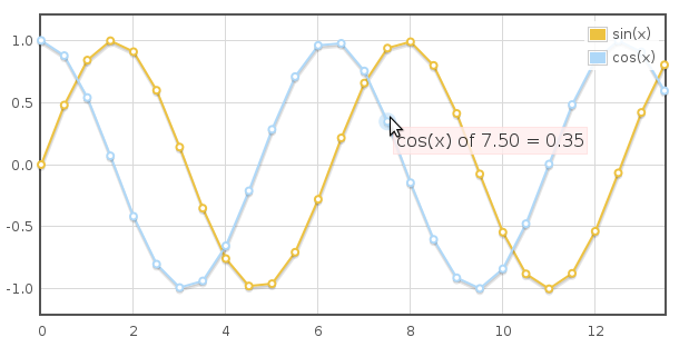
跟踪鼠标事件
主要有鼠标移动和点击事件,需要先开启相应开关:grid: {
clickable: true,
hoverable: true
}然后再绑定相应的事件,如点击事件:
$("#placeholder").bind("plotclick", function (event, pos, item) {
console.log("You clicked at " + pos.x + ", " + pos.y);
// axis coordinates for other axes, if present, are in pos.x2, pos.x3, ...
// if you need global screen coordinates, they are pos.pageX, pos.pageY

if (item) {
console.log(item.series, item.datapoint);
console.log("You clicked a point!");
}
});
plothover事件的的绑定也一样。item对象主要有以下属性:
item: {
datapoint: the point, e.g. [0, 2]
dataIndex: the index of the point in the data array
series: the series object
seriesIndex: the index of the series
pageX, pageY: the global screen coordinates of the point
}
内置方法
highlight(series, datapoint):高亮显示pointunhighlight(series, datapoint) or unhighlight():取消高亮point,没有参数则取消高亮当前的point
setData(data):重新设置数据,需要调用draw()方法来重绘
setupGrid():重新计算坐标、轴,需要调用draw()方法来重绘
draw():重绘图表
triggerRedrawOverlay():更新可交互的区域,如point
width()/height():获取宽高
offset():获取偏移
pointOffset({ x: xpos, y: ypos }):获取某个点相对于placeholder的div的偏移
resize():调整图表的大小
shutdown():清理即取消绑定所有事件处理函数
还有一些其他函数,但需要你比较了解flot内部运作,否则可能产生不好的结果:
getData():获取数据,即在$.plot方法中定义的数据
getAxes():获取坐标轴
getPlaceholder():获取placeholder元素
getCanvas():获取canvas对象
getPlotOffset():获取偏移
getOptions():获取设置的选项
如highlight方法,就可以在click事件中使用:
var pl = $.plot($("#placeholder"), data, options);

$("#placeholder").bind("plotclick", function (event, pos, item) {
if (item) {
pl.highlight(item.series, item.datapoint);
}
});
flot还提供了一些函数,用于在绘图各个流程步骤中进行一些额外的处理,这里不再列出。

相关文章推荐
- jquery.flot图表插件使用
- flot - jQuery 图表插件(jquery.flot)使用
- flot - jQuery 图表插件(jquery.flot)使用
- flot - jQuery 图表插件(jquery.flot)使用
- flot - jQuery 图表插件(jquery.flot)使用
- flot - jQuery 图表插件(jquery.flot)使用-2
- flot - jQuery 图表插件(jquery.flot)使用
- 使用Jquery.flot插件时出现“例外被抛出且未被接住”
- jQuery 图表插件 jqChart 使用
- 使用jQuery图表插件Sparklines来开发一个实用的网站PV(page view)实时监控应用
- jQuery 图表插件 jqChart 使用
- ASP.NET----jQuery插件flot绘画图表
- jQuery 的图表绘制插件 Flot
- 使用jQuery图表插件Sparklines来开发一个实用的网站PV(page view)实时监控应用
- 【部分原创】jquery图表插件flot笔记
- ASP.NET----jQuery插件flot绘画图表
- 使用jQuery图表插件Sparklines来开发一个实用的网站PV(page view)实时监控应用
- JQuery图表插件Flot之效果源码
- 使用highcharts插件时图表无法显示且jQuery报错:Uncaught ReferenceError: $ is not defined
- jQuery图表插件Flot中文文档