使用Chart FX for WPF简化图表(一)
2013-11-21 00:00
134 查看
有时候你需要漂亮的图表和大量比较绚丽的动画效果,但是有时候又没有必要展示太多视觉上的控件,想要最小化图表空间,使用WPF图表控件Chart FX for WPF就可以很好的实现这两种需求。
比如说你有一系列的产品,你想要展示关于这些产品一些列的信息,包括产品名称、版本等。

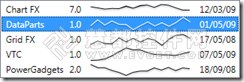
现在在我们上面得到的示例的基础上进行图表的简化:
在这一步中,我们做了一些简单的变化,比如说隐藏了里那个轴和标记,同时还设置了一些笔刷,值得注意的是,在这里的plotarea通常是指页边空白包围,但是在一些小的图表中,不需要这个页边空白。因此我们可以将图表的高度设置到20。
我们也简化了图表模版,通过使用预先定义好的样式可以很好实现,但是这个样式允许使用legend box或者是dataview。

接下来就是一些调试就可以完成了,注意在默认的情况下,列表框将会改变选定项的前景色为白色,在DataTemplate中需要一个触发器来完成这个操作:
因为 DataTemplate 实际上应用于 ContentPresenter,我们需要触发器找到ListBoxItem类型的第一个ancestor。
虽然说这个图表很小,但是依然支持鼠标的停靠操作,显示提示信息,具体代码如下:
比如说你有一系列的产品,你想要展示关于这些产品一些列的信息,包括产品名称、版本等。
public class ProductInfo
{
public string Name { get; set; }
public string Version { get; set; }
public List<ProductDownloads> Downloads { get; set; }
public string LatestRelease { get; set; }
}

public class ProductDownloads
{
public double Count { get; set; }
}
For simplicity we will use a templated listbox to show multiple columns so our first approach to the problem will look like this
<ListBox Grid.IsSharedSizeScope="true">
<ListBox.ItemTemplate>
<DataTemplate>
<Grid>
<Grid.ColumnDefinitions>
<ColumnDefinition Width="Auto" SharedSizeGroup="ColumnName"/>
<ColumnDefinition Width="Auto" SharedSizeGroup="ColumnVersion"/>
<ColumnDefinition Width="150" />
<ColumnDefinition Width="Auto" SharedSizeGroup="ColumnRelease"/>
</Grid.ColumnDefinitions>
<TextBlock VerticalAlignment="Center" Grid.Column="0"
Text="{Binding Path=Name}" Margin="4,0"/>
<TextBlock VerticalAlignment="Center" Grid.Column="1"
Text="{Binding Path=Version}" Margin="4,0"/>
<cfx:Chart x:Name="chart1" Grid.Column="2"
ItemsSource="{Binding Path=Downloads}"
Gallery="Line" Margin="4,0">
<cfx:Chart.Series>
<cfx:SeriesAttributes BindingPath="Count"/>
</cfx:Chart.Series>
<cfx:Chart.LegendBox>
<cfx:LegendBox Visibility="Collapsed"/>
</cfx:Chart.LegendBox>
</cfx:Chart>
<TextBlock VerticalAlignment="Center" Grid.Column="3"
Text="{Binding Path=LatestRelease}" Margin="4,0"/>
</Grid>
</DataTemplate>
</ListBox.ItemTemplate>
</ListBox>
现在在我们上面得到的示例的基础上进行图表的简化:
<cfx:Chart x:Name="chart1" Grid.Column="2" ItemsSource="{Binding Path=Downloads}"
Gallery="Line" Margin="4,0" Height="20">
<cfx:Chart.Series>
<cfx:SeriesAttributes BindingPath="Count" Stroke="Black" StrokeThickness="1">
<cfx:SeriesAttributes.Marker>
<cfx:MarkerAttributes Visibility="Collapsed"/>
</cfx:SeriesAttributes.Marker>
</cfx:SeriesAttributes>
</cfx:Chart.Series>
<cfx:Chart.LegendBox>
<cfx:LegendBox Visibility="Collapsed"/>
</cfx:Chart.LegendBox>
<cfx:Chart.AxisY>
<cfx:Axis Visibility="Collapsed"/>
</cfx:Chart.AxisY>
<cfx:Chart.AxisX>
<cfx:Axis Visibility="Collapsed"/>
</cfx:Chart.AxisX>
<cfx:Chart.PlotArea>
<cfx:PlotAreaAttributes Margin="0" AxesStyle="None"
Background="{x:Null}" Stroke="{x:Null}"/>
</cfx:Chart.PlotArea>
<cfx:Chart.Template>
<ControlTemplate>
<Border cfx:Chart.PanelName="Plot"/>
</ControlTemplate>
</cfx:Chart.Template>
</cfx:Chart>
在这一步中,我们做了一些简单的变化,比如说隐藏了里那个轴和标记,同时还设置了一些笔刷,值得注意的是,在这里的plotarea通常是指页边空白包围,但是在一些小的图表中,不需要这个页边空白。因此我们可以将图表的高度设置到20。
我们也简化了图表模版,通过使用预先定义好的样式可以很好实现,但是这个样式允许使用legend box或者是dataview。
接下来就是一些调试就可以完成了,注意在默认的情况下,列表框将会改变选定项的前景色为白色,在DataTemplate中需要一个触发器来完成这个操作:
<DataTemplate.Triggers>
<DataTrigger
Binding="{Binding RelativeSource={RelativeSource FindAncestor,
AncestorType={x:Type ListBoxItem}}, Path=IsSelected}"
Value="True">
<Setter TargetName="series" Property="Stroke" Value="White" />
</DataTrigger>
</DataTemplate.Triggers>
因为 DataTemplate 实际上应用于 ContentPresenter,我们需要触发器找到ListBoxItem类型的第一个ancestor。
虽然说这个图表很小,但是依然支持鼠标的停靠操作,显示提示信息,具体代码如下:
<cfx:SeriesAttributes.ToolTips>
<cfx:ToolTipAttributes x:Name="tooltips" IsEnabled="False"/>
</cfx:SeriesAttributes.ToolTips>
<DataTemplate.Triggers>
<DataTrigger
Binding="{Binding RelativeSource={RelativeSource FindAncestor,
AncestorType={x:Type ListBoxItem}}, Path=IsSelected}"
Value="True">
<Setter TargetName="series" Property="Stroke" Value="White" />
<Setter TargetName="tooltips" Property="IsEnabled" Value="True" />
</DataTrigger>
</DataTemplate.Triggers>

相关文章推荐
- WPF的数据绑定详细介绍
- 关于WPF使用MultiConverter控制Button状态的详细介绍
- 解析WPF实现音频文件循环顺序播放的解决方法
- WPF Toolkit - February 2010 Release
- 使用WPF创建一个Digg桌面应用
- Barcode Professional for WPF
- WPF数据表格支持vs2010
- Silverlight Gantt甘特图银光,WPF,甘特图,Silverlight,Gantt,任务甘特图,资源甘特图
- WPF甘特图开发包(含任务甘特图和资源甘特图)
- PointFromScreen和PointFromScreen的用法和区别
- 关于WPF自定义的求助贴
- DotNetFramwork Open Source
- 1 WPF中的依赖属性之一
- WPF多表头技术探索
- 程序员:开始编程生涯的5个建议
- 专家看台:新技术不断,微软系开发者如何面对
- WPF之数据绑定
- WPF是什么
- VS2008 和.NET Framework3.5新功能及相关技术
- WPF关闭当前程序(全部窗体并退出程序)