CSS各种形状
2013-11-16 00:00
281 查看

| #rectangle { width: 200px; height: 100px; background: red; } |

| #circle { width: 100px; height: 100px; background: red; -moz-border-radius: 50px; -webkit-border-radius: 50px; border-radius: 50px; } <br>/* Cleaner, but slightly less support: use "50%" as value */ |

| #oval { width: 200px; height: 100px; background: red; -moz-border-radius: 100px / 50px; -webkit-border-radius: 100px / 50px; border-radius: 100px / 50px; }<br> /* Cleaner, but slightly less support: use "50%" as value */ |

| #triangle-up { width: 0; height: 0; border-left: 50px solid transparent; border-right: 50px solid transparent; border-bottom: 100px solid red; } |

| #triangle-down { width: 0; height: 0; border-left: 50px solid transparent; border-right: 50px solid transparent; border-top: 100px solid red; } |

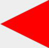
| #triangle-left { width: 0; height: 0; border-top: 50px solid transparent; border-right: 100px solid red; border-bottom: 50px solid transparent; } |
| #triangle-right { width: 0; height: 0; border-top: 50px solid transparent; border-left: 100px solid red; border-bottom: 50px solid transparent; } |

| #triangle-topleft { width: 0; height: 0; border-top: 100px solid red; border-right: 100px solid transparent; } |

| #triangle-topright { width: 0; height: 0; border-top: 100px solid red; border-left: 100px solid transparent; } |

| #triangle-bottomleft { width: 0; height: 0; border-bottom: 100px solid red; border-right: 100px solid transparent; } |

| #triangle-bottomright { width: 0; height: 0; border-bottom: 100px solid red; border-left: 100px solid transparent; } |

| #curvedarrow { position: relative; width: 0; height: 0; border-top: 9px solid transparent; border-right: 9px solid red; -webkit-transform: rotate(10deg);<br> -moz-transform: rotate(10deg); -ms-transform: rotate(10deg); -o-transform: rotate(10deg); }<br> #curvedarrow:after { content: ""; position: absolute; border: 0 solid transparent; border-top: 3px solid red; border-radius: 20px 0 0 0; top: -12px; <br>left: -9px; width: 12px; height: 12px; -webkit-transform: rotate(45deg); -moz-transform: rotate(45deg); -ms-transform: rotate(45deg); <br>-o-transform: rotate(45deg); } |

| #trapezoid { border-bottom: 100px solid red; border-left: 50px solid transparent; border-right: 50px solid transparent; height: 0; width: 100px; } |

| #parallelogram { width: 150px; height: 100px; -webkit-transform: skew(20deg); -moz-transform: skew(20deg); -o-transform: skew(20deg); background: red; } |

| #trapezoid { border-bottom: 100px solid red; border-left: 50px solid transparent; border-right: 50px solid transparent; height: 0; width: 100px; } |

| #star-six { width: 0; height: 0; border-left: 50px solid transparent; border-right: 50px solid transparent; border-bottom: 100px solid red;<br> position: relative; } #star-six:after { width: 0; height: 0; border-left: 50px solid transparent; border-right: 50px solid transparent; <br>border-top: 100px solid red; position: absolute; content: ""; top: 30px; left: -50px; } |

| #star-five { margin: 50px 0; position: relative; display: block; color: red; width: 0px; height: 0px; border-right: 100px solid transparent; <br>border-bottom: 70px solid red; border-left: 100px solid transparent; -moz-transform: rotate(35deg); -webkit-transform: rotate(35deg); <br>-ms-transform: rotate(35deg); -o-transform: rotate(35deg); } <br>#star-five:before { border-bottom: 80px solid red; border-left: 30px solid transparent;<br> border-right: 30px solid transparent; position: absolute; height: 0; width: 0; top: -45px; left: -65px; display: block; content: '';<br> -webkit-transform: rotate(-35deg); -moz-transform: rotate(-35deg); -ms-transform: rotate(-35deg); -o-transform: rotate(-35deg); }<br> #star-five:after { position: absolute; display: block; color: red; top: 3px; left: -105px; width: 0px; height: 0px; border-right: 100px solid transparent; border-bottom: 70px solid red; border-left: 100px solid transparent; -webkit-transform: rotate(-70deg); -moz-transform: rotate(-70deg); -ms-transform: rotate(-70deg); -o-transform: rotate(-70deg); content: ''; } |

| #pentagon { position: relative; width: 54px; border-width: 50px 18px 0; border-style: solid; border-color: red transparent; } <br>#pentagon:before { content: ""; position: absolute; height: 0; width: 0; top: -85px; left: -18px; border-width: 0 45px 35px; border-style: solid; <br>border-color: transparent transparent red; } |

| #hexagon { width: 100px; height: 55px; background: red; position: relative; } <br>#hexagon:before { content: ""; position: absolute; top: -25px; left: 0; width: 0; height: 0; border-left: 50px solid transparent; <br>border-right: 50px solid transparent; border-bottom: 25px solid red; }<br> #hexagon:after { content: ""; position: absolute; bottom: -25px; left: 0; width: 0; height: 0; border-left: 50px solid transparent; <br>border-right: 50px solid transparent; border-top: 25px solid red; } |

| #octagon { width: 100px; height: 100px; background: red; position: relative; }<br> #octagon:before { content: ""; position: absolute; top: 0; left: 0; border-bottom: 29px solid red; border-left: 29px solid #eee; <br>border-right: 29px solid #eee; width: 42px; height: 0; }<br> #octagon:after { content: ""; position: absolute; bottom: 0; left: 0; border-top: 29px solid red; border-left: 29px solid #eee;<br> border-right: 29px solid #eee; width: 42px; height: 0; } |

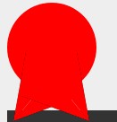
| #heart { position: relative; width: 100px; height: 90px; }<br> #heart:before, #heart:after { position: absolute; content: ""; left: 50px; top: 0; width: 50px; height: 80px; background: red; <br>-moz-border-radius: 50px 50px 0 0; border-radius: 50px 50px 0 0; -webkit-transform: rotate(-45deg); -moz-transform: rotate(-45deg); <br>-ms-transform: rotate(-45deg); -o-transform: rotate(-45deg); transform: rotate(-45deg); -webkit-transform-origin: 0 100%; -moz-transform-origin: 0 100%; <br>-ms-transform-origin: 0 100%; -o-transform-origin: 0 100%; transform-origin: 0 100%; } <br>#heart:after { left: 0; -webkit-transform: rotate(45deg); -moz-transform: rotate(45deg); -ms-transform: rotate(45deg); -o-transform: rotate(45deg);<br> transform: rotate(45deg); -webkit-transform-origin: 100% 100%; -moz-transform-origin: 100% 100%; -ms-transform-origin: 100% 100%; <br>-o-transform-origin: 100% 100%; transform-origin :100% 100%; } |

| #infinity { position: relative; width: 212px; height: 100px; } <br>#infinity:before, #infinity:after { content: ""; position: absolute; top: 0; left: 0; width: 60px; height: 60px; border: 20px solid red;<br> -moz-border-radius: 50px 50px 0 50px; border-radius: 50px 50px 0 50px; -webkit-transform: rotate(-45deg); -moz-transform: rotate(-45deg);<br> -ms-transform: rotate(-45deg); -o-transform: rotate(-45deg); transform: rotate(-45deg); }<br> #infinity:after { left: auto; right: 0; -moz-border-radius: 50px 50px 50px 0; border-radius: 50px 50px 50px 0; -webkit-transform: rotate(45deg); <br>-moz-transform: rotate(45deg); -ms-transform: rotate(45deg); -o-transform: rotate(45deg); transform: rotate(45deg); } |

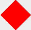
| #diamond { width: 0; height: 0; border: 50px solid transparent; border-bottom-color: red; position: relative; top: -50px; }<br> #diamond:after { content: ''; position: absolute; left: -50px; top: 50px; width: 0; height: 0; border: 50px solid transparent; border-top-color: red; } |
| #diamond-shield { width: 0; height: 0; border: 50px solid transparent; border-bottom: 20px solid red; position: relative; top: -50px; }<br> #diamond-shield:after { content: ''; position: absolute; left: -50px; top: 20px; width: 0; height: 0; border: 50px solid transparent; <br>border-top: 70px solid red; } |

| #diamond-narrow { width: 0; height: 0; border: 50px solid transparent; border-bottom: 70px solid red; position: relative; top: -50px; } <br>#diamond-narrow:after { content: ''; position: absolute; left: -50px; top: 70px; width: 0; height: 0; border: 50px solid transparent; <br>border-top: 70px solid red; } |

| #cut-diamond { border-style: solid; border-color: transparent transparent red transparent; border-width: 0 25px 25px 25px; height: 0; width: 50px;<br> position: relative; margin: 20px 0 50px 0; }<br> #cut-diamond:after { content: ""; position: absolute; top: 25px; left: -25px; width: 0; height: 0; border-style: solid; <br>border-color: red transparent transparent transparent; border-width: 70px 50px 0 50px; } |

| #egg { display:block; width: 126px; height: 180px; background-color: red; -webkit-border-radius: 63px 63px 63px 63px / 108px 108px 72px 72px;<br> border-radius: 50% 50% 50% 50% / 60% 60% 40% 40%; } |

| #pacman { width: 0px; height: 0px; border-right: 60px solid transparent; border-top: 60px solid red; border-left: 60px solid red;<br> border-bottom: 60px solid red; border-top-left-radius: 60px; border-top-right-radius: 60px; border-bottom-left-radius: 60px; <br>border-bottom-right-radius: 60px; } |

| #talkbubble { width: 120px; height: 80px; background: red; position: relative; -moz-border-radius: 10px;<br> -webkit-border-radius: 10px; border-radius: 10px; } <br>#talkbubble:before { content:""; position: absolute; right: 100%; top: 26px; width: 0; height: 0; border-top: 13px solid transparent; <br>border-right: 26px solid red; border-bottom: 13px solid transparent; } |

| #burst-12 { background: red; width: 80px; height: 80px; position: relative; text-align: center; }<br> #burst-12:before, #burst-12:after { content: ""; position: absolute; top: 0; left: 0; height: 80px; width: 80px; background: red; } <br>#burst-12:before { -webkit-transform: rotate(30deg); -moz-transform: rotate(30deg); -ms-transform: rotate(30deg); -o-transform: rotate(30deg); } <br>#burst-12:after { -webkit-transform: rotate(60deg); -moz-transform: rotate(60deg); -ms-transform: rotate(60deg); -o-transform: rotate(60deg); } |

| #burst-8 { background: red; width: 80px; height: 80px; position: relative; text-align: center; -webkit-transform: rotate(20deg); <br>-moz-transform: rotate(20deg); -ms-transform: rotate(20deg); -o-transform: rotate(20eg); } <br>#burst-8:before { content: ""; position: absolute; top: 0; left: 0; height: 80px; width: 80px; background: red; -webkit-transform: rotate(135deg);<br> -moz-transform: rotate(135deg); -ms-transform: rotate(135deg); -o-transform: rotate(135deg); } |

| #yin-yang { width: 96px; height: 48px; background: #eee; border-color: red; border-style: solid; border-width: 2px 2px 50px 2px; <br>border-radius: 100%; position: relative; } #yin-yang:before { content: ""; position: absolute; top: 50%; left: 0; background: #eee; <br>border: 18px solid red; border-radius: 100%; width: 12px; height: 12px; } <br>#yin-yang:after { content: ""; position: absolute; top: 50%; left: 50%; background: red; border: 18px solid #eee; border-radius:100%;<br> width: 12px; height: 12px; } |
| #badge-ribbon { position: relative; background: red; height: 100px; width: 100px; -moz-border-radius: 50px; -webkit-border-radius: 50px; <br>border-radius: 50px; } <br>#badge-ribbon:before, #badge-ribbon:after { content: ''; position: absolute; border-bottom: 70px solid red; border-left: 40px solid transparent;<br> border-right: 40px solid transparent; top: 70px; left: -10px; -webkit-transform: rotate(-140deg); -moz-transform: rotate(-140deg); <br>-ms-transform: rotate(-140deg); -o-transform: rotate(-140deg); }<br> #badge-ribbon:after { left: auto; right: -10px; -webkit-transform: rotate(140deg); -moz-transform: rotate(140deg); -ms-transform: rotate(140deg); <br>-o-transform: rotate(140deg); } |

相关文章推荐
- CSS实现各种形状
- 如何用 CSS 绘制各种形状
- 用css绘制各种形状(放松一下)
- 用css实现的各种形状
- CSS绘制各种形状
- 纯 CSS 创建各种不同的图形形状
- 用css绘制各种形状
- CSS实现各种形状
- 【转】用CSS代码写出的各种形状图形的方法
- 基于纯CSS创建各种图形形状
- 用css 添加手状样式,鼠标移上去变各种形状!例如:小手。。。
- 用css画的各种形状
- 纯 CSS 创建各种不同的图形形状
- CSS代码实例:用CSS代码写出的各种形状图形
- 用CSS代码写出的各种形状图形的方法
- css绘制各种形状
- CSS代码写出的各种形状图形
- css中各种鼠标形状
- CSS代码实例:用CSS代码写出的各种形状图形
- 各种css形状 CSS实现圆角,三角,五角星,五边形,爱心,12角星,8角星,圆,椭圆,圆圈,八卦等等