开始使用QML编程(3)
2013-05-28 15:51
375 查看
Building a Text Editor
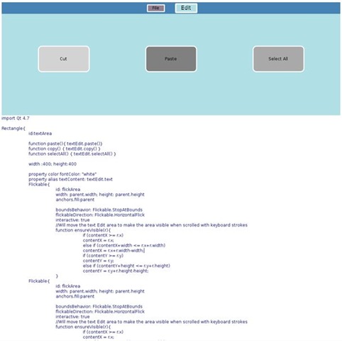
Declaring a TextArea如果不包含一个可编辑的文字区域,我们的文本编辑器就不能称之为一个文本编辑器。QML的TextEdit元素允许我们声明一个多行的可编辑的文字区域。TextEdit与Text元素不同,它不允许用户直接编辑文本。
[javascript] view plaincopyprint?TextEdit{
id: textEditor
anchors.fill:parent
width:parent.width; height:parent.height
color:"midnightblue"
focus: true
wrapMode: TextEdit.Wrap
onCursorRectangleChanged: flickArea.ensureVisible(cursorRectangle)
}
编辑器设置了它的字体颜色,文本也是可以换行的。TextEdit区域位于一个flickable区域内,如果文本逛标位于可视区域外,文本可以滚动。ensureVisible()函数会检查光标矩形是否在可视边界外,相应地移动文本区域。QML的脚本使用JavaScript语法,正如我们之前提到的,Javascript
文件可以被导入到QML文件中使用。
[javascript] view plaincopyprint?function ensureVisible(r){
if (contentX >= r.x)
contentX = r.x;
else if (contentX+width <= r.x+r.width)
contentX = r.x+r.width-width;
if (contentY >= r.y)
contentY = r.y;
else if (contentY+height <= r.y+r.height)
contentY = r.y+r.height-height;
}
Combining Components for the Text Editor
现在我们准备好使用QML来创建我们的文本编辑器的布局。文本编辑器有两个不见,我们创建的菜单栏和文本区域。QML允许我们重用组件,因此,在需要时通过导入和定制组件,使我们的代码更加简洁。我们的文本编辑器将窗口一分为二:三分之一的屏幕留给菜单栏,另外的来显示文本区域。菜单栏显示在其他元素之前。
[javascript] view plaincopyprint?Rectangle{
id: screen
width: 1000; height: 1000
//the screen is partitioned into the MenuBar and TextArea. 1/3 of the screen is assigned to the MenuBar
property int partition: height/3
MenuBar{
id:menuBar
height: partition
width:parent.width
z: 1
}
TextArea{
id:textArea
anchors.bottom:parent.bottom
y: partition
color: "white"
height: partition*2
width:parent.width
}
}
通过导入重用的组件,我们的TextEditor看起来更加简单。之后我们可以定制主程序,而不必担心已经定义好了行为的那些属性。通过这种方式,可以简单的创建应用程序的布局和UI组件。
Decorating the Text Editor
Implementing a Drawer Interface我们的文本编辑器看起来比较简单,我们需要装饰一下。使用QML,我们可以声明转换效果并让我们的文本编辑器有动画效果。我们的菜单栏占用了三分之一的屏幕,如果我们让它只有在我们需要它的时候才显示出来多好。
我们可以添加一个抽屉(drawer)接口,当点击时候它会缩短或扩展菜单栏。在我们的实现中,我们有一个响应鼠标点击的小矩形。这个抽屉(drawer),和这个应用程序一样,有两个状态,抽屉开(drawer is open)和抽屉关(drawer is closed)状态。这个drawer item是一条有个很小的高度的矩形。一个嵌套的Image元素声明了一个位于drawer中间的箭头图标。使用screen标识符,只要用户点击鼠标区域,这个drawer就为整个程序指派一个状态。
[javascript] view plaincopyprint?Rectangle{
id:drawer
height:15
Image{
id: arrowIcon
source: "images/arrow.png"
anchors.horizontalCenter: parent.horizontalCenter
}
MouseArea{
id: drawerMouseArea
anchors.fill:parent
onClicked:{
if (screen.state == "DRAWER_CLOSED"){
screen.state = "DRAWER_OPEN"
}
else if (screen.state == "DRAWER_OPEN"){
screen.state = "DRAWER_CLOSED"
}
}
...
}
}
状态是一个简单的配置集合,可以在State元素里声明。状态列表可以罗列并绑定到states属性。我们的程序中,这两个状态叫DRAWER_CLOSED和DRAWER_OPEN。item配置在PropertyChanges元素里声明。在DRAWER_OPEN状态中,四个items会收到属性改变。第一个目标,menuBar,会改变它的y属性为0。同样地,当状态是DRAWER_OPEN的时候,textArea会降到一个新位置。为满足当前的状态,textArea、drawer和drawer的图标都会响应属性的改变。
[javascript] view plaincopyprint?states:[
State {
name: "DRAWER_OPEN"
PropertyChanges { target: menuBar; y: 0}
PropertyChanges { target: textArea; y: partition + drawer.height}
PropertyChanges { target: drawer; y: partition}
PropertyChanges { target: arrowIcon; rotation: 180}
},
State {
name: "DRAWER_CLOSED"
PropertyChanges { target: menuBar; y:-height; }
PropertyChanges { target: textArea; y: drawer.height; height: screen.height - drawer.height }
PropertyChanges { target: drawer; y: 0 }
PropertyChanges { target: arrowIcon; rotation: 0 }
}
]
平滑的过渡可以改变生硬的状态变化。可以使用Transition元素来声明状态间的过渡。Transition可以绑定到item的transitions属性。当状态改变成DRAWER_OPEN或DRAWER_CLOSED的时候,我们的编辑器会有一个状态过渡。过渡需要一个from和一个to状态,这点很重要。不过对我们的过渡,我们可以使用通配符*来表示所有的状态改变都需要应用过渡。
过渡中,我们可以指派动画给属性改变。menuBar的位置从y:0切换到y:-partition,我们可以使用NumberAnimation元素来动画化这个过渡。我们声明目标的属性会使用一个特定的释放(easing)曲线来动画一段时间。释放曲线控制了状态过渡中的动画等级和插入的行为。我们选择的释放曲线是Easing.OutQuint,在靠近动画结束的时候会减慢移动。请阅读QML'的动画文章。
[javascript] view plaincopyprint?transitions: [
Transition {
to: "*"
NumberAnimation { target: textArea; properties: "y, height"; duration: 100; easing.type:Easing.OutExpo }
NumberAnimation { target: menuBar; properties: "y"; duration: 100; easing.type: Easing.OutExpo }
NumberAnimation { target: drawer; properties: "y"; duration: 100; easing.type: Easing.OutExpo }
}
]
通过声明一个Behavior元素是动画化属性改变的另一种方式。过渡仅适用在状态改变时,Behavior可以为一般的属性改变设定一个动画。在文本编辑器中,箭头有一个NumberAnimation,当属性改变时,动态改变它的rotation属性。
[javascript] view plaincopyprint?In TextEditor.qml:
Behavior{
NumberAnimation{property: "rotation";easing.type: Easing.OutExpo }
}
有了状态和动画的知识,现在回到我们的组件,我们可以改善它们的外观。在Button.qml中,当button点击时,我们增加了color和scale属性改变。颜色类型使用ColorAnimation动画化,数字用NumberAnimation。下面显示的on propertyName语法帮助我们确定单一的属性目标。
[javascript] view plaincopyprint?In Button.qml:
...
color: buttonMouseArea.pressed ? Qt.darker(buttonColor, 1.5) : buttonColor
Behavior on color { ColorAnimation{ duration: 55} }
scale: buttonMouseArea.pressed ? 1.1 : 1.00
Behavior on scale { NumberAnimation{ duration: 55} }
另外,我们可以通过添加诸如梯度渐变和不透明效果的颜色效果来增强我们的QML组件的外观。声明一个Gradient元素会覆盖color 属性。你可以使用GradientStop元素在梯度渐变中声明一个颜色。梯度渐变使用0.0到1.0之间的scale来定位。
[javascript] view plaincopyprint?In MenuBar.qml
gradient: Gradient {
GradientStop { position: 0.0; color: "#8C8F8C" }
GradientStop { position: 0.17; color: "#6A6D6A" }
GradientStop { position: 0.98;color: "#3F3F3F" }
GradientStop { position: 1.0; color: "#0e1B20" }
}
菜单栏使用梯度渐变来显示一个梯度渐变的模拟深度。第一个颜色在0.0,最后一个颜色在1.0.
转自 http://www.cnblogs.com/smoozer/archive/2011/03/28/1997352.html

相关文章推荐
- Qt Quick 译05 - 开始使用QML编程(3)
- Qt Quick 译05 - 开始使用QML编程(2)
- Qt Quick 译05 - 开始使用QML编程(4)
- Qt Quick 译05 - 开始使用QML编程(1)
- 开始使用QML编程(4)
- 开始使用QML编程(1)
- 开始使用QML编程(2)
- 编程小白的第一本 python 入门书 学习笔记07 第八章 开始使用第三方类库
- 使用JAVA开始面向对象的编程
- 使用纯C语言开始win32 sdk编程
- 开始使用Ubuntu真机环境作为编程环境。
- 使用WinPcap编程(2)——打开网络设备并且开始捕获数据包
- 使用Java开始面向对象的编程
- 使用Java开始面向对象的编程
- 从C开始_概览_使用C语言编程的几个步骤
- cesium编程入门(三)开始使用cesium开发
- 今天开始使用unity 5.3 进行学习编程
- 翻译《有关编程、重构及其他的终极问题?》——15.在你的代码中开始使用enum class吧
- 【VS开发】使用WinPcap编程(2)——打开网络设备并且开始捕获数据包
- QML和C++混合编程--在C++应用程序中使用QML