关于android中shape的使用
2013-03-26 15:49
561 查看
转载自http://blog.csdn.net/qq282133/article/details/7370467
file location:
The filename is used as the resource ID.(这个文件名作为资源id,被当做图片资源使用)compiled resource datatype:(复杂资源的数据类型)Resource pointer to a
In XML:
元素:
attributes:
The following attributes are used only when
attributes:
Note: Every corner must (initially) be provided a corner radius greater than 1, or else no corners are rounded. If you want specific corners to notbe rounded, a work-around is to use
attributes:
attributes:
attributes:
Note: The shape scales to the size of the container View proportionate to the dimensions defined here, by default. When you use the shape in an
attributes:
attributes:
This layout XML applies the shape drawable to a View:
This application code gets the shape drawable and applies it to a View:
gradient -- 对应颜色渐变。 startcolor、endcolor就不多说了。 android:angle 是指从哪个角度开始变。
gradient:渐变
android:startColor和android:endColor分别为起始和结束颜色,android:angle是渐变角度,必须为45的整数倍。
另外渐变默认的模式为android:type="linear",即线性渐变,可以指定渐变为径向渐变,android:type="radial",径向渐变需要指定半径android:gradientRadius="50"。
solid -- 填充。
solid:实心,就是填充的意思
android:color指定填充的颜色
stroke -- 描边。
stroke:描边
android:width="2dp" 描边的宽度,android:color 描边的颜色。
我们还可以把描边弄成虚线的形式,设置方式为:
android:dashWidth="5dp"
android:dashGap="3dp"
其中android:dashWidth表示'-'这样一个横线的宽度,android:dashGap表示之间隔开的距离。
corners -- 圆角。
corners:圆角
android:radius为角的弧度,值越大角越圆。
我们还可以把四个角设定成不同的角度,方法为:
<corners
android:topRightRadius="20dp" 右上角
android:bottomLeftRadius="20dp" 右下角//这里要特别注意是右下角,不是左下角
android:topLeftRadius="1dp" 左上角
android:bottomRightRadius="0dp" 左下角//这里要特别注意是左下角,不是右下角
/>
padding -- 定义内容离边界的距离。 与android:padding_left、android:padding_right这些是一个道理。
/article/5122005.html
android:angle网上有各种说法,这里,我说说自己的实验结果,渐变的时候,最原始的,即android:angle=“0”时,是从左到右,按照开始颜色到结束颜色来渲染的,android:angle=“90”是从上到下来渲染的,android:angle=“180”是从右到左来渲染的,android:angle=“360”和android:angle=“0”是一样的,所以这里应该是这样的,渲染时按照最原始的渲染色板(把控件内部看作一块可以绕中心旋转的板子)围绕控件中心来旋转相应的度数,即android:angle里面的值就是所需要旋转的角度,只是这个旋转角度必须是45的整数倍
-------------------------------------------------------------------------
以下是我测试的列子:
Shape Drawable
这一类的shape定义在xml中file location:
res/drawable/filename.xml
The filename is used as the resource ID.(这个文件名作为资源id,被当做图片资源使用)compiled resource datatype:(复杂资源的数据类型)Resource pointer to a
GradientDrawable.resource reference(资源参考):In Java:
R.drawable.filename
In XML:
@[package:]drawable/filenamesyntax:(语法)
<?xml version="1.0" encoding="utf-8"?>
<shape
xmlns:android="http://schemas.android.com/apk/res/android"
android:shape=["rectangle" | "oval" | "line" | "ring"] >
//长方形/矩形  椭圆形  线性   圈/环
<corners
android:radius="integer"
android:topLeftRadius="integer"
android:topRightRadius="integer"
android:bottomLeftRadius="integer"
android:bottomRightRadius="integer" />
<gradient
android:angle="integer"
android:centerX="integer"
android:centerY="integer"
android:centerColor="integer"
android:endColor="color"
android:gradientRadius="integer"
android:startColor="color"
android:type=["linear" | "radial" | "sweep"]
android:useLevel=["true" | "false"] />
<padding
android:left="integer"
android:top="integer"
android:right="integer"
android:bottom="integer" />
<size
android:width="integer"
android:height="integer" />
<solid
android:color="color" />
<stroke
android:width="integer"
android:color="color"
android:dashWidth="integer"
android:dashGap="integer" />
</shape>
元素:
<shape>The shape drawable. This must be the root element.
attributes:
xmlns:androidString. Required. Defines the XML namespace, which must be
"http://schemas.android.com/apk/res/android".
android:shapeKeyword. Defines the type of shape. Valid values are:(定义这个类型的形状,变量值是:)
| Value | Desciption |
|---|---|
"rectangle" | A rectangle (长方形)that fills the containing View. This is the default shape.(这个是默认的形状) |
"oval" | An oval (椭圆形)shape that fits the dimensions of the containing View. |
"line" | A horizontalline that spans the width of the containing View. This shape requires the <stroke>element to define the width of the line.水平线,需要在stroke中定义线的宽度 |
"ring" | A ring shape.(环状/圈) |
android:shape="ring":
android:innerRadiusDimension. The radius for the inner part of the ring (the hole in the middle), as a dimension value or dimension resource.
android:innerRadiusRatioFloat. The radius for the inner part of the ring, expressed as a ratio of the ring's width. For instance, if
android:innerRadiusRatio="5", then the inner radius equals the ring's width divided by 5. This value is overridden by
android:innerRadius. Default value is 9.
android:thicknessDimension. The thickness of the ring, as a dimension value or dimension resource.
android:thicknessRatioFloat. The thickness of the ring, expressed as a ratio of the ring's width. For instance, if
android:thicknessRatio="2", then the thickness equals the ring's width divided by 2. This value is overridden by
android:innerRadius. Default value is 3.
android:useLevelBoolean. "true" if this is used as a
LevelListDrawable. This should normally be "false" or your shape may not appear.android:visble Provides initial visibility state of the drawable; the default value is false. [boolean]
<corners>Creates rounded corners for the shape. Applies only when the shape is a rectangle.创建圆角的形状。仅适用于当其形状是一个长方形。
attributes:
android:radiusDimension. The radius for all corners, as a dimension value or dimension resource. This is overridden for each corner by the following attributes.
android:topLeftRadiusDimension. The radius for the top-left corner, as a dimension value or dimension resource.
android:topRightRadiusDimension. The radius for the top-right corner, as a dimension value or dimension resource.
android:bottomLeftRadiusDimension. The radius for the bottom-left corner, as a dimension value or dimension resource.
android:bottomRightRadiusDimension. The radius for the bottom-right corner, as a dimension value or dimension resource.
Note: Every corner must (initially) be provided a corner radius greater than 1, or else no corners are rounded. If you want specific corners to notbe rounded, a work-around is to use
android:radiusto set a default corner radius greater than 1, but then override each and every corner with the values you really want, providing zero ("0dp") where you don't want rounded corners.
<gradient>Specifies a gradient color for the shape.指定一个渐变颜色的形状。
attributes:
android:angleInteger. The angle for the gradient, in degrees. 0 is left to right, 90 is bottom to top. It must be a multiple of 45. Default is 0.
android:centerXFloat. The relative X-position for the center of the gradient (0 - 1.0).
android:centerYFloat. The relative Y-position for the center of the gradient (0 - 1.0).
android:centerColorColor. Optional color that comes between the start and end colors, as a hexadecimal value or color resource.
android:endColorColor. The ending color, as a hexadecimal value or color resource.
android:gradientRadiusFloat. The radius for the gradient. Only applied when
android:type="radial".
android:startColorColor. The starting color, as a hexadecimal value or color resource.
android:typeKeyword. The type of gradient pattern to apply. Valid values are:
| Value | Description |
|---|---|
"linear" | A linear gradient. This is the default. |
"radial" | A radial gradient. The start color is the center color. |
"sweep" | A sweeping line gradient. |
android:useLevelBoolean. "true" if this is used as a
LevelListDrawable.
<padding>Padding to apply to the containing View element (this pads the position of the View content, not the shape).适用于包含填充视图元素(这垫的位置,而不是观点内容的形状)
attributes:
android:leftDimension. Left padding, as a dimension value or dimension resource.
android:topDimension. Top padding, as a dimension value or dimension resource.
android:rightDimension. Right padding, as a dimension value or dimension resource.
android:bottomDimension. Bottom padding, as a dimension value or dimension resource.
<size>The size of the shape.
attributes:
android:heightDimension. The height of the shape, as a dimension value or dimension resource.
android:widthDimension. The width of the shape, as a dimension value or dimension resource.
Note: The shape scales to the size of the container View proportionate to the dimensions defined here, by default. When you use the shape in an
ImageView, you can restrict scaling by setting the
android:scaleTypeto
"center".
<solid>A solid color to fill the shape.
attributes:
android:colorColor. The color to apply to the shape, as a hexadecimal value or color resource.
<stroke>A stroke line for the shape.
attributes:
android:widthDimension. The thickness of the line, as a dimension value or dimension resource.
android:colorColor. The color of the line, as a hexadecimal value or color resource.
android:dashGapDimension. The distance between line dashes, as a dimension value or dimension resource. Only valid if
android:dashWidthis set.
android:dashWidthDimension. The size of each dash line, as a dimension value or dimension resource. Only valid if
android:dashGapis set.example:XML file saved at
res/drawable/gradient_box.xml:
<?xml version="1.0" encoding="utf-8"?> <shape xmlns:android="http://schemas.android.com/apk/res/android" android:shape="rectangle"> <gradient android:startColor="#FFFF0000" android:endColor="#80FF00FF" android:angle="45"/> <padding android:left="7dp" android:top="7dp" android:right="7dp" android:bottom="7dp" /> <corners android:radius="8dp" /> </shape>
This layout XML applies the shape drawable to a View:
<TextView android:background="@drawable/gradient_box" android:layout_height="wrap_content" android:layout_width="wrap_content" />
This application code gets the shape drawable and applies it to a View:
Resources res = [code]getResources(); Drawable shape = res.
getDrawable(R.drawable.gradient_box); TextView tv = (TextView)findViewByID(R.id.textview); tv.setBackground(shape);[/code]
gradient -- 对应颜色渐变。 startcolor、endcolor就不多说了。 android:angle 是指从哪个角度开始变。
gradient:渐变
android:startColor和android:endColor分别为起始和结束颜色,android:angle是渐变角度,必须为45的整数倍。
另外渐变默认的模式为android:type="linear",即线性渐变,可以指定渐变为径向渐变,android:type="radial",径向渐变需要指定半径android:gradientRadius="50"。
solid -- 填充。
solid:实心,就是填充的意思
android:color指定填充的颜色
stroke -- 描边。
stroke:描边
android:width="2dp" 描边的宽度,android:color 描边的颜色。
我们还可以把描边弄成虚线的形式,设置方式为:
android:dashWidth="5dp"
android:dashGap="3dp"
其中android:dashWidth表示'-'这样一个横线的宽度,android:dashGap表示之间隔开的距离。
corners -- 圆角。
corners:圆角
android:radius为角的弧度,值越大角越圆。
我们还可以把四个角设定成不同的角度,方法为:
<corners
android:topRightRadius="20dp" 右上角
android:bottomLeftRadius="20dp" 右下角//这里要特别注意是右下角,不是左下角
android:topLeftRadius="1dp" 左上角
android:bottomRightRadius="0dp" 左下角//这里要特别注意是左下角,不是右下角
/>
padding -- 定义内容离边界的距离。 与android:padding_left、android:padding_right这些是一个道理。
/article/5122005.html
android:angle网上有各种说法,这里,我说说自己的实验结果,渐变的时候,最原始的,即android:angle=“0”时,是从左到右,按照开始颜色到结束颜色来渲染的,android:angle=“90”是从上到下来渲染的,android:angle=“180”是从右到左来渲染的,android:angle=“360”和android:angle=“0”是一样的,所以这里应该是这样的,渲染时按照最原始的渲染色板(把控件内部看作一块可以绕中心旋转的板子)围绕控件中心来旋转相应的度数,即android:angle里面的值就是所需要旋转的角度,只是这个旋转角度必须是45的整数倍
-------------------------------------------------------------------------
以下是我测试的列子:
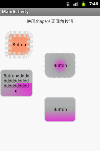
<?xml version="1.0" encoding="utf-8"?>
<!-- visable 提供初始可见性状态,默认为false
-->
<shape xmlns:android="http://schemas.android.com/apk/res/android"
android:visible="true"
>

<!-- 圆角
bottomLeftRadius 右下角  ,bottomLeftRadius是右下角,而不是左下角,这点要注意
bottomRightRadius 左下角
radius 角的幅度,值越大,角越圆
topLeftRadius 左上角
topRightRadius 右上角
-->
<corners
android:bottomLeftRadius="20dp"
android:bottomRightRadius="2dp"
android:radius="5dp"
android:topLeftRadius="10dp"
android:topRightRadius="10dp" >
</corners>
<!-- 倾斜度,渐变
startColor 开始颜色
centerColor中间颜色
endColor结束颜色
uselevel 值是true/false 为true表示将被用作levelListDrawable(关于此
用来管理一系列轮流交替使用的图片资源,比如电池的电量图标,用不同的图片来显示当前电量等级)
angle 渐变角度(PS:默认为angle=0时,渐变色是从左向右。 然后逆时针方向转,当angle=90时为从下往上
。angle必须为45的整数倍)
type渐变方式,默认为线形渐变,此外还有曲线渐变,放射渐变
centerX  渐变中心X点坐标的相对位置(取值范围0-1.0)
centerY 渐变中心Y点坐标的相对位置(取值范围0-1.0)
gadientRadius 渐变色半径.当 android:type="radial" 放射渐变时才使用。单独使用
android:type="radial"会报错。
-->
<gradient

android:startColor="#DBDCDD"
android:centerColor="#ADADAF"
android:endColor="#B8B9BB"
android:useLevel="false"
android:angle="0"
android:type="radial"
android:centerX="0"
android:centerY="0"
android:gradientRadius="1">
</gradient>
<!--
内部边距,即内容与边的距离 ,
shape内的填充内容距离shape的大小,而不是指shape相对于其他组件的距离 -->
<padding
android:left="2dp"
android:top="2dp"
android:right="2dp" android:bottom="2dp" />
<!-- 描述:size: 大小
属性:
android:width   表示形状的宽度
android:height 表示形状的高度   -->
<size
android:width="100dp"
android:height="80dp">
</size>
<!--  solid:实心,就是填充的意思
android:color指定填充的颜色-->
<solid
android:color="#ff9d77"
>
</solid>
<!-- 描述: stroke:描边  相当于html中的盒子模型的border

属性:
android:width 描边的宽度
android:color 描边的颜色
android:dashWidth 表示描边的样式是虚线的宽度,
值为0时,表示为实线。值大于0则为虚线。
android:dashGap  表示描边为虚线时,虚线之间的间隔 即“ - - - - ”
其中android:dashWidth表示'-'这样一个横线的宽度,android:dashGap表示之间隔开的距离。
-->
<stroke
android:width="20dp"
android:color="#dcdcdc"
android:dashWidth="2dp"
android:dashGap="2dp">
</stroke>

</shape>

相关文章推荐
- android 中关于shape的使用
- android关于selector和shape的使用
- Android 关于shape的使用
- android 关于shape渐变的使用
- android关于shape的使用
- 关于android shape 的使用
- 关于android中shape的使用
- 【笔记】关于android中shape使用的注意事项
- 关于android里面Shape属性的使用
- 关于android中shape的使用
- 关于android中shape的使用
- 使用shape为android各种元素制作圆角
- android:shape的使用
- 关于Android Dedub Bridge(adb)的使用
- Android (shape,gradient)使用总结
- Android自定义shape的使用
- 关于Android中使用SVG特性的探索与总结
- Android中shape的使用
- android shape的使用
- Android关于PowerManager.WakeLock的使用相关介绍