SharePoint 2010 Base CSS Classes
2011-08-22 10:32
393 查看
【转】http://erikswenson.blogspot.com/2010/01/sharepoint-2010-base-css-classes.html
This will be the first of many SharePoint 2010 posts. I will be focusing on a few of the main CSS classes used for SharePoint 2010 Public Beta. As the product becomes more final there might be some changes to the class names but I will be sure to create a new post if that happens. This will be quite a lengthy but it should be helpful. The default CSS given below are just highlights of the full CSS attributes for that class.
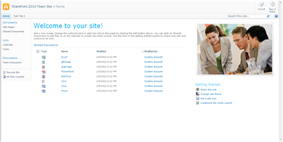
I will be using a basic team site as my base for the screenshots.
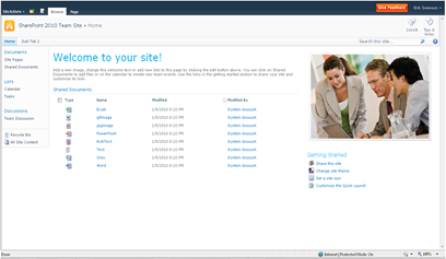
Here is a basic structure of the main areas that I will cover.
Ribbon Row
Table Row Left
Site Actions
Navigate Up
Edit
Tab List
Browse
Page
Table Row Right
Give Feedback
Welcome Menu
Workspace
Body Container
Title Row
Title
Title Logo
Title Text / Breadcrumb
Page Description
Social Data
Separator
I like It
Tags/Notes
Top Header 2/Top Links
li Static-Selected
li Static
Search
Help
Status Bar Container
Main Area
Left Panel
Navigation Manager
li Static (Header)
ul li Static (Link)
Special Navigation Links List
Recycle Bin
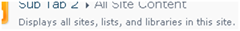
View All Site Content
Content Table / Body Area
Web Part Cell
Web Part Header
WP Title
WP Header TD
WP Header Menu
WP Header Selection
Web Part Content
Ribbon Row:
Class/ID = “body #s4-ribbonrow”
Default CSS:
min-height:43px;
background-color:#21374c;
Comments: This is the container for all of the items in the top ribbon

Table Row Left:
Class/ID = “ms-cui-TabRowLeft”
Default CSS:
float:left;
margin-top:20px;
Comments: This is the container Site Actions, Navigate Up and Edit

Site Actions:
Class/ID = “ms-siteactionsmenuinner”
Default CSS:
border-color:#21374C;
border-top-color:#394f63;
background:url("/_layouts/images/bgximg.png") repeat-x -0px -467px;
background-color:#21374c;
Comments: Main Style for Site Actions menu

Navigate Up:
Class/ID = “.s4-breadcrumb-anchor,.ms-qatbutton”
Default CSS:
margin:0px 3px 0px 0px;
padding:2px 5px 0px;
Comments: There is an image “fgimg.png” that sits within an “A” hyperlink Tag. This image is large and has many icons in it. It uses inline absolute positioning to show the correct Icon.
”position: absolute; top: -112px !important;”

Here is what the “fgimg.png” image looks like:
Edit:
Class/ID = “.s4-breadcrumb-anchor,.ms-qatbutton” (Same as Above)
Default CSS:
Same As Above
Comments: Same as above except that the background image position is different. “position: absolute; top: -235px;”

Browse:
Class/ID = “.ms-cui-tt-s > .ms-cui-tt-a”
Default CSS:
border-color:#b6babf;
background-color:#fff;
color:#23272c !important;
Comments: This is the selected state of the browse button. Note the “s” at the end of the class.

Page:
Class/ID = “.ms-cui-tt-span”
Default CSS:
padding:4px 10px 4px;
border-top:1px solid transparent;
text-align:center;
Comments: This is the non-selected state of the page button.

Give Feedback:
Class/ID = “No Class Or ID Specified, See below”
Default CSS:
Inline CSS and Image
Comments: If you would like to remove this icon via CSS, use the following:
.ms-cui-TabRowRight a img{
display: none;
}

Welcome Menu:
Class/ID = “.ms-welcomeMenu”
Default CSS:
padding:2px 5px 3px;
margin:0px 3px;
font-size:1em;
font-family:Verdana,sans-serif;
border:1px solid transparent;
Comments: The class for the arrow is “.ms-viewselector-arrow”

Workspace:
Class/ID = “body #s4-workspace”
Default CSS:
overflow:visible !important;
overflow-y:scroll;
overflow-x:auto;
position:relative;
left:0px;
Comments: This is the container and scroll area for the site.
Body Container:
Class/ID = “body #s4-bodyContainer”
Default CSS:
min-width:760px;
Comments: This class controls the minimum width.
Title Row:
Class/ID = “body #s4-titlerow”
Default CSS:
display:block !important;
Comments: This is the container for the Title, Tags, Ribbon, Main navigation, Search and Help.

Title Row:
Class/ID = “.s4-title”
Default CSS:
padding:0px 0px 0px 10px;
margin:0px;
min-height:64px;
background:url("/_layouts/images/bgximg.png") repeat-x -0px -1013px;
background-color:#f9f9f9;
word-wrap:break-word;
-ms-word-wrap:break-word;
overflow-x:hidden;
Comments: Notice that there is a min height of 64px and a background image is applied by default.

Title Logo:
Class/ID = “.s4-titlelogo”
Default CSS:
padding:12px 10px 12px 0px;
text-align:center;
vertical-align:middle;
Comments: The logo can be changed via the Admin UI. Default Image size is 35x35px

Title Text:
Class/ID = “.s4-titletext”
Default CSS:
width:100%;
Comments: The title text is also the bread crumb.

Page Description:
Class/ID = “.s4-title .s4-pagedescription,.s4-title .s4uniqpermdescription”
Default CSS:
margin-top:6px;
font-size:1em;
color:#5d6878;
font-weight:normal;
Comments: This only shows up if you have specified a description of the site.
Social Data:
Class/ID = “ms-socialNotif-Container”
Default CSS:
width:120px;
overflow-x:auto;
overflow-y:hidden;
padding:0px 3px;
Comments: This is the container that holds both I Like It and Notes.
Social Separator:
Class/ID = “.ms-socialNotif-groupSeparator”
Default CSS:
height:60px;
position:relative;
top:4px;
margin:0px 3px;
border-right:1px solid;
border-right-color:#e7e7e8;
Comments: This is the slight line on the left of the social tags.

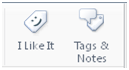
I Like It:
Class/ID = “.ms-socialNotif”
Default CSS:
width:48px;
height:60px;
overflow:hidden;
margin:0px 1px;
padding:0px 2px;
border:1px solid transparent;
Comments: This class is shared with the tags and notes. The text uses the class “.ms-socialNotif-text” and the image “mossfgimg.png” with inline style of
position: absolute; top: -132px !important;
Here is what the “mossfgimg.png” image looks like:

Tags & Notes:
Class/ID = “.ms-socialNotif”
Default CSS:
Same As “I Like It” above
Comments: This class is shared with the I like It Feature. The image “mossfgimg.png” with inline style of
position: absolute; top: -300px !important;
Top Header 2:
Class/ID = “body #s4-topheader2”
Default CSS:
background:url("/_layouts/images/selbg.png") repeat-x left top;
background-color:#f6f6f6;
vertical-align:middle;
min-height:25px;
border-top:1px solid #e0e0e0;
border-bottom:1px solid #b8babd;
Comments: This class makes up the majority of the navigation row style.
Top Links:
Class/ID = “.s4-toplinks”
Default CSS:
padding:0px;
Comments: This is the container for the main navigation, search and help.

Top Link Selected:
Class/ID = “.s4-toplinks .s4-tn a.selected”
Default CSS:
border-color:#91cdf2;
border-bottom-color:#addbf7;
border-top-color:#c6e5f8;
background:url("/_layouts/images/selbg.png") repeat-x left top;
background-color:#ccebff;
color:#003759;
padding:4px 5px;
margin:0px 5px;
Comments: The hover class is “.s4-toplinks .s4-tn a.selected:hover”

[b]Top Link Static:[/b]
Class/ID = “.s4-tn li.static > .menu-item”
Default CSS:
color:#3b4f65;
white-space:nowrap;
border:1px solid transparent;
padding:4px 10px;
height:15px;
Comments: The hover class is “.s4-tn li.static > a:hover”

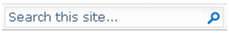
Search:
Class/ID = “.s4-search table”
Default CSS:
width: 212px;
margin-right: 17px;
Comments: This is the container for the search box. The class resides in the Search.css file.
Search Input:
Class/ID = “.s4-search input”
Default CSS:
width: 212px;
margin-right: 17px;
Comments: Note that this class does not change width, border color or height. You could use this to change the background color.
Search Image:
Class/ID = “.s4-search .ms-searchimage”
Default CSS:
background-color:#fff;
border:1px solid #e3e3e3 !important;
height:16px;
padding:2px 3px 1px;
border-left:none !important;
margin-top:3px;
Comments: This class controls the border around the go image.

Help:
Class/ID = “.s4-help”
Default CSS:
margin:4px;
Comments: This uses the “fgimg.png” with inline style of:
position: absolute; top: -293px !important;

Status Bar Container:
Class/ID = “.s4-statusbarcontainer”
Default CSS:
None
Comments: I am not 100% sure where or how this is used. I can only imagine that this is a publishing class.
Main Area:
Class/ID = “body #s4-mainarea”
Default CSS:
float:left;
clear:both;
Comments: This includes both left navigation and content
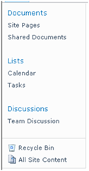
Left Panel:
Class/ID = “body #s4-leftpanel”
Default CSS:
width:155px;
float:left;
Comments: This is the left navigation
Left Panel Headers:
Class/ID = “.s4-ql ul.root > li > .menu-item,.s4-qlheader,.s4-qlheader:visited”
Default CSS:
font-size:1.2em;
color:#0072bc;
margin:0px;
padding:3px 4px 3px 10px;
word-wrap:break-word;
overflow-x:hidden;
Comments: This class controls the look of the header text

Left Panel Links:
Class/ID = “.s4-ql ul.root ul > li > a”
Default CSS:
padding:3px 4px 4px 10px;
color:#3b4f65;
word-wrap:break-word;
overflow-x:hidden;
zoom:1;
Comments: This class controls the look of the link text
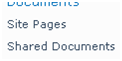
Special Navigation Links List:
Class/ID = “.s4-specialNavLinkList”
Default CSS:
margin:0px;
border-top:1px solid #dbddde;
padding-top:5px;
Comments: This class makes the line above the recycle bin
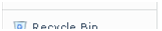
Recycle Bin:
Class/ID = “.s4-specialNavLinkList a”
Default CSS:
padding:3px 4px 3px 10px;
color:#3b4f65;
Comments: This is a shared class with view all site content

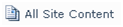
View All Site Content:
Class/ID = “.s4-specialNavLinkList a”
Default CSS:
Same As Above
Comments: This is a shared class with Recycle Bin
Content Table Body Area:
Class/ID = “.s4-ca”
Default CSS:
margin-left:155px;
margin-right:0px;
min-height:324px;
Comments: This is main class for the body content. Notice the 155px margin to the left. This basically moves the content over so that it does not overlap the left navigation.
Web Part Cell:
Class/ID = “.s4-wpcell”
Default CSS:
border:1px solid transparent;
Comments: This would be a good class to define a pixel line around web parts.
Web Part Header:
Class/ID = “.ms-WPHeader”
Default CSS:
background-color:#FFFFFF;
Comments: This controls the background color of the wp header.
Web Part Header TD:
Class/ID = “.ms-WPHeader td”
Default CSS:
border-bottom:1px solid #EBEBEB;
Comments: This controls the border color of the wp header.
Web Part Header Menu:
Class/ID = “.ms-WPHeaderTdMenu”
Default CSS:
width:21px;
border:1px solid transparent;
Comments: This class is for the web part menu spacing.

Web Part Header Selection:
Class/ID = “.ms-WPHeaderTdSelection”
Default CSS:
width:21px;
Comments: This class is for the web part selector spacing.

Web Part Content:
Class/ID = “.ms-wpContentDivSpace”
Default CSS:
margin-left:5px;
margin-right:5px;
Comments: This class adds marginal space left and right for the web part content.
There are many many many more classes that I could cover but these are some of the main ones to get you going. I will cover more in future posts.
Please leave a comment!
This will be the first of many SharePoint 2010 posts. I will be focusing on a few of the main CSS classes used for SharePoint 2010 Public Beta. As the product becomes more final there might be some changes to the class names but I will be sure to create a new post if that happens. This will be quite a lengthy but it should be helpful. The default CSS given below are just highlights of the full CSS attributes for that class.
I will be using a basic team site as my base for the screenshots.

Here is a basic structure of the main areas that I will cover.
Ribbon Row
Table Row Left
Site Actions
Navigate Up
Edit
Tab List
Browse
Page
Table Row Right
Give Feedback
Welcome Menu
Workspace
Body Container
Title Row
Title
Title Logo
Title Text / Breadcrumb
Page Description
Social Data
Separator
I like It
Tags/Notes
Top Header 2/Top Links
li Static-Selected
li Static
Search
Help
Status Bar Container
Main Area
Left Panel
Navigation Manager
li Static (Header)
ul li Static (Link)
Special Navigation Links List
Recycle Bin
View All Site Content
Content Table / Body Area
Web Part Cell
Web Part Header
WP Title
WP Header TD
WP Header Menu
WP Header Selection
Web Part Content
Ribbon Row:
Class/ID = “body #s4-ribbonrow”
Default CSS:
min-height:43px;
background-color:#21374c;
Comments: This is the container for all of the items in the top ribbon

Table Row Left:
Class/ID = “ms-cui-TabRowLeft”
Default CSS:
float:left;
margin-top:20px;
Comments: This is the container Site Actions, Navigate Up and Edit

Site Actions:
Class/ID = “ms-siteactionsmenuinner”
Default CSS:
border-color:#21374C;
border-top-color:#394f63;
background:url("/_layouts/images/bgximg.png") repeat-x -0px -467px;
background-color:#21374c;
Comments: Main Style for Site Actions menu

Navigate Up:
Class/ID = “.s4-breadcrumb-anchor,.ms-qatbutton”
Default CSS:
margin:0px 3px 0px 0px;
padding:2px 5px 0px;
Comments: There is an image “fgimg.png” that sits within an “A” hyperlink Tag. This image is large and has many icons in it. It uses inline absolute positioning to show the correct Icon.
”position: absolute; top: -112px !important;”

Here is what the “fgimg.png” image looks like:

Edit:
Class/ID = “.s4-breadcrumb-anchor,.ms-qatbutton” (Same as Above)
Default CSS:
Same As Above
Comments: Same as above except that the background image position is different. “position: absolute; top: -235px;”

Browse:
Class/ID = “.ms-cui-tt-s > .ms-cui-tt-a”
Default CSS:
border-color:#b6babf;
background-color:#fff;
color:#23272c !important;
Comments: This is the selected state of the browse button. Note the “s” at the end of the class.

Page:
Class/ID = “.ms-cui-tt-span”
Default CSS:
padding:4px 10px 4px;
border-top:1px solid transparent;
text-align:center;
Comments: This is the non-selected state of the page button.

Give Feedback:
Class/ID = “No Class Or ID Specified, See below”
Default CSS:
Inline CSS and Image
Comments: If you would like to remove this icon via CSS, use the following:
.ms-cui-TabRowRight a img{
display: none;
}

Welcome Menu:
Class/ID = “.ms-welcomeMenu”
Default CSS:
padding:2px 5px 3px;
margin:0px 3px;
font-size:1em;
font-family:Verdana,sans-serif;
border:1px solid transparent;
Comments: The class for the arrow is “.ms-viewselector-arrow”

Workspace:
Class/ID = “body #s4-workspace”
Default CSS:
overflow:visible !important;
overflow-y:scroll;
overflow-x:auto;
position:relative;
left:0px;
Comments: This is the container and scroll area for the site.

Body Container:
Class/ID = “body #s4-bodyContainer”
Default CSS:
min-width:760px;
Comments: This class controls the minimum width.
Title Row:
Class/ID = “body #s4-titlerow”
Default CSS:
display:block !important;
Comments: This is the container for the Title, Tags, Ribbon, Main navigation, Search and Help.

Title Row:
Class/ID = “.s4-title”
Default CSS:
padding:0px 0px 0px 10px;
margin:0px;
min-height:64px;
background:url("/_layouts/images/bgximg.png") repeat-x -0px -1013px;
background-color:#f9f9f9;
word-wrap:break-word;
-ms-word-wrap:break-word;
overflow-x:hidden;
Comments: Notice that there is a min height of 64px and a background image is applied by default.

Title Logo:
Class/ID = “.s4-titlelogo”
Default CSS:
padding:12px 10px 12px 0px;
text-align:center;
vertical-align:middle;
Comments: The logo can be changed via the Admin UI. Default Image size is 35x35px

Title Text:
Class/ID = “.s4-titletext”
Default CSS:
width:100%;
Comments: The title text is also the bread crumb.

Page Description:
Class/ID = “.s4-title .s4-pagedescription,.s4-title .s4uniqpermdescription”
Default CSS:
margin-top:6px;
font-size:1em;
color:#5d6878;
font-weight:normal;
Comments: This only shows up if you have specified a description of the site.

Social Data:
Class/ID = “ms-socialNotif-Container”
Default CSS:
width:120px;
overflow-x:auto;
overflow-y:hidden;
padding:0px 3px;
Comments: This is the container that holds both I Like It and Notes.

Social Separator:
Class/ID = “.ms-socialNotif-groupSeparator”
Default CSS:
height:60px;
position:relative;
top:4px;
margin:0px 3px;
border-right:1px solid;
border-right-color:#e7e7e8;
Comments: This is the slight line on the left of the social tags.

I Like It:
Class/ID = “.ms-socialNotif”
Default CSS:
width:48px;
height:60px;
overflow:hidden;
margin:0px 1px;
padding:0px 2px;
border:1px solid transparent;
Comments: This class is shared with the tags and notes. The text uses the class “.ms-socialNotif-text” and the image “mossfgimg.png” with inline style of
position: absolute; top: -132px !important;
Here is what the “mossfgimg.png” image looks like:

Tags & Notes:
Class/ID = “.ms-socialNotif”
Default CSS:
Same As “I Like It” above
Comments: This class is shared with the I like It Feature. The image “mossfgimg.png” with inline style of
position: absolute; top: -300px !important;
Top Header 2:
Class/ID = “body #s4-topheader2”
Default CSS:
background:url("/_layouts/images/selbg.png") repeat-x left top;
background-color:#f6f6f6;
vertical-align:middle;
min-height:25px;
border-top:1px solid #e0e0e0;
border-bottom:1px solid #b8babd;
Comments: This class makes up the majority of the navigation row style.
Top Links:
Class/ID = “.s4-toplinks”
Default CSS:
padding:0px;
Comments: This is the container for the main navigation, search and help.

Top Link Selected:
Class/ID = “.s4-toplinks .s4-tn a.selected”
Default CSS:
border-color:#91cdf2;
border-bottom-color:#addbf7;
border-top-color:#c6e5f8;
background:url("/_layouts/images/selbg.png") repeat-x left top;
background-color:#ccebff;
color:#003759;
padding:4px 5px;
margin:0px 5px;
Comments: The hover class is “.s4-toplinks .s4-tn a.selected:hover”

[b]Top Link Static:[/b]
Class/ID = “.s4-tn li.static > .menu-item”
Default CSS:
color:#3b4f65;
white-space:nowrap;
border:1px solid transparent;
padding:4px 10px;
height:15px;
Comments: The hover class is “.s4-tn li.static > a:hover”

Search:
Class/ID = “.s4-search table”
Default CSS:
width: 212px;
margin-right: 17px;
Comments: This is the container for the search box. The class resides in the Search.css file.

Search Input:
Class/ID = “.s4-search input”
Default CSS:
width: 212px;
margin-right: 17px;
Comments: Note that this class does not change width, border color or height. You could use this to change the background color.
Search Image:
Class/ID = “.s4-search .ms-searchimage”
Default CSS:
background-color:#fff;
border:1px solid #e3e3e3 !important;
height:16px;
padding:2px 3px 1px;
border-left:none !important;
margin-top:3px;
Comments: This class controls the border around the go image.

Help:
Class/ID = “.s4-help”
Default CSS:
margin:4px;
Comments: This uses the “fgimg.png” with inline style of:
position: absolute; top: -293px !important;

Status Bar Container:
Class/ID = “.s4-statusbarcontainer”
Default CSS:
None
Comments: I am not 100% sure where or how this is used. I can only imagine that this is a publishing class.
Main Area:
Class/ID = “body #s4-mainarea”
Default CSS:
float:left;
clear:both;
Comments: This includes both left navigation and content

Left Panel:
Class/ID = “body #s4-leftpanel”
Default CSS:
width:155px;
float:left;
Comments: This is the left navigation

Left Panel Headers:
Class/ID = “.s4-ql ul.root > li > .menu-item,.s4-qlheader,.s4-qlheader:visited”
Default CSS:
font-size:1.2em;
color:#0072bc;
margin:0px;
padding:3px 4px 3px 10px;
word-wrap:break-word;
overflow-x:hidden;
Comments: This class controls the look of the header text

Left Panel Links:
Class/ID = “.s4-ql ul.root ul > li > a”
Default CSS:
padding:3px 4px 4px 10px;
color:#3b4f65;
word-wrap:break-word;
overflow-x:hidden;
zoom:1;
Comments: This class controls the look of the link text

Special Navigation Links List:
Class/ID = “.s4-specialNavLinkList”
Default CSS:
margin:0px;
border-top:1px solid #dbddde;
padding-top:5px;
Comments: This class makes the line above the recycle bin

Recycle Bin:
Class/ID = “.s4-specialNavLinkList a”
Default CSS:
padding:3px 4px 3px 10px;
color:#3b4f65;
Comments: This is a shared class with view all site content

View All Site Content:
Class/ID = “.s4-specialNavLinkList a”
Default CSS:
Same As Above
Comments: This is a shared class with Recycle Bin

Content Table Body Area:
Class/ID = “.s4-ca”
Default CSS:
margin-left:155px;
margin-right:0px;
min-height:324px;
Comments: This is main class for the body content. Notice the 155px margin to the left. This basically moves the content over so that it does not overlap the left navigation.

Web Part Cell:
Class/ID = “.s4-wpcell”
Default CSS:
border:1px solid transparent;
Comments: This would be a good class to define a pixel line around web parts.

Web Part Header:
Class/ID = “.ms-WPHeader”
Default CSS:
background-color:#FFFFFF;
Comments: This controls the background color of the wp header.
Web Part Header TD:
Class/ID = “.ms-WPHeader td”
Default CSS:
border-bottom:1px solid #EBEBEB;
Comments: This controls the border color of the wp header.
Web Part Header Menu:
Class/ID = “.ms-WPHeaderTdMenu”
Default CSS:
width:21px;
border:1px solid transparent;
Comments: This class is for the web part menu spacing.

Web Part Header Selection:
Class/ID = “.ms-WPHeaderTdSelection”
Default CSS:
width:21px;
Comments: This class is for the web part selector spacing.

Web Part Content:
Class/ID = “.ms-wpContentDivSpace”
Default CSS:
margin-left:5px;
margin-right:5px;
Comments: This class adds marginal space left and right for the web part content.
There are many many many more classes that I could cover but these are some of the main ones to get you going. I will cover more in future posts.
Please leave a comment!

相关文章推荐
- Sharepoint 2010 根据用户权限隐藏Ribbon菜单(利用css)
- SharePoint 2010自定义母版页小技巧——JavaScript和CSS引用
- SharePoint 2010中, SPEventReceiverBase.EnableEventFiring和DisableEventFiring都已废弃(obsolete), 应使用SPEventReceiverBase.EventFiringEnabled
- SharePoint 2010自定义母版页小技巧——JavaScript和CSS引用
- SharePoint 2010自定Page Layout不改变core4.css加入自定义style和markup
- SharePoint 2010 PowerShell base function abut list
- Sharepoint 2010 根据用户权限隐藏Ribbon菜单(利用css)
- Sharepoint 2010 根据用户权限隐藏Ribbon菜单(利用css)
- SharePoint 2010 模板页注册corev4 CSS
- SharePoint 2010 At Work--SharePoint 2010 Tab Page 创建选项卡页面
- SharePoint 2010 网络上的开发经验和资源
- 创建与SharePoint 2010风格一致的下拉菜单 推荐
- [C++] OOP - Virtual Functions and Abstract Base Classes
- SharePoint 2010 和AD LDS的集成
- 使用Visual Studio 2010与Visual Studio 11“合作”开发SharePoint 2011程序
- 在SharePoint 2010中创建商业智能(BI)中心网站
- Sharepoint 2010 用VS定制Master,并且每个Web应用同一个Master
- “SharePoint 2010应用程序开发指南”节选 - 第二章 使用Visual Studio
- 如何启用SharePoint 2010的代码块
- sharepoint 2010 从PeopleEditor控件中取出多用户,并返回SPFieldUserValueCollection