iOS 图标尺寸及用途。
2011-06-28 23:07
330 查看
圆角半径
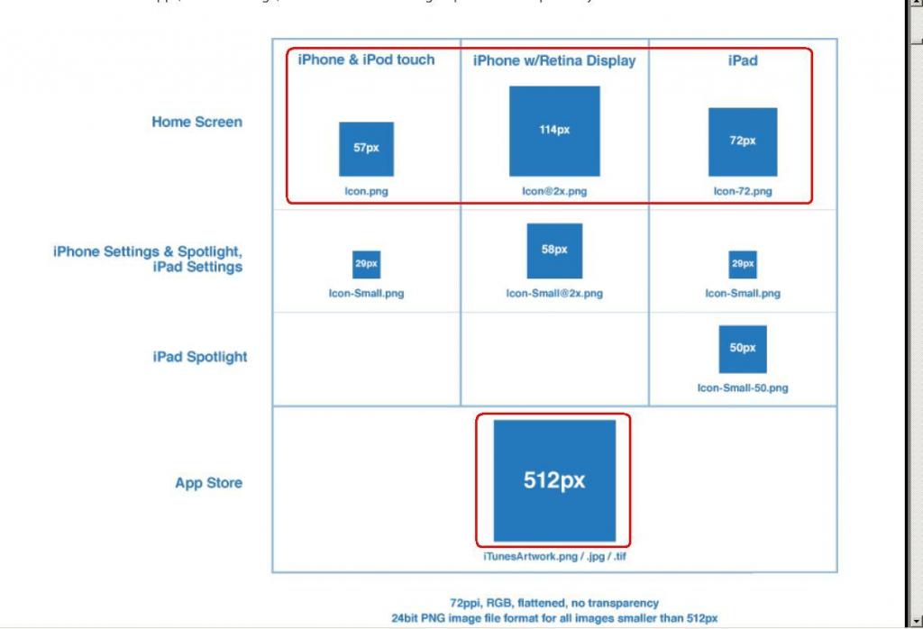
iTunes Artwork icon ───────────────────────── 512px (90px)
App icon(iPhone4) ────────────────────────── 114px (20px)
App icon(iPad) ───────────────────────────── 72px (12px)
App icon(iPhone 3G/3GS) ───────────────────── 57px(10px)
Spotlight/Settings icon icon(iPhone4) ───────────── 58px (10px)
Spotlight/Settings icon icon(iPhone 3G/3GS/iPad) ──── 29px (9px)
=====================================================================
Designing an app for iPhone, iPad or iPhone4? Here's a couple of things to keep in mind:
iPhone & iPod Touch (1st, 2nd & 3rd Generation)
•   Portrait: 320 x 480 px, 320 x 480 point

•   Landscape: 480 x 320 px, 480 x 320 point

•   Status Bar: 20px, 20point

•   DPI: 163dpi

•   Color Mode: 8bit RGB

•   Color Temperature: Warm

•   Application icon: 57 x 57 px, 57 x 57 point

•   Appstore icon: 512 x 512 px, 512 x 512 point

•   Spotlight search icon: 29 x 29px, 29 x 29 point

•   Document icon: 22 x 29 px, 22 x 29 point

•   Webclip icon: 57 x 57 px, 57 x 57 point

•   Toolbar icon: 20 x 20 px, 20 x 20 point

•   Tab bar icon: 30 x 30 px, 30 x 30 point

•   Launch image:  see above portrait/landscape
RAW
Notes: n/a
iPhone4
•   Portrait: 640 x 960 px, 320 x 480 point

•   Landscape: 960 x 640 px, 480 x 320 point

•   Status Bar: 40px, 20point

•   DPI: 326dpi

•   Color Mode: 8bit RGB

•   Color Temperature: Cool

•   Application icon: 114 x 114 px, 57 x 57 point

•   Appstore icon: 512 x 512 px, 512 x 512 point

•   Spotlight search icon: 58 x 58 px, 29 x 29 point

•   Document icon: 44 x 58 px, 22 x 29 point

•   Webclip icon: 114 x 114 px, 57 x 57 point

•   Toolbar icon: 40 x 40 px, 20 x 20 point

•   Tab bar icon:  60 x 60 px, 30 x 30 point

•   Launch image:  see above portrait/landscape
RAW
Notes: effectively pixel-doubled previous generations, bare in mind the screen is the same size and concessions will have to be made e.g. keeping assets the same *physical size but doubling their effective resolution. see below.*
iPad
•   Portrait: 768 x 1024px, 768 x 1024point

•   Landscape: 1024 x 768px, 1024 x 768point

•   Status Bar: 20px, 20point

•   DPI: 132dpi

•   Color Mode: 8bit RGB

•   Color Temperature: Warm

•   Application icon: 72 x 72 px, 72 x 72 point

•   Appstore icon: 512 x 512 px, 512 x 512 point

•   Spotlight search icon (results): 50 x 50 px, 50 x 50 point

•   Spotlight search icon (settings): 29 x 29 px, 29 x 29 point

•   Document icon: 64 x 64 px, 64 x 64 point

•   Webclip icon: 72 x 72 px, 72 x 72 point

•   Toolbar icon: 20 x 20 px, 20 x 20 point

•   Tab bar icon: 30 x 30 px, 30 x 30 point

•   Launch image: see above portrait/landscape
RAW
Notes: many apps include a rounded mask at the corners of the screen/split view - its part of the default view of many apps by the OS. The radius of the rounded corner of these are 6px onto a black background and are optional.
Icon size radii (via Toxinide):
•   29x29px, border-radius: 5px

•   50x50px, border-radius: 9px

•   57x57px, border-radius: 10px

•   58x58px, border-radius: 10px

•   72x72px, border-radius: 12px

•   114x114px, border-radius: 20px

•   512x512px, border-radius: 90px
RAW
Apple automatically bevels/rounds the corners of icons and optionally automatically applies a gloss to icons used in development of iTunes Appstore icons and as such you should not apply the above border-radii to your icons when you export them, they are best left for preview/mockup artwork.
Use the UIPrerenderedIcon plist setting to disable the default gloss feature:
developer.apple.com/iphone/library/documentation/General/Reference/InfoPlistKeyReference/Articles/…
Icons should be exported as either high quality JPEGs or preferably PNGs (24bit, alpha-capable where appropriate). More information regarding icons can be found at:
developer.apple.com/iphone/library/documentation/userexperience/conceptual/mobilehig/IconsImages/…
A word about points: The point sizes listed here are not "Photoshop-points" as you may know them, but more accurately "Apple-points" as described in the Resolution Independence Guide:
developer.apple.com/mac/library/documentation/UserExperience/Conceptual/HiDPIOverview/HiDPIConcepts/…
Essentially what this means is that in cases like iPhone4 where you have double the resolution, you do not have double the amount of space to place items, only double the 'definition'. Specifically this means, the screen display is too small for you to show artwork (text specifically) like you would otherwise. Just be aware that even though you have twice the pixels, its still the same size screen and there is a limit to how much information you can place on such a screen without straining one's eyes.
A word about image formats: iOS devices are predisposed to preferring PNG file formats for a number of reasons, both hardware and software. For more information on the subject (via jeffbarg):
iphonedevelopment.blogspot.com/2008/10/…
Comments/Suggestions? Did I get something wrong or could I add more? I'd like to hear your feedback, lets make this as comprehensive as possible :-)
Share on Twitter

相关文章推荐
- iOS 图标尺寸及用途。(新同学可以看看)
- iOS 图标尺寸及用途
- ios app图标尺寸设置
- iOS appicon 图标尺寸
- IOS APP的所有图标尺寸规范
- IOS App Icon Size 图标尺寸
- iPhone/iPad/Android UI尺寸规范 UI尺寸规范,UI图标尺寸,UI界面尺寸,iPhone6尺寸,iPhone6 Plus尺寸,安卓尺寸,iOS尺寸
- iOS App图标和启动画面尺寸
- iOS 图标、图形尺寸?
- iOS各版本图标尺寸汇总
- iOS App图标和启动画面尺寸
- iOS App图标和启动画面尺寸
- IOS App Icon Size 图标尺寸
- iOS开发之图标和启动图尺寸规范介绍
- iOS App图标和LaunchImage启动页尺寸及命名规则
- IOS App Icon Size 图标尺寸
- iOS App图标和启动画面尺寸
- iOS开发之Swift标签栏按钮UITabBarItem样式修改(图标文字尺寸,颜色等)
- iOS APP的图标尺寸、启动画面尺寸、宣传画面尺寸
- iOS App图标和启动画面尺寸