silverlight基础6-VisualStateManager
2010-06-12 21:40
267 查看
VisualStateManager
VisualStateManager用于管理控件的状态以及用于状态过渡的逻辑,一般放在controltemplate里面。
xmal中:
<templateRoot>
<VisualStateManager.VisualStateGroups>
oneOrMoreVisualStateGroups
</VisualStateManager.VisualStateGroups>
</templateRoot>
一个<VisualStateManager>的结构如下:
------------------------------------------------------------------------------------------------------------------------------------
<VisualStateManager.VisualStateGroups> 状态组组合
<VisualStateGroup> 设置单个的状态组
<VisualStateGroup.Transitions> 设置单个的状态组里不同状态切换时的动画时间
<VisualState> 设置单个的状态的动画效果
</VisualStateGroup>
</VisualStateManager.VisualStateGroups>
-------------------------------------------------------------------------------------------------------------------------------------
以下的例子创建了一个VisualStateManager,里面包含了3种状态情形(VisualState:Normal,Mouseover,Pressed)
此外创建了一个button引用这个,当鼠标放在这个button上时,button会变大,当鼠标按下这个button时,button颜色会改变
xmal中:
代码
<UserControl x:Class="VisualStateManager_Sample.MainPage"
xmlns="http://schemas.microsoft.com/winfx/2006/xaml/presentation"
xmlns:x="http://schemas.microsoft.com/winfx/2006/xaml"
xmlns:d="http://schemas.microsoft.com/expression/blend/2008"
xmlns:mc="http://schemas.openxmlformats.org/markup-compatibility/2006"
mc:Ignorable="d"
d:DesignHeight="300" d:DesignWidth="400">
<Grid x:Name="LayoutRoot" Background="White">
<Grid.Resources>
<!--Style-包含-ControlTemplate-包含-VisualStateManager-->
<Style x:Key="ButtonTemplate" TargetType="Button">
<Setter Property="Template">
<Setter.Value>
<ControlTemplate TargetType="Button">
<!--设置控件的Width,Height,Opacity,BorderThickness-->
<Border x:Name="Button_RootElement" Width="500" Height="100" Opacity="1" BorderThickness="2">
<VisualStateManager.VisualStateGroups>
<!--VisualStateGroup - 视觉状态组,包含CommonStates和FocusStates
CommonStates 包括: Normal, MouseOver, Pressed, Disabled四个VisualState
FocusStates 包括: Unfocused, Focused两个VisualState-->
<VisualStateGroup x:Name="CommonStates">
<!--设置视觉状态组改变时的动画时间-->
<VisualStateGroup.Transitions>
<!--Take 0.3 second from Normal state to trasition to the MouseOver state.-->
<VisualTransition From="Normal" To="MouseOver" GeneratedDuration="0:0:0.3"/>
<!--Take 0.2 second from MouseOver state to trasition to the Normal state.-->
<VisualTransition From="MouseOver" To="Normal" GeneratedDuration="0:0:0.2"/>
<!--Take 0.2 second from MouseOver state to trasition to the Pressed state.-->
<VisualTransition From="MouseOver" To="Pressed" GeneratedDuration="0:0:0.2"/>
<!--Take 0.2 second from Pressed state to trasition to the MouseOver state.-->
<VisualTransition From="Pressed" To="MouseOver" GeneratedDuration="0:0:0.2"/>
</VisualStateGroup.Transitions>
<!--3个VisualState,第一个VisualState为Normal-->
<VisualState x:Name="Normal" />
<!--Change the button Width and Height when the mouse is over the button.
分别设置Button_RootElement下的Width和Height属性,鼠标放在button上时,button会变大-->
<VisualState x:Name="MouseOver">
<Storyboard>
<DoubleAnimation Storyboard.TargetName="Button_RootElement"
Storyboard.TargetProperty="Width" To="600" />
<DoubleAnimation Storyboard.TargetName="Button_RootElement"
Storyboard.TargetProperty="Height" To="120" />
</Storyboard>
</VisualState>
<!--Change the BackgroundBrush背景色, BackgroundBrush边框色, Opacity when the button is pressed.-->
<VisualState x:Name="Pressed">
<Storyboard>
<DoubleAnimation Storyboard.TargetName="Button_RootElement"
Storyboard.TargetProperty="Opacity" To="0.8" />
<ColorAnimation Storyboard.TargetName="BackgroundBrush"
Storyboard.TargetProperty="Color" To="LightSkyBlue" />
<ColorAnimation Storyboard.TargetName="BorderBrush"
Storyboard.TargetProperty="Color" To="Blue" />
</Storyboard>
</VisualState>
</VisualStateGroup>
</VisualStateManager.VisualStateGroups>
<!--内容设置.-->
<ContentPresenter
HorizontalAlignment="{TemplateBinding HorizontalContentAlignment}"
VerticalAlignment="{TemplateBinding VerticalContentAlignment}"/>
<!--背景色设置.-->
<Border.Background>
<SolidColorBrush x:Name="BackgroundBrush" Color="Gray"/>
</Border.Background>
<!--边框颜色设置.-->
<Border.BorderBrush>
<SolidColorBrush x:Name="BorderBrush" Color="Black"/>
</Border.BorderBrush>
</Border>
</ControlTemplate>
</Setter.Value>
</Setter>
</Style>
</Grid.Resources>
<!--button引用ButtonTemplate模板.-->
<Button Style="{StaticResource ButtonTemplate}"
HorizontalAlignment="Center" VerticalAlignment="Center"
Content="I'm a Button" />
</Grid>
</UserControl>
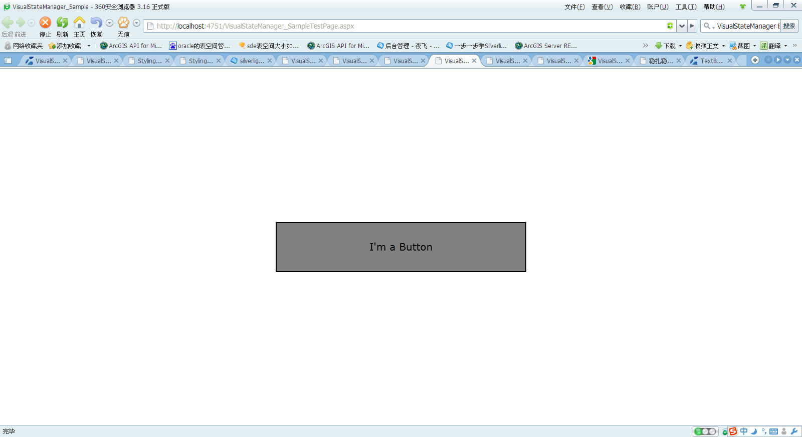
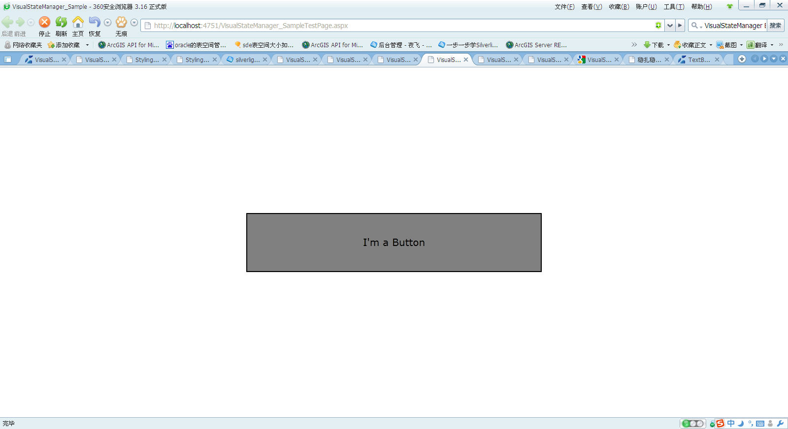
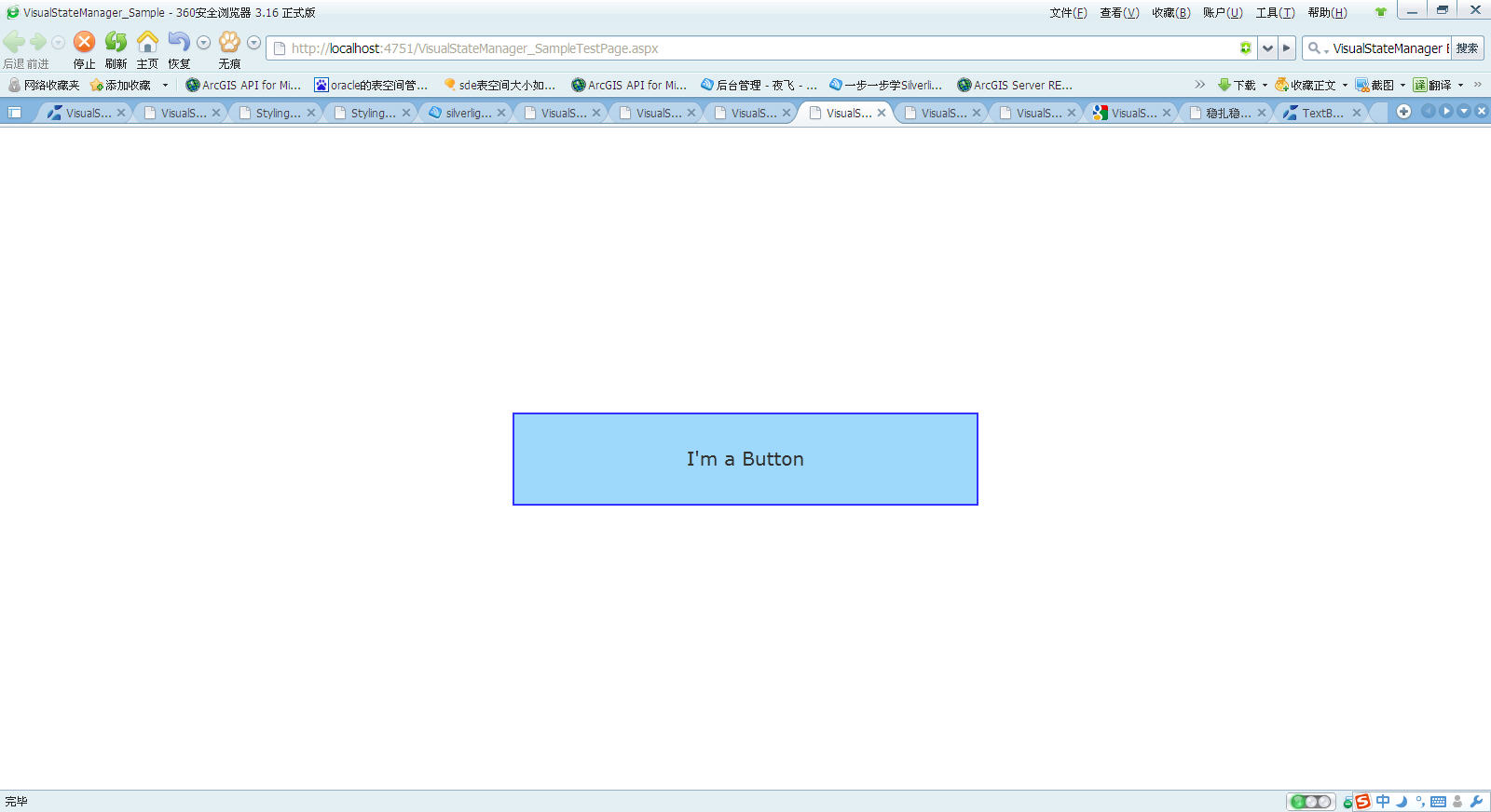
界面如下(由于是截屏,鼠标不可见)
1)button初始化时
2)鼠标在button时
3)当鼠标点击时
VisualStateManager用于管理控件的状态以及用于状态过渡的逻辑,一般放在controltemplate里面。
xmal中:
<templateRoot>
<VisualStateManager.VisualStateGroups>
oneOrMoreVisualStateGroups
</VisualStateManager.VisualStateGroups>
</templateRoot>
一个<VisualStateManager>的结构如下:
------------------------------------------------------------------------------------------------------------------------------------
<VisualStateManager.VisualStateGroups> 状态组组合
<VisualStateGroup> 设置单个的状态组
<VisualStateGroup.Transitions> 设置单个的状态组里不同状态切换时的动画时间
<VisualState> 设置单个的状态的动画效果
</VisualStateGroup>
</VisualStateManager.VisualStateGroups>
-------------------------------------------------------------------------------------------------------------------------------------
以下的例子创建了一个VisualStateManager,里面包含了3种状态情形(VisualState:Normal,Mouseover,Pressed)
此外创建了一个button引用这个,当鼠标放在这个button上时,button会变大,当鼠标按下这个button时,button颜色会改变
xmal中:
代码
<UserControl x:Class="VisualStateManager_Sample.MainPage"
xmlns="http://schemas.microsoft.com/winfx/2006/xaml/presentation"
xmlns:x="http://schemas.microsoft.com/winfx/2006/xaml"
xmlns:d="http://schemas.microsoft.com/expression/blend/2008"
xmlns:mc="http://schemas.openxmlformats.org/markup-compatibility/2006"
mc:Ignorable="d"
d:DesignHeight="300" d:DesignWidth="400">
<Grid x:Name="LayoutRoot" Background="White">
<Grid.Resources>
<!--Style-包含-ControlTemplate-包含-VisualStateManager-->
<Style x:Key="ButtonTemplate" TargetType="Button">
<Setter Property="Template">
<Setter.Value>
<ControlTemplate TargetType="Button">
<!--设置控件的Width,Height,Opacity,BorderThickness-->
<Border x:Name="Button_RootElement" Width="500" Height="100" Opacity="1" BorderThickness="2">
<VisualStateManager.VisualStateGroups>
<!--VisualStateGroup - 视觉状态组,包含CommonStates和FocusStates
CommonStates 包括: Normal, MouseOver, Pressed, Disabled四个VisualState
FocusStates 包括: Unfocused, Focused两个VisualState-->
<VisualStateGroup x:Name="CommonStates">
<!--设置视觉状态组改变时的动画时间-->
<VisualStateGroup.Transitions>
<!--Take 0.3 second from Normal state to trasition to the MouseOver state.-->
<VisualTransition From="Normal" To="MouseOver" GeneratedDuration="0:0:0.3"/>
<!--Take 0.2 second from MouseOver state to trasition to the Normal state.-->
<VisualTransition From="MouseOver" To="Normal" GeneratedDuration="0:0:0.2"/>
<!--Take 0.2 second from MouseOver state to trasition to the Pressed state.-->
<VisualTransition From="MouseOver" To="Pressed" GeneratedDuration="0:0:0.2"/>
<!--Take 0.2 second from Pressed state to trasition to the MouseOver state.-->
<VisualTransition From="Pressed" To="MouseOver" GeneratedDuration="0:0:0.2"/>
</VisualStateGroup.Transitions>
<!--3个VisualState,第一个VisualState为Normal-->
<VisualState x:Name="Normal" />
<!--Change the button Width and Height when the mouse is over the button.
分别设置Button_RootElement下的Width和Height属性,鼠标放在button上时,button会变大-->
<VisualState x:Name="MouseOver">
<Storyboard>
<DoubleAnimation Storyboard.TargetName="Button_RootElement"
Storyboard.TargetProperty="Width" To="600" />
<DoubleAnimation Storyboard.TargetName="Button_RootElement"
Storyboard.TargetProperty="Height" To="120" />
</Storyboard>
</VisualState>
<!--Change the BackgroundBrush背景色, BackgroundBrush边框色, Opacity when the button is pressed.-->
<VisualState x:Name="Pressed">
<Storyboard>
<DoubleAnimation Storyboard.TargetName="Button_RootElement"
Storyboard.TargetProperty="Opacity" To="0.8" />
<ColorAnimation Storyboard.TargetName="BackgroundBrush"
Storyboard.TargetProperty="Color" To="LightSkyBlue" />
<ColorAnimation Storyboard.TargetName="BorderBrush"
Storyboard.TargetProperty="Color" To="Blue" />
</Storyboard>
</VisualState>
</VisualStateGroup>
</VisualStateManager.VisualStateGroups>
<!--内容设置.-->
<ContentPresenter
HorizontalAlignment="{TemplateBinding HorizontalContentAlignment}"
VerticalAlignment="{TemplateBinding VerticalContentAlignment}"/>
<!--背景色设置.-->
<Border.Background>
<SolidColorBrush x:Name="BackgroundBrush" Color="Gray"/>
</Border.Background>
<!--边框颜色设置.-->
<Border.BorderBrush>
<SolidColorBrush x:Name="BorderBrush" Color="Black"/>
</Border.BorderBrush>
</Border>
</ControlTemplate>
</Setter.Value>
</Setter>
</Style>
</Grid.Resources>
<!--button引用ButtonTemplate模板.-->
<Button Style="{StaticResource ButtonTemplate}"
HorizontalAlignment="Center" VerticalAlignment="Center"
Content="I'm a Button" />
</Grid>
</UserControl>
界面如下(由于是截屏,鼠标不可见)
1)button初始化时
2)鼠标在button时
3)当鼠标点击时

相关文章推荐
- Silverlight & Blend动画设计系列九:动画(Animation)与视图状态管理(Visual State Manager)
- Silverlight & Blend动画设计系列九:动画(Animation)与视图状态管理(Visual State Manager)
- Silverlight & Blend动画设计系列九:动画(Animation)与视图状态管理(Visual State Manager)
- Silverlight的VisualStateManager
- silverlight基本使用Visual State Manager
- Silverlight的VisualStateManager
- Silverlight & Blend动画设计系列九:动画(Animation)与视图状态管理(Visual State Manager)
- Silverlight & Blend动画设计系列九:动画(Animation)与视图状态管理(Visual State Manager)
- Expression Blend实例中文教程(11) - 视觉管理器快速入门Visual State Manager(VSM)
- WPF: WPF 中的 Triggers 和 VisualStateManager
- 动画类DoubleAnimationUsingKeyFrames、ObjectAnimationUsingKeyFrames、TransformGroup,VisualStateManager的实际应用
- Expression Blend实例中文教程(11) - 视觉管理器快速入门Visual State Manager(VSM)
- 在编写wpf界面时候中出现如下错误: 类型引用不明确。至少有两个名称空间(“System.Windows”和“System.Windows”)中已出现名为“VisualStateManager”的类型。请考虑调整程序集 XmlnsDefinition 特性。
- Expression Blend实例中文教程(11) - 视觉管理器快速入门Visual State Manager(VSM)
- 重新想象 Windows 8 Store Apps (15) - 控件 UI: 字体继承, Style, ControlTemplate, SystemResource, VisualState, VisualStateManager
- VisualStateManager
- VisualStateManager控件状态利器 详解
- Silverlight & Blend动画设计系列九:动画(Animation)与视图状态管理(Visual State Manager)
- 背水一战 Windows 10 (7) - 控件 UI: VisualState, VisualStateManager, 控件的默认 UI
- Expression Blend实例中文教程(11) - 视觉管理器快速入门Visual State Manager(VSM)