Silverlight项目中"自定义控件开发/Style"学习笔记
2009-11-11 11:28
204 查看
本文不涉及高深的设计模式(比如mvc,mvvm之类),也没有太多的编程技巧,只是记录自己做为asp.net开发者学习silverlight中自定义控件开发的一些过程,高手请绕过。
先推荐一篇不错的文章http://www.cnblogs.com/carysun/articles/1259025.html 写得很全面,只不过图片讲解不够丰富,初学者可能有些感到跳跃性大了一些。
正文开始:
做过asp.net网站开发的都知道用户控件是一个很方便的功能,通常我们会把一些模块化的功能封装成用户控件,用的时候直接拖出来即可,如果用户控件很多,还可以考虑把一些逻辑成熟变化相对不大的控件单独从项目中拆分出来,以达到可重用、可维护的“分层”(此分层非一般项目架构中的三层之意)
silverlight做为MS系列技术之一,自然也继承了这一思想,允许开发者将常用的布局/功能/代码封装成自定义控件,需要的时候直接拖出来使用。
看下面的图:
public class BBSComment : Control
<ResourceDictionary
xmlns="http://schemas.microsoft.com/winfx/2006/xaml/presentation"
xmlns:x="http://schemas.microsoft.com/winfx/2006/xaml"
xmlns:local="clr-namespace:CustomControlDemo">
<Style TargetType="local:BBSComment">
<Setter Property="Template">
<Setter.Value>
<ControlTemplate TargetType="local:BBSComment">
<Border Background="{TemplateBinding Background}"
BorderBrush="{TemplateBinding BorderBrush}"
BorderThickness="{TemplateBinding BorderThickness}">
</Border>
</ControlTemplate>
</Setter.Value>
</Setter>
</Style>
</ResourceDictionary>
先不管其它,我们只看<ControlTemplate >...</ControlTemplate>模板部分,这个可以理解为asp.net中的Repeater控件的ItemTemplate,即这个控件运行时,最终会把这里定义的内容显示出来(即一个Border边框)
我们来映证一下,先在silverlight项目中添加对Control项目的引用,在silverlight上右击,选择"Add Reference"(添加引用),切换到Project标签,选择Control项目
<UserControl x:Class="Silverlight.MainPage"
xmlns="http://schemas.microsoft.com/winfx/2006/xaml/presentation"
xmlns:x="http://schemas.microsoft.com/winfx/2006/xaml"
xmlns:d="http://schemas.microsoft.com/expression/blend/2008" xmlns:mc="http://schemas.openxmlformats.org/markup-compatibility/2006"
xmlns:custom="clr-namespace:ControlLib;assembly=ControlLib"
mc:Ignorable="d" d:DesignWidth="640" d:DesignHeight="480">
<Grid x:Name="LayoutRoot">
<custom:BBSComment Width="100" Height="100" BorderThickness="10" Background="AliceBlue" BorderBrush="Red"></custom:BBSComment>
</Grid>
</UserControl>
运行后,会看到一个红色的border边框,说明Generic.xaml中定义的ControlTemplate确实起作用了
<ResourceDictionary
xmlns="http://schemas.microsoft.com/winfx/2006/xaml/presentation"
xmlns:x="http://schemas.microsoft.com/winfx/2006/xaml"
xmlns:local="clr-namespace:ControlLib">
<Style TargetType="local:BBSComment">
<Setter Property="Template">
<Setter.Value>
<ControlTemplate TargetType="local:BBSComment">
<Border Background="{TemplateBinding Background}"
BorderBrush="{TemplateBinding BorderBrush}"
BorderThickness="{TemplateBinding BorderThickness}">
</Border>
</ControlTemplate>
</Setter.Value>
</Setter>
</Style>
<Style TargetType="local:BBSComment" x:Name="style2">
<Setter Property="Template">
<Setter.Value>
<ControlTemplate TargetType="local:BBSComment">
<Border Width="100" Height="50" Background="Red" BorderBrush="Green" BorderThickness="3">
</Border>
</ControlTemplate>
</Setter.Value>
</Setter>
</Style>
</ResourceDictionary>
这里我把默认生成的代码,复制了一节,并命名为style2,相当于样式表中定义了另一个类名,看下如何应用,仍然在Blend环境中,保持Silverlight项目的MainPage.xaml文件打开状态,注意右侧面板中的Resources标签面板,在App.xaml上右击,选择“Link to Resource Ditionary”-->"Generic.xaml"
<ResourceDictionary>
<ResourceDictionary.MergedDictionaries>
<ResourceDictionary Source="/ControlLib;Component/Themes/Generic.xaml"/>
</ResourceDictionary.MergedDictionaries>
</ResourceDictionary>
即增加了一节<ResourceDictionary>...</ResourceDictionary>
引用了样式后,自然就能使用了,我们把刚才MainPage.xaml上的BBSComment控件删除掉(或屏蔽掉),再拖一个到页面上,并命名为bbsComment2,然后参考下图操作
<Style TargetType="local:BBSComment" x:Name="style2">
<Setter Property="Width" Value="500" />
<Setter Property="Template">
<Setter.Value>
<ControlTemplate TargetType="local:BBSComment">
<Border Width="100" Width="{TemplateBinding Width}" Background="Red" BorderBrush="Green" BorderThickness="3" /> </ControlTemplate>
</Setter.Value>
</Setter>
</Style>
注意新加的一行<Setter Property="Width" Value="500" />,这里表明这个控件的默认宽度是500,如果不写宽度,则控件默认宽度为500px
这里仅讲解了Width宽度属性,至于其它属性,大家可以依葫芦画瓢,自己去尝试吧.
另外“xaml中style” 比“html中css”强大的一个地方在于,css只能控制元素的外观,而style除了控制外观之外,还可以控制呈现的内容。
比如同样是刚才的BBSComment控件,我们可以把generic.xaml中style2的定义改为:
<Style TargetType="local:BBSComment" x:Name="style2">
<Setter Property="Template">
<Setter.Value>
<ControlTemplate TargetType="local:BBSComment">
<TextBlock Text="TextBlock" TextWrapping="Wrap"/>
</ControlTemplate>
</Setter.Value>
</Setter>
</Style>
再次运行,发现刚才的Border已经没了,取而代之是一行文字"TextBlock"!换言之,style可以同时影响对象的外观和内容,在接下来的尝试中,我们还将看到style的更强大威力,它甚至可以影响到对象的行为。
接下来看一下所谓的视觉状态(VisualState),我们抛开官方的定义,以web开发者的眼光跟css来做一个类比,先看下这个常见的例子
</style>
<a href="#" class="f12">我是一个链接(12号字)</a>
<br/><br/>
<a href="#" class="f14">我是一个链接(14号字)</a>
对于a链接来讲,它可能会处于link,visited,hover,active这一组状态中的任何一个,另外对于同一个a标记的字体大小,也不可能同时处于多种大小状态(本示例中要么为12px,要么为14px,不可能即是12号字,又是14号字)
我们可以把"link,visited,hover,active"理解为一个互斥状态组,当鼠标从空白地方移动到a链接上时,a链接从link(或visited)状态变成hover状态,点击时,又从hover状态变成active状态,但不管如何,a元素只能同时处理这一种组状态中的某一个,类似:字体大小,不同的颜色...这些也可以理解为另外几组互斥的状态组。
没错,这其实就是silverlight中的视觉状态组/视觉状态,直接用代码说话,修改generic.xaml的内容为这样:
<ResourceDictionary
xmlns="http://schemas.microsoft.com/winfx/2006/xaml/presentation"
xmlns:x="http://schemas.microsoft.com/winfx/2006/xaml"
xmlns:vsm="clr-namespace:System.Windows;assembly=System.Windows"
xmlns:local="clr-namespace:ControlLib">
<Style TargetType="local:BBSComment">
<Setter Property="Width" Value="500" />
<Setter Property="Height" Value="200" />
<Setter Property="Template">
<Setter.Value>
<ControlTemplate TargetType="local:BBSComment">
<Border x:Name="border" CornerRadius="10" Width="{TemplateBinding Width}" Height="{TemplateBinding Height}" Background="#FFEFEFEF" BorderThickness="10"
BorderBrush="#FFDCD7B6">
<vsm:VisualStateManager.VisualStateGroups>
<vsm:VisualStateGroup x:Name="CommState">
<vsm:VisualState x:Name="normal"/>
<vsm:VisualState x:Name="mouseover">
<Storyboard>
<ColorAnimation Storyboard.TargetName="border" Storyboard.TargetProperty="(Border.BorderBrush).(SolidColorBrush.Color)" To="Red"
Duration="00:00:02" /> </Storyboard>
</vsm:VisualState>
<vsm:VisualStateGroup.Transitions>
<vsm:VisualTransition From="normal" To="mouseover" GeneratedDuration="00:00:00.1"/>
<vsm:VisualTransition From="mouseover" To="normal" GeneratedDuration="00:00:00.3"/>
</vsm:VisualStateGroup.Transitions>
</vsm:VisualStateGroup>
</vsm:VisualStateManager.VisualStateGroups>
<StackPanel Orientation="Vertical">
<TextBox x:Name="txtContent" Text="走过路过,不要错过" TextWrapping="Wrap" Height="145" BorderThickness="0"/>
<StackPanel>
<Button Content="发表评论" x:Name="btnSubmit" Height="25" Width="80" Margin="5,5,0,0" HorizontalAlignment="Left"/>
<TextBlock x:Name="txtTip" Text="评论内容不得超过200字,请遵守互联网相关法律法规" Visibility="Collapsed"></TextBlock>
</StackPanel>
</StackPanel>
</Border>
</ControlTemplate>
</Setter.Value>
</Setter>
</Style>
</ResourceDictionary>
解释一下:
<vsm:VisualStateGroup x:Name="CommState">... </vsm:VisualStateGroup>这里定义一个状态组CommState,
<vsm:VisualState x:Name="normal"/>,<vsm:VisualState x:Name="mouseover">...</vsm:VisualState>定义二个视觉状态,而mouseover里面的Storyboard把边框的颜色改为红色(即相当于前面提到的a:hover效果),
<vsm:VisualStateGroup.Transitions>
<vsm:VisualTransition From="normal" To="mouseover" GeneratedDuration="00:00:00.1"/>
<vsm:VisualTransition From="mouseover" To="normal" GeneratedDuration="00:00:00.3"/>
</vsm:VisualStateGroup.Transitions>
这一段定义了从normal状态变化到mouseover状态的过渡时间,好了,代码看懂了,运行一下你会遗憾的发现,鼠标移动到控件上时,并没有按你预期的那个边框变红?换言之,状态没有发生变化(也称迁移),这也是跟css不一样的地方,css中a的伪类由浏览器自动监听鼠标动作进行切换,而在xaml的style中,对于自定义控件,必须手写代码进行切换
修改一下BBSComment.cs代码:
using System.Windows;
using System.Windows.Controls;
using System.Windows.Input;
namespace ControlLib
<custom:BBSComment>
<custom:BBSComment.Content>
<!--// </custom:BBSComment.Content>
</custom:BBSComment>
这样来定义呢?当然可以,不过需要做一些修改,咱们把public class BBSComment : Control 改成 public class BBSComment : ContentControl,即让BBSComment继承自ContentControl
然后MainPage.xaml中写类似下面的代码,编译就能通过了,但是如果急着想看下效果,抱歉,还不行!
<custom:BBSComment x:Name="bbs3" Margin="0,10,0,0">
<custom:BBSComment.Content>
<StackPanel Orientation="Horizontal">
<TextBlock Text="验证码:" Height="20" Margin="5,5,0,0" TextAlignment="Center" VerticalAlignment="Center"/>
<TextBox Height="20" Width="40" Margin="0,5,0,0"></TextBox>
<TextBlock Text="1680" Height="20" Margin="5,5,0,0" VerticalAlignment="Center" HorizontalAlignment="Center"/>
</StackPanel>
</custom:BBSComment.Content>
</custom:BBSComment>
继续修改Generic.xaml,参考下面的代码:
<StackPanel Orientation="Vertical">
<TextBox x:Name="txtContent" Text="走过路过,不要错过" TextWrapping="Wrap" Height="145" BorderThickness="0"/>
<StackPanel Orientation="Horizontal">
<ContentPresenter></ContentPresenter>
<Button Content="发表评论" x:Name="btnSubmit" Height="25" Width="80" Margin="5,5,0,0" HorizontalAlignment="Left"/>
<TextBlock x:Name="txtTip" Text="评论内容不得超过200字,请遵守互联网相关法律法规" Visibility="Collapsed" HorizontalAlignment="Center"
VerticalAlignment="Center" Margin="5,0,0,0" ></TextBlock>
</StackPanel>
</StackPanel>
里面增加了一个 <ContentPresenter></ContentPresenter>,意在保留一个占位符,可以让用户通过<xxx.Content>....</xxx.Content>来扩展内容,运行时扩展的内容将替换这个占位符(回想一下Dreamweaver中的模板页,Asp.Net中的母版页MasterPage,多么类似的设计!)
当然,自定义控件也支持事件,例如:
<custom:BBSComment x:Name="bbs2" Margin="0,10,0,0" MouseLeftButtonUp="bbs2_MouseLeftButtonUp"></custom:BBSComment>
private void bbs2_MouseLeftButtonUp(object sender, MouseButtonEventArgs e)
{
HtmlPage.Window.Alert("you clicked me");
}
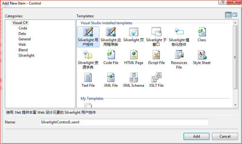
总算写完了,希望对初学者有所帮助,也许有人会问:自定义控件为啥直接新建一个"Silverlight用户控件"(如下图),那里面想怎么编辑就怎么编辑,不是更方便?
确实如此,不过“存在即合理”,既然MS把Silverlight模板化控件单独分出来,自然有它的道理,大家慢慢体会吧。
后记:文中所记内容纯属个人理解,不当或错误之处,欢迎指正,转载请注明出处(菩提树下的杨过)
先推荐一篇不错的文章http://www.cnblogs.com/carysun/articles/1259025.html 写得很全面,只不过图片讲解不够丰富,初学者可能有些感到跳跃性大了一些。
正文开始:
做过asp.net网站开发的都知道用户控件是一个很方便的功能,通常我们会把一些模块化的功能封装成用户控件,用的时候直接拖出来即可,如果用户控件很多,还可以考虑把一些逻辑成熟变化相对不大的控件单独从项目中拆分出来,以达到可重用、可维护的“分层”(此分层非一般项目架构中的三层之意)
silverlight做为MS系列技术之一,自然也继承了这一思想,允许开发者将常用的布局/功能/代码封装成自定义控件,需要的时候直接拖出来使用。
看下面的图:
public class BBSComment : Control
<ResourceDictionary
xmlns="http://schemas.microsoft.com/winfx/2006/xaml/presentation"
xmlns:x="http://schemas.microsoft.com/winfx/2006/xaml"
xmlns:local="clr-namespace:CustomControlDemo">
<Style TargetType="local:BBSComment">
<Setter Property="Template">
<Setter.Value>
<ControlTemplate TargetType="local:BBSComment">
<Border Background="{TemplateBinding Background}"
BorderBrush="{TemplateBinding BorderBrush}"
BorderThickness="{TemplateBinding BorderThickness}">
</Border>
</ControlTemplate>
</Setter.Value>
</Setter>
</Style>
</ResourceDictionary>
先不管其它,我们只看<ControlTemplate >...</ControlTemplate>模板部分,这个可以理解为asp.net中的Repeater控件的ItemTemplate,即这个控件运行时,最终会把这里定义的内容显示出来(即一个Border边框)
我们来映证一下,先在silverlight项目中添加对Control项目的引用,在silverlight上右击,选择"Add Reference"(添加引用),切换到Project标签,选择Control项目
<UserControl x:Class="Silverlight.MainPage"
xmlns="http://schemas.microsoft.com/winfx/2006/xaml/presentation"
xmlns:x="http://schemas.microsoft.com/winfx/2006/xaml"
xmlns:d="http://schemas.microsoft.com/expression/blend/2008" xmlns:mc="http://schemas.openxmlformats.org/markup-compatibility/2006"
xmlns:custom="clr-namespace:ControlLib;assembly=ControlLib"
mc:Ignorable="d" d:DesignWidth="640" d:DesignHeight="480">
<Grid x:Name="LayoutRoot">
<custom:BBSComment Width="100" Height="100" BorderThickness="10" Background="AliceBlue" BorderBrush="Red"></custom:BBSComment>
</Grid>
</UserControl>
运行后,会看到一个红色的border边框,说明Generic.xaml中定义的ControlTemplate确实起作用了
<ResourceDictionary
xmlns="http://schemas.microsoft.com/winfx/2006/xaml/presentation"
xmlns:x="http://schemas.microsoft.com/winfx/2006/xaml"
xmlns:local="clr-namespace:ControlLib">
<Style TargetType="local:BBSComment">
<Setter Property="Template">
<Setter.Value>
<ControlTemplate TargetType="local:BBSComment">
<Border Background="{TemplateBinding Background}"
BorderBrush="{TemplateBinding BorderBrush}"
BorderThickness="{TemplateBinding BorderThickness}">
</Border>
</ControlTemplate>
</Setter.Value>
</Setter>
</Style>
<Style TargetType="local:BBSComment" x:Name="style2">
<Setter Property="Template">
<Setter.Value>
<ControlTemplate TargetType="local:BBSComment">
<Border Width="100" Height="50" Background="Red" BorderBrush="Green" BorderThickness="3">
</Border>
</ControlTemplate>
</Setter.Value>
</Setter>
</Style>
</ResourceDictionary>
这里我把默认生成的代码,复制了一节,并命名为style2,相当于样式表中定义了另一个类名,看下如何应用,仍然在Blend环境中,保持Silverlight项目的MainPage.xaml文件打开状态,注意右侧面板中的Resources标签面板,在App.xaml上右击,选择“Link to Resource Ditionary”-->"Generic.xaml"
<ResourceDictionary>
<ResourceDictionary.MergedDictionaries>
<ResourceDictionary Source="/ControlLib;Component/Themes/Generic.xaml"/>
</ResourceDictionary.MergedDictionaries>
</ResourceDictionary>
即增加了一节<ResourceDictionary>...</ResourceDictionary>
引用了样式后,自然就能使用了,我们把刚才MainPage.xaml上的BBSComment控件删除掉(或屏蔽掉),再拖一个到页面上,并命名为bbsComment2,然后参考下图操作
<Style TargetType="local:BBSComment" x:Name="style2">
<Setter Property="Width" Value="500" />
<Setter Property="Template">
<Setter.Value>
<ControlTemplate TargetType="local:BBSComment">
<Border Width="100" Width="{TemplateBinding Width}" Background="Red" BorderBrush="Green" BorderThickness="3" /> </ControlTemplate>
</Setter.Value>
</Setter>
</Style>
注意新加的一行<Setter Property="Width" Value="500" />,这里表明这个控件的默认宽度是500,如果不写宽度,则控件默认宽度为500px
这里仅讲解了Width宽度属性,至于其它属性,大家可以依葫芦画瓢,自己去尝试吧.
另外“xaml中style” 比“html中css”强大的一个地方在于,css只能控制元素的外观,而style除了控制外观之外,还可以控制呈现的内容。
比如同样是刚才的BBSComment控件,我们可以把generic.xaml中style2的定义改为:
<Style TargetType="local:BBSComment" x:Name="style2">
<Setter Property="Template">
<Setter.Value>
<ControlTemplate TargetType="local:BBSComment">
<TextBlock Text="TextBlock" TextWrapping="Wrap"/>
</ControlTemplate>
</Setter.Value>
</Setter>
</Style>
再次运行,发现刚才的Border已经没了,取而代之是一行文字"TextBlock"!换言之,style可以同时影响对象的外观和内容,在接下来的尝试中,我们还将看到style的更强大威力,它甚至可以影响到对象的行为。
接下来看一下所谓的视觉状态(VisualState),我们抛开官方的定义,以web开发者的眼光跟css来做一个类比,先看下这个常见的例子
</style>
<a href="#" class="f12">我是一个链接(12号字)</a>
<br/><br/>
<a href="#" class="f14">我是一个链接(14号字)</a>
对于a链接来讲,它可能会处于link,visited,hover,active这一组状态中的任何一个,另外对于同一个a标记的字体大小,也不可能同时处于多种大小状态(本示例中要么为12px,要么为14px,不可能即是12号字,又是14号字)
我们可以把"link,visited,hover,active"理解为一个互斥状态组,当鼠标从空白地方移动到a链接上时,a链接从link(或visited)状态变成hover状态,点击时,又从hover状态变成active状态,但不管如何,a元素只能同时处理这一种组状态中的某一个,类似:字体大小,不同的颜色...这些也可以理解为另外几组互斥的状态组。
没错,这其实就是silverlight中的视觉状态组/视觉状态,直接用代码说话,修改generic.xaml的内容为这样:
<ResourceDictionary
xmlns="http://schemas.microsoft.com/winfx/2006/xaml/presentation"
xmlns:x="http://schemas.microsoft.com/winfx/2006/xaml"
xmlns:vsm="clr-namespace:System.Windows;assembly=System.Windows"
xmlns:local="clr-namespace:ControlLib">
<Style TargetType="local:BBSComment">
<Setter Property="Width" Value="500" />
<Setter Property="Height" Value="200" />
<Setter Property="Template">
<Setter.Value>
<ControlTemplate TargetType="local:BBSComment">
<Border x:Name="border" CornerRadius="10" Width="{TemplateBinding Width}" Height="{TemplateBinding Height}" Background="#FFEFEFEF" BorderThickness="10"
BorderBrush="#FFDCD7B6">
<vsm:VisualStateManager.VisualStateGroups>
<vsm:VisualStateGroup x:Name="CommState">
<vsm:VisualState x:Name="normal"/>
<vsm:VisualState x:Name="mouseover">
<Storyboard>
<ColorAnimation Storyboard.TargetName="border" Storyboard.TargetProperty="(Border.BorderBrush).(SolidColorBrush.Color)" To="Red"
Duration="00:00:02" /> </Storyboard>
</vsm:VisualState>
<vsm:VisualStateGroup.Transitions>
<vsm:VisualTransition From="normal" To="mouseover" GeneratedDuration="00:00:00.1"/>
<vsm:VisualTransition From="mouseover" To="normal" GeneratedDuration="00:00:00.3"/>
</vsm:VisualStateGroup.Transitions>
</vsm:VisualStateGroup>
</vsm:VisualStateManager.VisualStateGroups>
<StackPanel Orientation="Vertical">
<TextBox x:Name="txtContent" Text="走过路过,不要错过" TextWrapping="Wrap" Height="145" BorderThickness="0"/>
<StackPanel>
<Button Content="发表评论" x:Name="btnSubmit" Height="25" Width="80" Margin="5,5,0,0" HorizontalAlignment="Left"/>
<TextBlock x:Name="txtTip" Text="评论内容不得超过200字,请遵守互联网相关法律法规" Visibility="Collapsed"></TextBlock>
</StackPanel>
</StackPanel>
</Border>
</ControlTemplate>
</Setter.Value>
</Setter>
</Style>
</ResourceDictionary>
解释一下:
<vsm:VisualStateGroup x:Name="CommState">... </vsm:VisualStateGroup>这里定义一个状态组CommState,
<vsm:VisualState x:Name="normal"/>,<vsm:VisualState x:Name="mouseover">...</vsm:VisualState>定义二个视觉状态,而mouseover里面的Storyboard把边框的颜色改为红色(即相当于前面提到的a:hover效果),
<vsm:VisualStateGroup.Transitions>
<vsm:VisualTransition From="normal" To="mouseover" GeneratedDuration="00:00:00.1"/>
<vsm:VisualTransition From="mouseover" To="normal" GeneratedDuration="00:00:00.3"/>
</vsm:VisualStateGroup.Transitions>
这一段定义了从normal状态变化到mouseover状态的过渡时间,好了,代码看懂了,运行一下你会遗憾的发现,鼠标移动到控件上时,并没有按你预期的那个边框变红?换言之,状态没有发生变化(也称迁移),这也是跟css不一样的地方,css中a的伪类由浏览器自动监听鼠标动作进行切换,而在xaml的style中,对于自定义控件,必须手写代码进行切换
修改一下BBSComment.cs代码:
using System.Windows;
using System.Windows.Controls;
using System.Windows.Input;
namespace ControlLib
<custom:BBSComment>
<custom:BBSComment.Content>
<!--// </custom:BBSComment.Content>
</custom:BBSComment>
这样来定义呢?当然可以,不过需要做一些修改,咱们把public class BBSComment : Control 改成 public class BBSComment : ContentControl,即让BBSComment继承自ContentControl
然后MainPage.xaml中写类似下面的代码,编译就能通过了,但是如果急着想看下效果,抱歉,还不行!
<custom:BBSComment x:Name="bbs3" Margin="0,10,0,0">
<custom:BBSComment.Content>
<StackPanel Orientation="Horizontal">
<TextBlock Text="验证码:" Height="20" Margin="5,5,0,0" TextAlignment="Center" VerticalAlignment="Center"/>
<TextBox Height="20" Width="40" Margin="0,5,0,0"></TextBox>
<TextBlock Text="1680" Height="20" Margin="5,5,0,0" VerticalAlignment="Center" HorizontalAlignment="Center"/>
</StackPanel>
</custom:BBSComment.Content>
</custom:BBSComment>
继续修改Generic.xaml,参考下面的代码:
<StackPanel Orientation="Vertical">
<TextBox x:Name="txtContent" Text="走过路过,不要错过" TextWrapping="Wrap" Height="145" BorderThickness="0"/>
<StackPanel Orientation="Horizontal">
<ContentPresenter></ContentPresenter>
<Button Content="发表评论" x:Name="btnSubmit" Height="25" Width="80" Margin="5,5,0,0" HorizontalAlignment="Left"/>
<TextBlock x:Name="txtTip" Text="评论内容不得超过200字,请遵守互联网相关法律法规" Visibility="Collapsed" HorizontalAlignment="Center"
VerticalAlignment="Center" Margin="5,0,0,0" ></TextBlock>
</StackPanel>
</StackPanel>
里面增加了一个 <ContentPresenter></ContentPresenter>,意在保留一个占位符,可以让用户通过<xxx.Content>....</xxx.Content>来扩展内容,运行时扩展的内容将替换这个占位符(回想一下Dreamweaver中的模板页,Asp.Net中的母版页MasterPage,多么类似的设计!)
当然,自定义控件也支持事件,例如:
<custom:BBSComment x:Name="bbs2" Margin="0,10,0,0" MouseLeftButtonUp="bbs2_MouseLeftButtonUp"></custom:BBSComment>
private void bbs2_MouseLeftButtonUp(object sender, MouseButtonEventArgs e)
{
HtmlPage.Window.Alert("you clicked me");
}
总算写完了,希望对初学者有所帮助,也许有人会问:自定义控件为啥直接新建一个"Silverlight用户控件"(如下图),那里面想怎么编辑就怎么编辑,不是更方便?
确实如此,不过“存在即合理”,既然MS把Silverlight模板化控件单独分出来,自然有它的道理,大家慢慢体会吧。
后记:文中所记内容纯属个人理解,不当或错误之处,欢迎指正,转载请注明出处(菩提树下的杨过)

相关文章推荐
- Silverlight项目中"自定义控件开发/Style"学习笔记
- Silverlight编译错误,提示某文件不是项目的一部分或"生成操作"没有设置为"资源"
- 装了个VS2010,打开silverlight项目时却出现了错误“找不到C:/Program Files/MSBuild/Microsoft/Silverlight/Microsoft.Silverlight.CSharp.targets"
- 解决coco2dx创建的项目在通过 eclipse ndk编译时报"undefined reference to XXXX "
- 【原创】有关Silverlight中 "Silverlight提示4004错误" 的解决方案及思路。
- C++项目中的extern "C" {}
- ios7.1安装提示"无法安装应用程序 因为证书无效"的解决方案二(dropbox被封项目转移到Appharbor上)
- C++项目中的extern "C" {}
- Maven构建WEB项目JSP报The superclass "javax.servlet.http.HttpServlet" was not found on the Java Build Path
- 在Android项目中的测试类点击"run as JUnit test"出错
- Android自定义控件 开源组件SlidingMenu的项目集成
- Silverlight实现查询建模(二) 项目层次划分
- 详解C++项目中的extern "C" {}
- Intellij idea13从SVN导出项目出现:cannot load supported fromats: cannot run program "SVN"
- [翻译]开发Silverlight 2.0的自定义控件
- SilverLight-Access:银光项目测试数据类列表
- 升级xcode8之后,运行项目警告:"subsystem: com.apple.UIKit, category: HIDEventFiltered, enable_level: 0" 的警
- VS2010或Silverlight 4.0使用ASP.NET配置工具打开"安全"选项出错的解决
- 部署项目到weblogic中出现"Bean already exists: "weblogic.j2ee.descriptor.FilterMappingBeanImpl@4b873872"
- C++项目中的extern "C" {}